App Navigation
Applicaster supports a range of navigation elements allowing to connect to screens or actions.
On mobile, side menus, bottom tab bars, and in-line horizontal tabs are supported, in addition to a customizable top navigation bar with action buttons.
On TVs, top menu bar is supported, along with horizontals and vertical tabs.
iOS and Android
Navigation bar
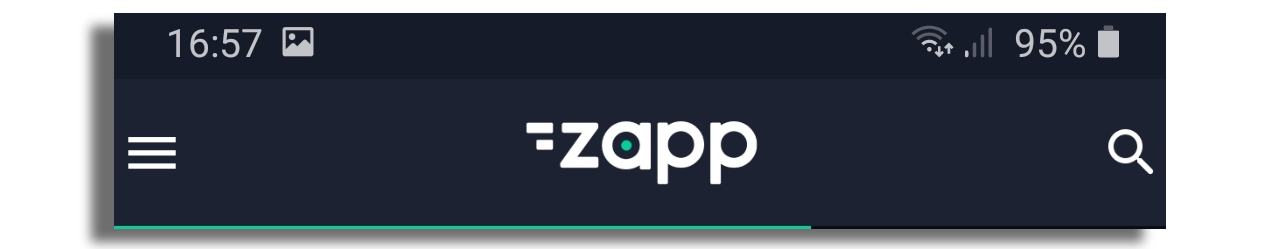
Every app must have a navigation bar that consists of a logo and action buttons such as back button, menu button and close button. You can add a Chromecast button or link to any screen, such as search, via the navigation bar. It's also possible to create multiple navigation bars and associate them with specific screens.
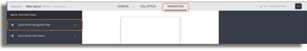
Configuration
Go to the Navigation section of the Studio and choose the Navigation Bar.
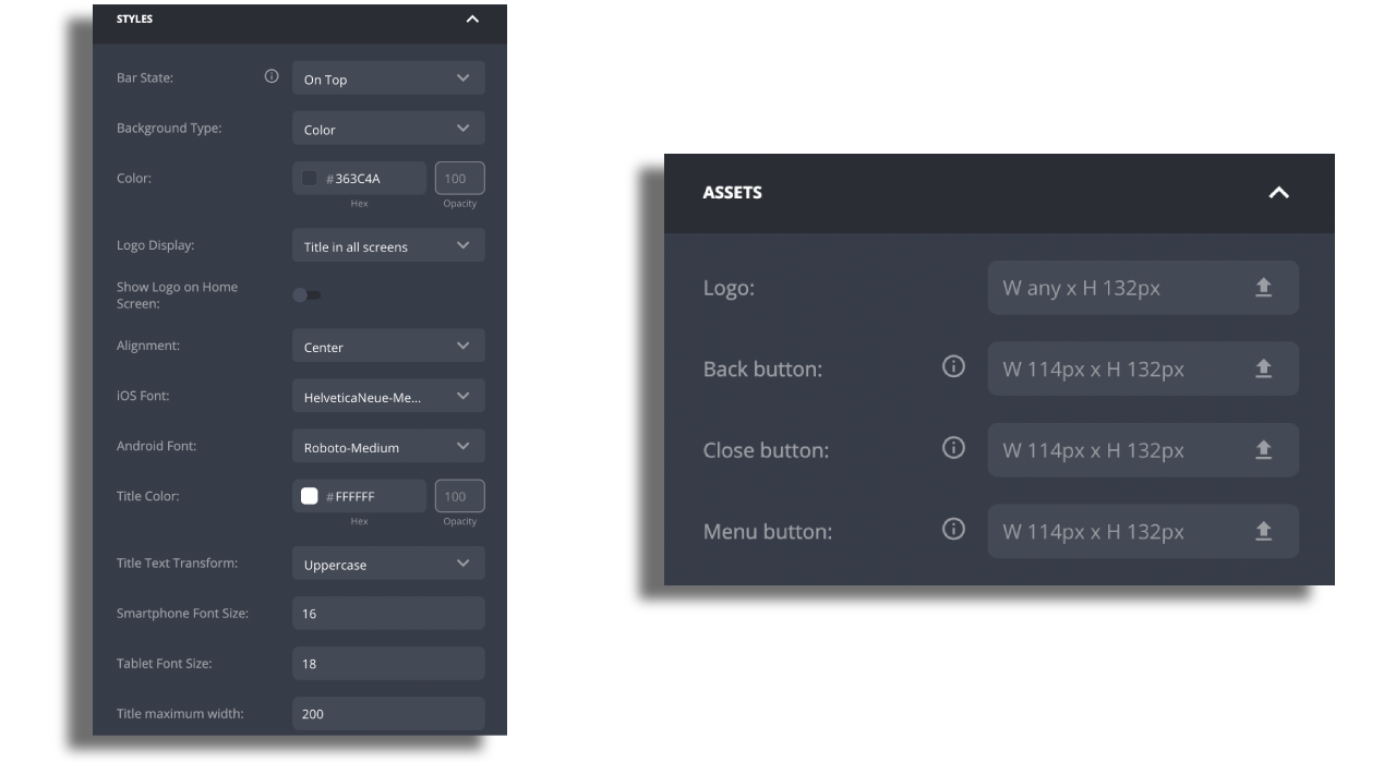
Modify the nav bar settings according to your needs. Please note the following:
Default navigation - Select to make Navigation Bar the default navigation to apply to the app vs any other custom designed navigation plugin.
Logo Display - The logo can be displayed on all screens, or only on the home screen. In the latter case, the name of the screen is shown instead of the logo.
On the Assets section, upload the relevant assets according to the following instructions:
Logo - Please upload a logo in the PNG format with dimensions of 128 px by 44 px, and ensure that it is exported at a resolution of 3 times the standard pixel density (@3x). Use transparent background to fill any unwanted space and make logo fit available size.
Assets - The size should be 38px x 44px and exported at a resolution of 3 times the standard pixel density (@3x).
Additional Action Buttons - To link a screen, click on the +ADD ITEM button and choose "Screen Navigation Button".
To add Chromecast, please read here
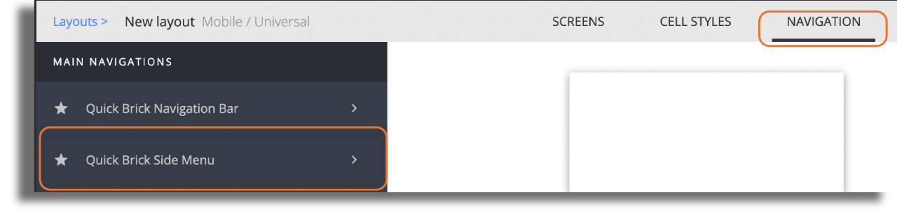
Side Menu
A Side Menu is used to navigate to main screens within the app.
Configuration
When creating a new layout, side menu is a added by default. To style it and add items, just go to the navigation section of the studio and choose side menu.
Modify the side menu settings according to your needs. You can change:
- the background color of the menu and each item in the menu.
- font family, color and size.
- color for selected and unselected state of menu items.
- add any icon asset on the right of each item. The asset needs to be in PNG format, size: 40px x 40px and exported at a resolution of 3 times the standard pixel density (@3x).
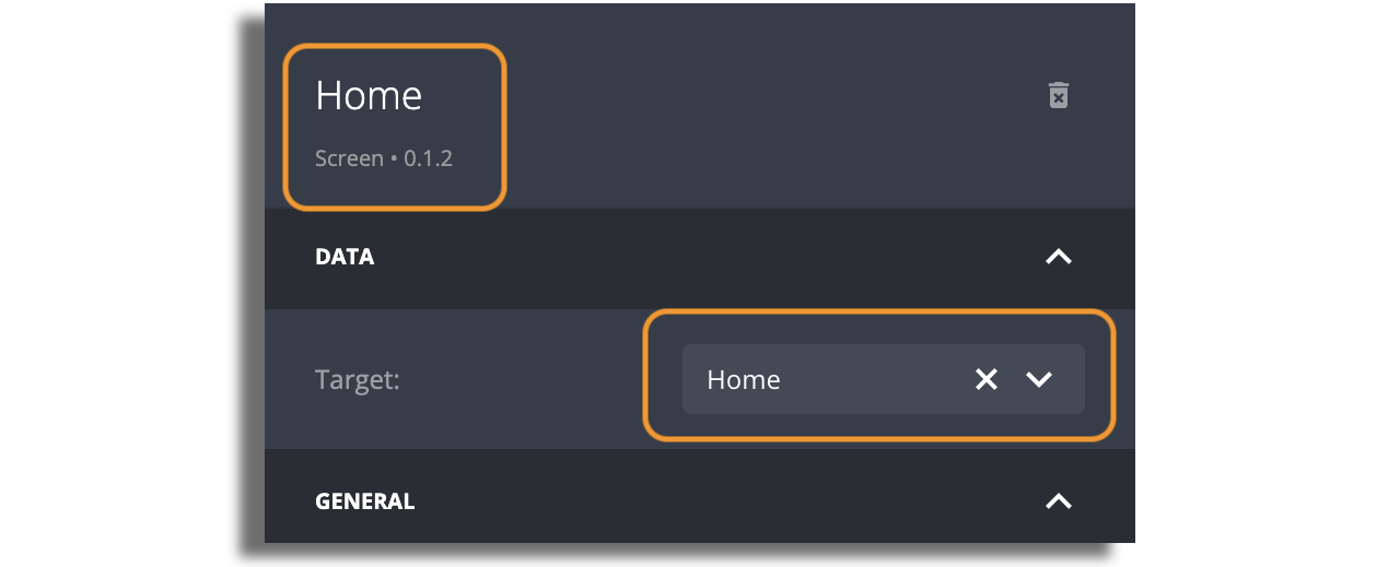
Attach screens to the Menu
Click on the +ADD ITEM button and choose the item you would like to add.
Your new item will appear on the left panel. Choose the new item you just added and set its name, icon and screen target.
The name that you set for the screen will show up in the side menu.
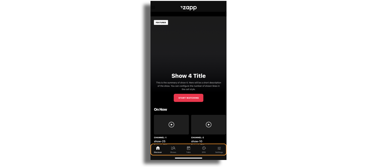
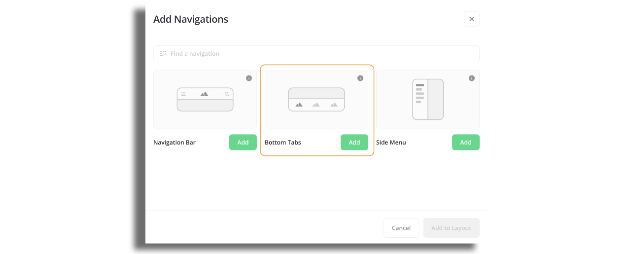
Bottom Tabs
Bottom Tabs acts as a navigation menu and can display one to five menu items at the bottom of a screen. Each menu item is represented by an icon and an optional text label.
Configuration
Go to the Navigation section of the Studio and choose the Bottom Tabs.
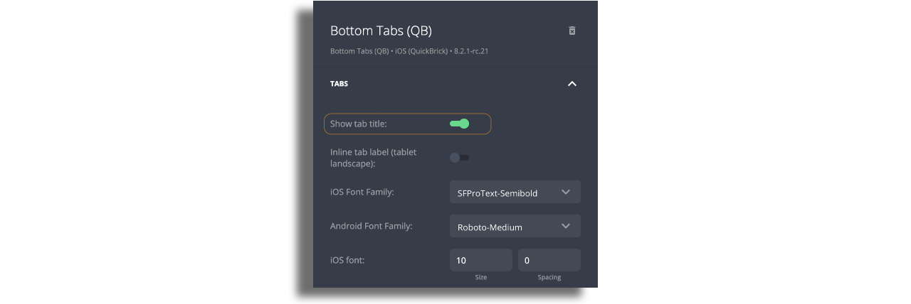
Modify the bottom tab bar settings according to your needs. You can change:
Background color of the bottom tab bar, top border color and thikness, font family and size.
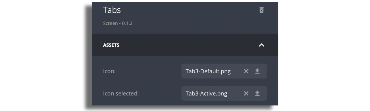
Upload 40px on 40px assets for item icons. Make sure that the assets are exported at a resolution of 3 times the standard pixel density (@3x)
Ensure that the toggle to display tab titles is enabled if you wish to have items portrayed with images and titles.
- Add items to the bottom tab bar that will represent screens. You can do so by clicking on Add Item in the right panel. Each item will represent a screen in the bottom tab bar.
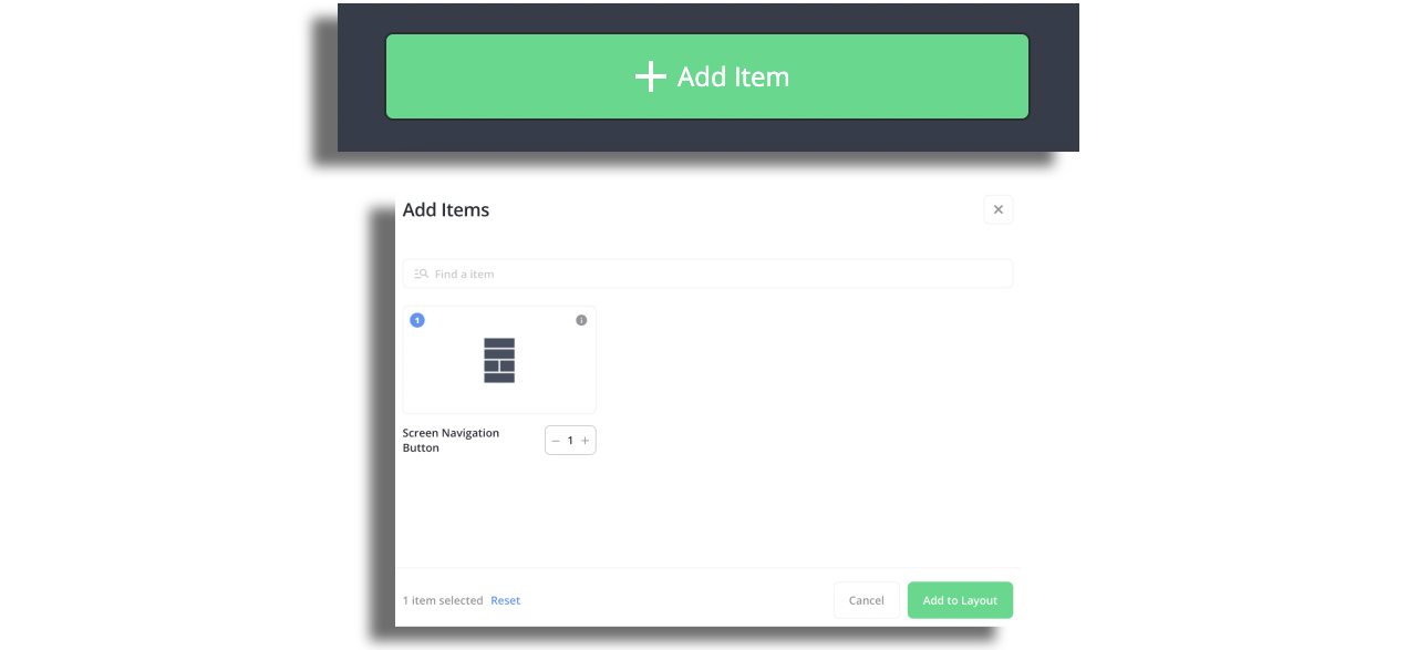
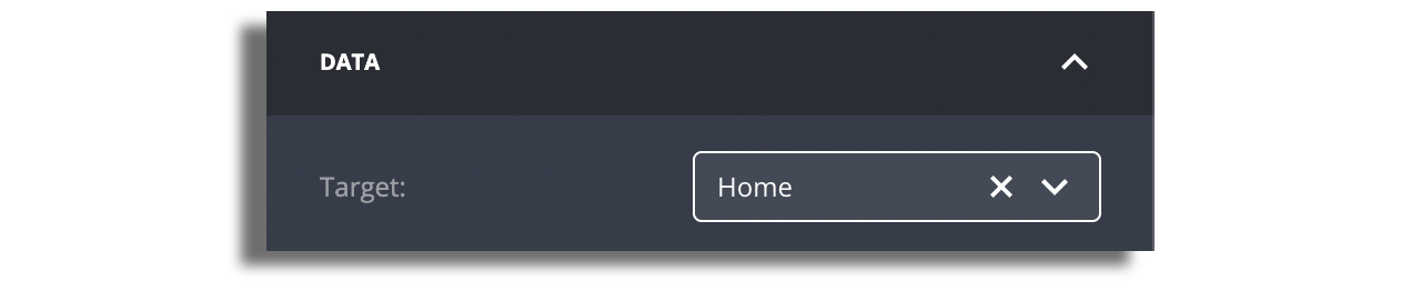
- Each item must have assigned target screen. The item's name will be automatically retrieved from the screen, but you have the option to modify it and the edited name will then be displayed as the title.
- Enter each item, change the button state to "image" and upload assets. For each item, switch the button status to "image", and then upload the corresponding assets.The section to upload assets will only appear if you chooose option
imageat the top of the right panel.
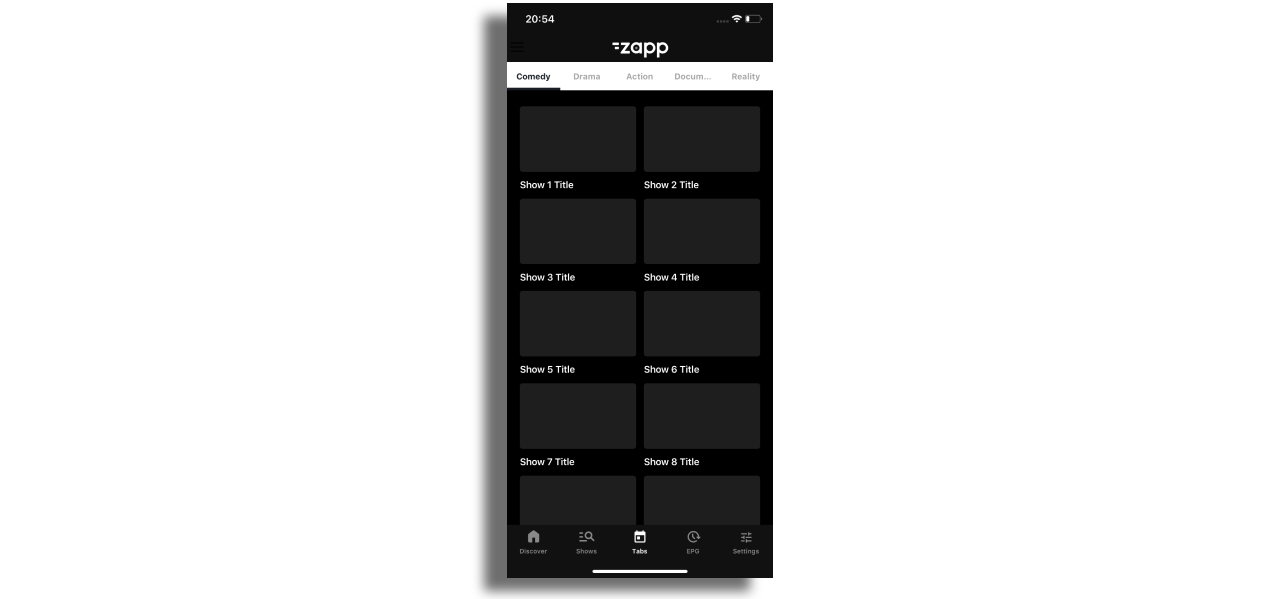
Tabs
Tabs represent inner screen navigation and allows users easily navigate content grouped by any topic, such as show season, music genre, etc.
Configuration
In order to add tabs, select Add Screen and then choose Tabs.
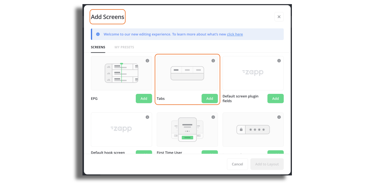
Select the screen in Studio and configure the Tabs in the right hand panel. Note the following:
Display Mode There are three modes that can be chosen when using the tabs component.
Fractional- tabs are equally distributed across 100% width of the screen.Fixed- all tabs have the same width which is defined by the user.Dynamic- tabs have different widths based on text label width.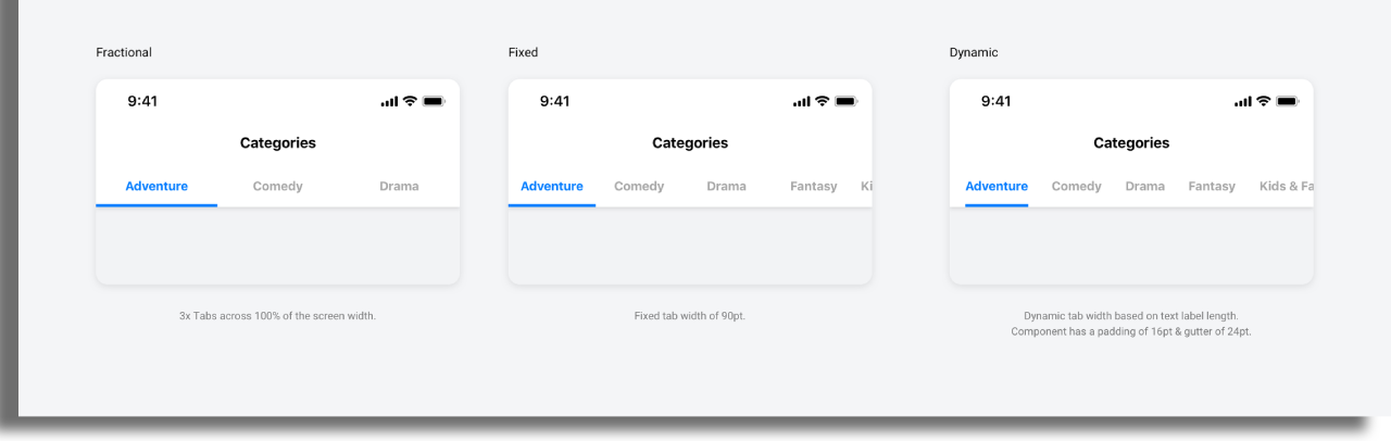
Data source
Assign data source on tabs screen that will include the type value for the screen inside the tab. In the example below the type value is season_generic. This value opens the screen that is set in type mapping. For more info on how type mapping works, check out this article.
  "entry": [
    {
      "extensions": {

      },
      "id": "season-1",
      "title": "Season 1",
      "type": {
        "value": "season_generic"
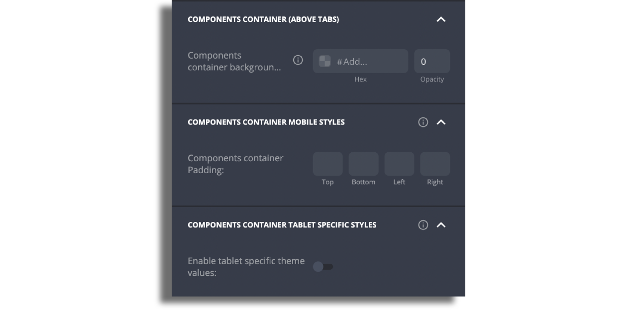
Components Container (above tabs) - you can add one component above the tabs by adding this component to the screen, selecting cell style and assigning data source to it.
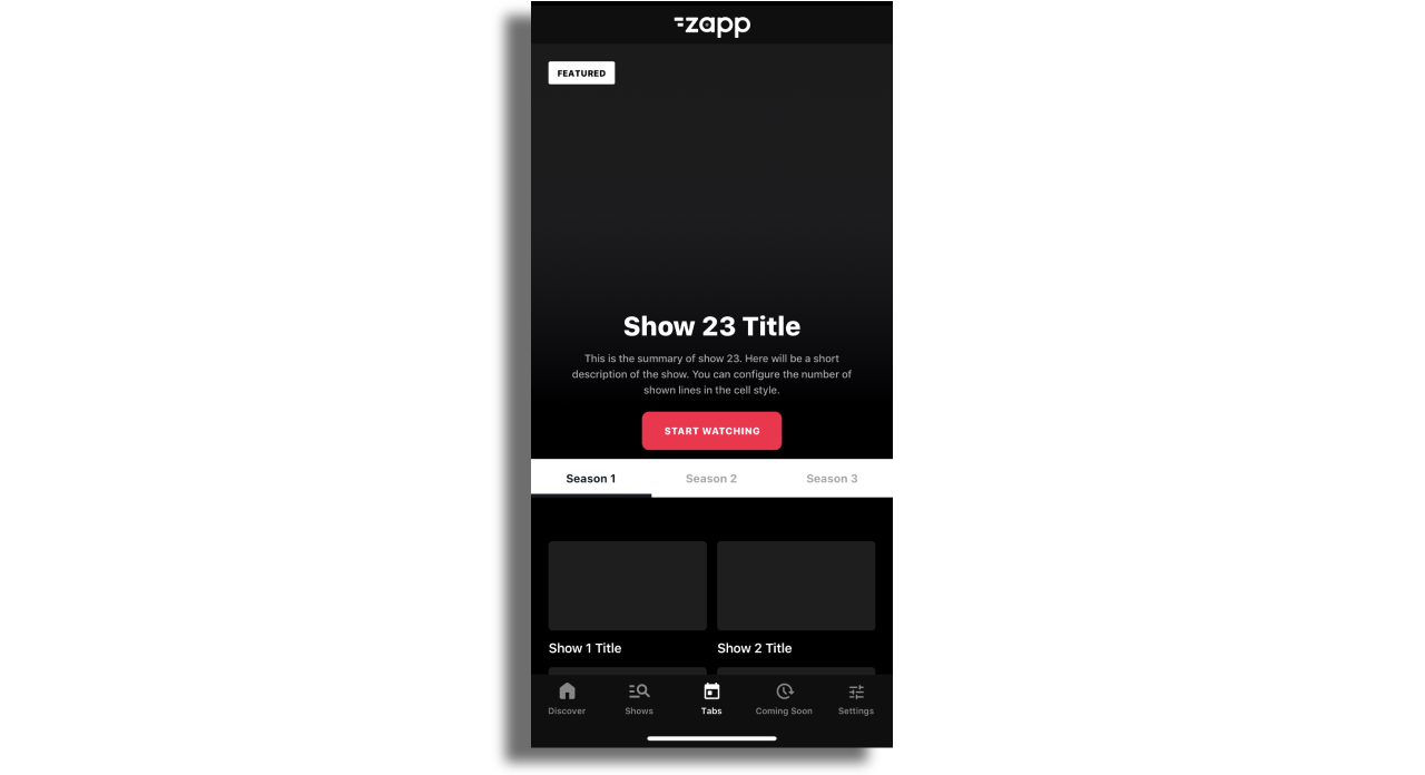
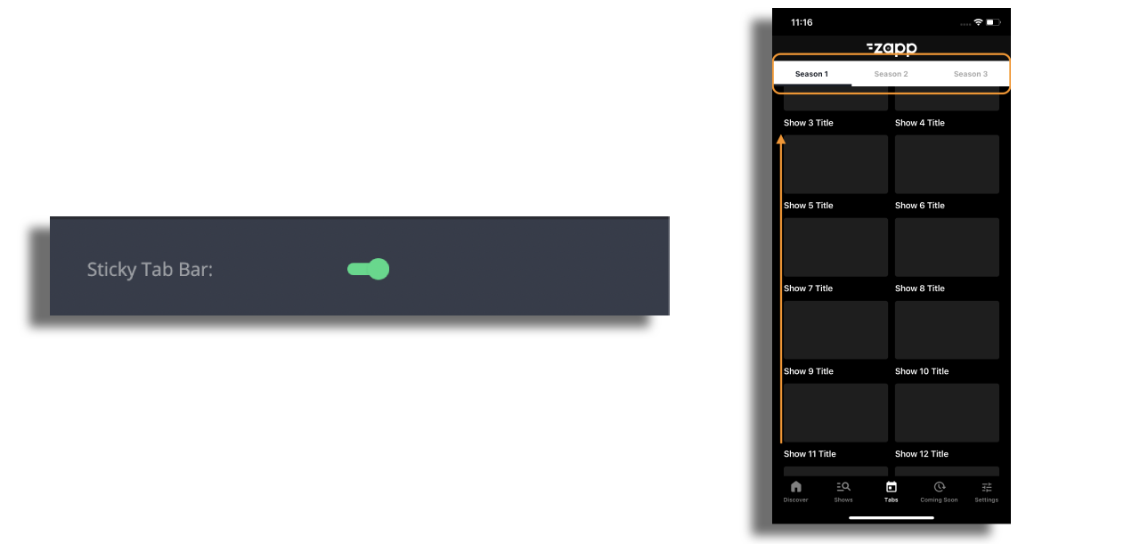
To ensure that the tabs remain attached to the navigation bar while scrolling the content upwards, activate the Sticky Tab Bar option.
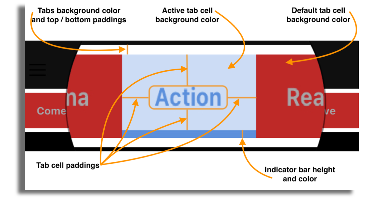
Tab design - Tabs and its' contents can be styled according to your needs:
Text label- text transformation, font family, size, color and spacing.Tab Bar- background color and padding.Tab cell- background color default and active, paddings, indicator bar height and color (indicator is the underline).
Container above the tabs on tablet - Within the section displayed below, you have the ability to customize certain properties for the components located above the tabs, such as padding and background color. Moreover, you can activate specific theme values for tablets if you are utilizing the same layout for both mobile and tablet devices.
tvOS, Android TV, Samsung TV, LG TV.
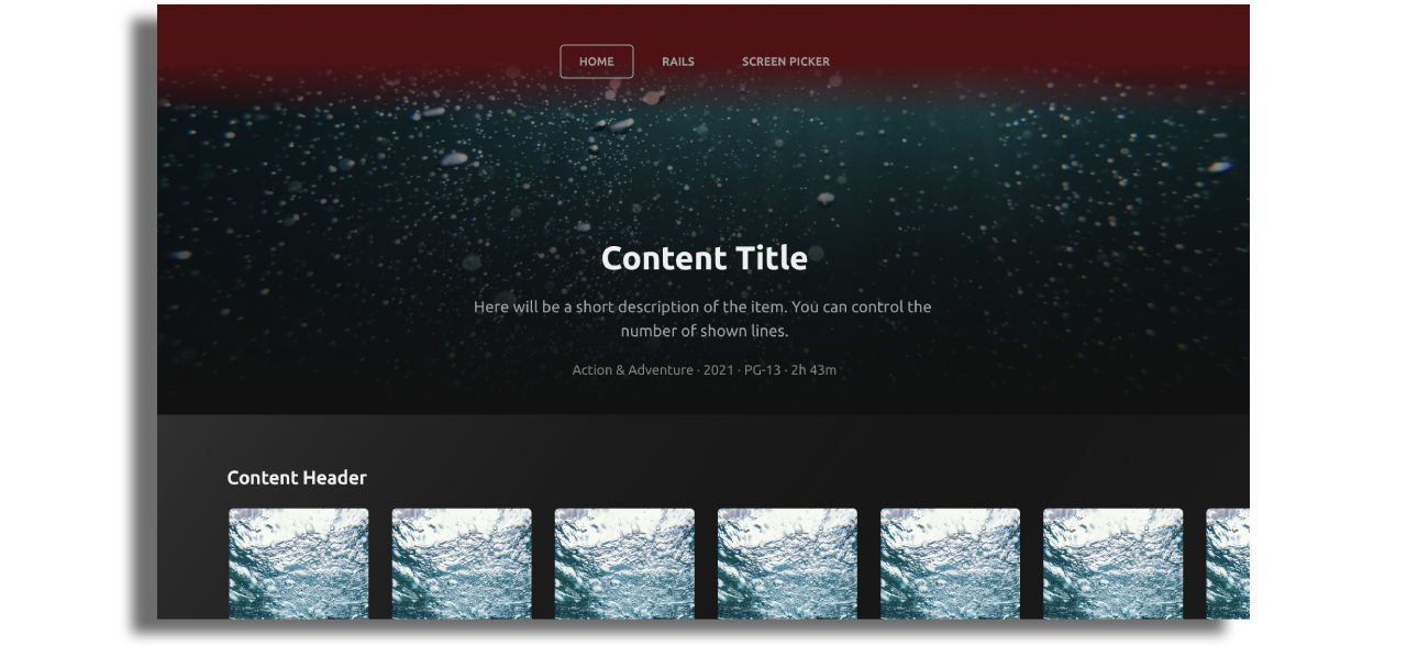
Tv Top Menu

The Top Menu must be used in an app and and can contain the following components:
- A single logo.
- Screen Navigation Buttons.
- A single optional action button e.g. for a settings page.
Please keep in mind:
- Only 1 TV Top Menu can be used in an app.
- Only 8 items max can be added to the top menu.
- Very large font sizes and long strings will result in the menu being truncated. Keep menu titles short and font sizes reasonable.
Style the Top Menu
Top menu styles can be adjusted in different ways: Background image, Color or Gradient.
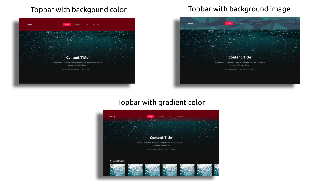
Color or Background image
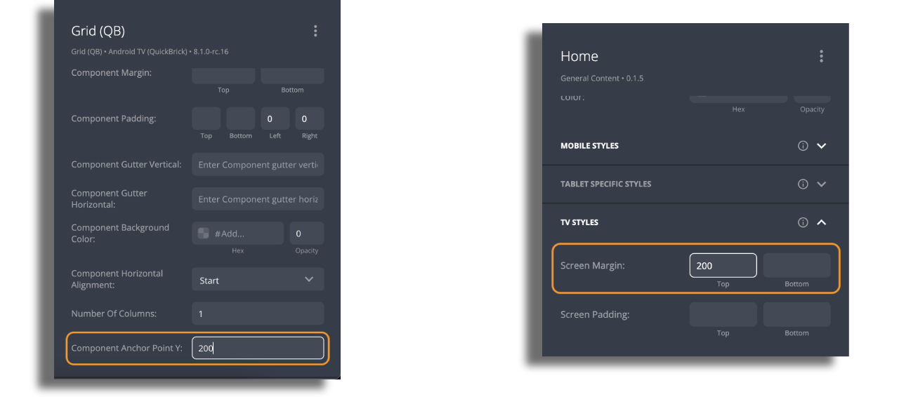
If you intend to use an image or a color as a background for the topbar, ensure that you set both the screen top margin and component anchor point to a value of 200, which is the default height of the topbar. This will ensure that the image appears below the topbar. However, if your desired image has a different height, you should adjust the screen and component settings accordingly to maintain proper alignment.
Gradient Color
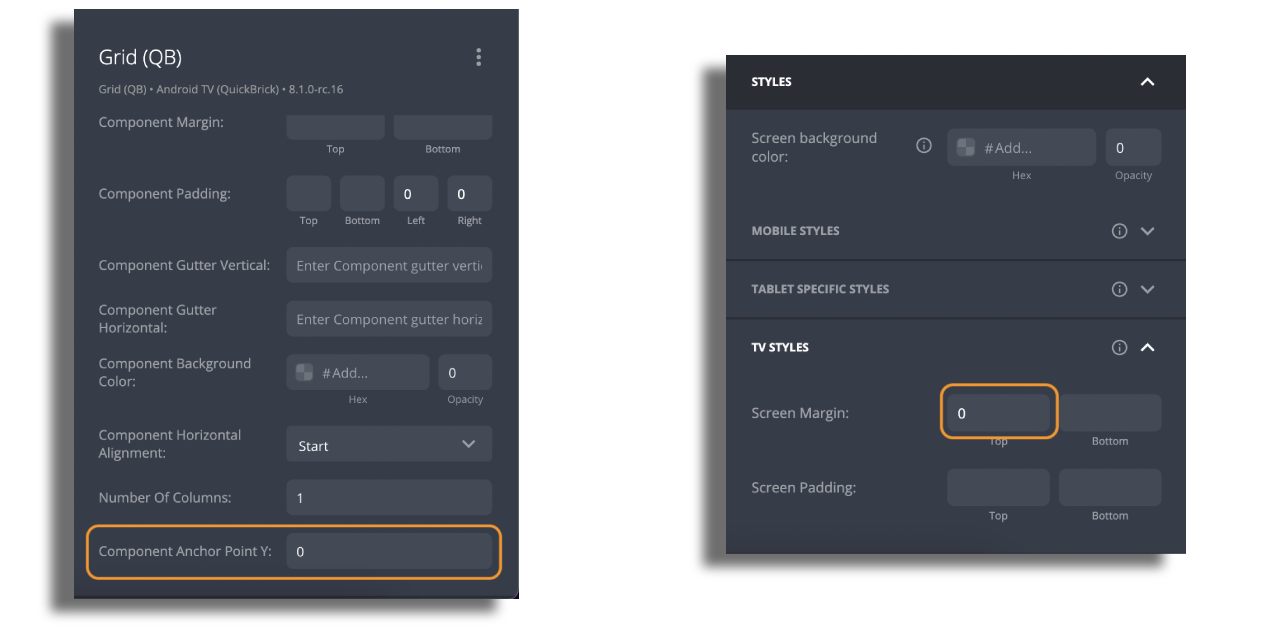
If you are working with gradient color, you can utilize the same steps as previously mentioned. However, there is an additional option to mask components with large images behind the topbar. To achieve this effect, set both the screen top margin and component anchor point to 0. Doing so will allow you to achieve the desired result.
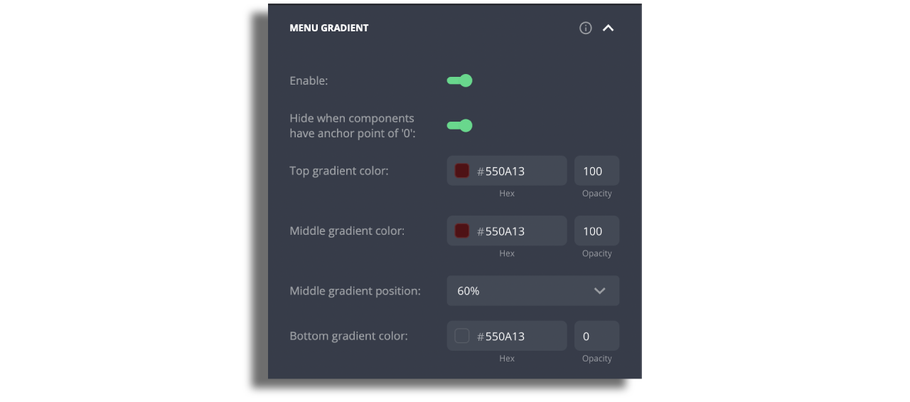
To avoid displaying gradient colors on components with large images while showing it on other components on the screen, you can activate the option to hide the gradient specifically for those components. For a smooth gradient transition, it is recommended to set the middle gradient position to 60% or higher. There's an option to also add a bottom gradient color.
Style The Menu item
Screen items for navigation buttons only support text at present.
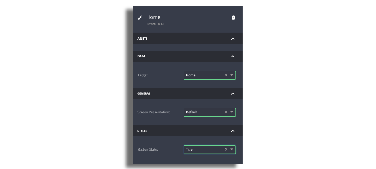
- Set
Data Targetto the screen for that Navigation Button and edit the title. (By default the menu will set the title to be the name of the screen selected though this can be over-ridden). - Set
Screen Presentationto default. - Set
Button Stateto Title.
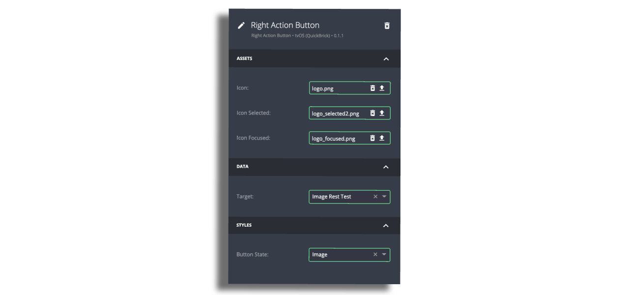
Tv Menu Action Button
- Either title or icons that also indicate focused and selected states can be chosen
- In case with icons, select Image for the
Button State. - Icons should be 40px by 40px in PNG format. Make sure that the assets are exported at a resolution of 3 times the standard pixel density (@3x)
- Set the
target screento launch when selecting this menu item.
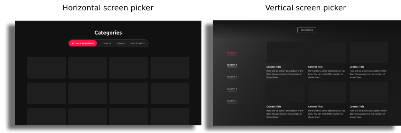
Screen picker
The Screen Picker acts as a vertical side menu or horizontal tabs that can be added to a screen to present e.g. subcategories of that screen. More than one screen picker can be used in an app and attached to their own specific main menu screen. Depending on whether you are using a vertical or horizontal screen picker the styling configuration will vary.
To have a screen picker, first add a new General Content screen. On this screen select New Component and add the Screen Picker component.
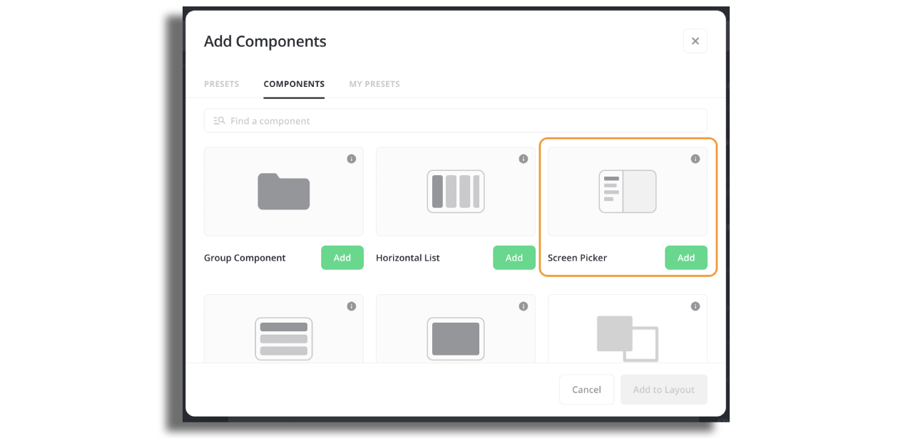
Once one screen picker is added to a screen no other component type may be added to this screen.
Attach a feed to the screen picker. A Screen Picker may be driven from a Data Source Feed or a Manual Feed to create the list of screens in the picker.
Content in a screen picker may optionally be connected to a further target screen that will launch a new screen presentation when a content item in the first screen picker is selected. This can be used to build nested screen picker structures for further sub-categories.
The screen picker can be styled with respect to:
- Position on the screen relative to the top and left of the screen (x and y co-ordinates):
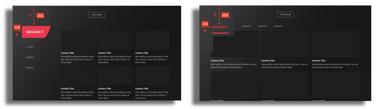
- The gap (gutter) between screen picker items:
- The width of the seen picker:
- The
font typefont weightfont sizeletter spacingline height, per TV platform. - The
maximum number of linesof text (wrapping) to present in all entries. - The
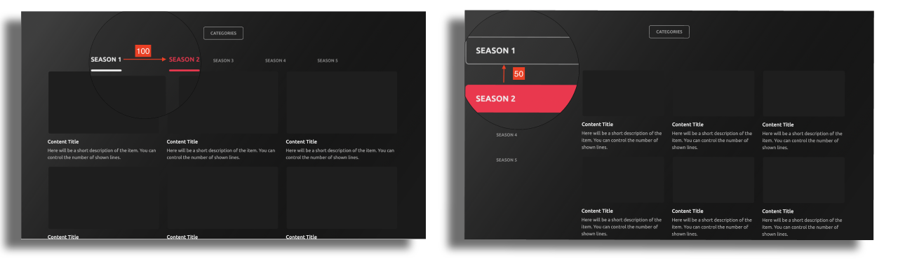
focus statemethod to use i.etext colorcell background colortext background colortext underlineortext borderand background rounding. - 4 focus states exist to differentiate between by styling the screen picker; selected, unselected, in focus and unselected, in focus and selected.
Horizontal Screen Picker
When choosing a horizontal screen picker the configuration options are broader. Below you can see the examples on additional configurations:
- Background styling
Horizontal screen picker can be styled with background color, background image, border. When using a background image, for optimal results it’s recommended to use an image with 76 pixels height and the width of the image should match the width of the screenpicker.
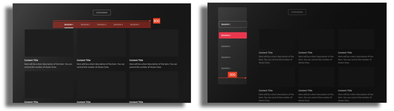
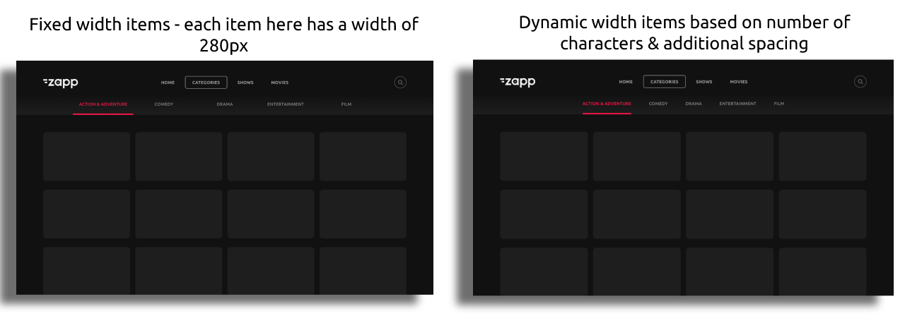
- Dynamic and fixed width menu type
Dynamic: This means that menu can grow dynamically as more/less items are added.
Fixed: a specific width can be assigned to the menu.
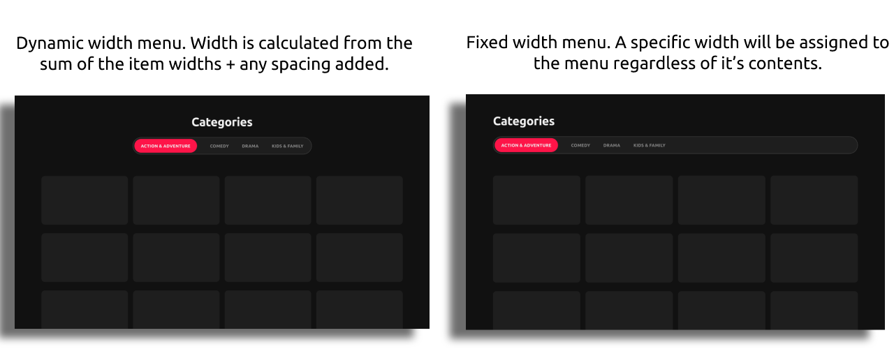
- Dynamic or Fixed item type - The width of the item can be either dynamic or fixed:
Dynamic: the item width is based on the size of the title and/or image (plus any paddings etc). This means that most items will be different widths within the menu.
Fixed: a specific width can be assigned to the item so that each item will be the same width regardless of it’s contents width.
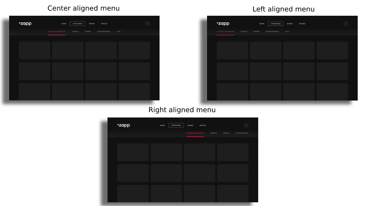
- Alignment
Left, center, or right alignment is possible when items do not exceed the screen width. Please note that the alignment is for the screen picker container:
- Various component styling - Assets can be added to each item in the horizontal screen picker items.
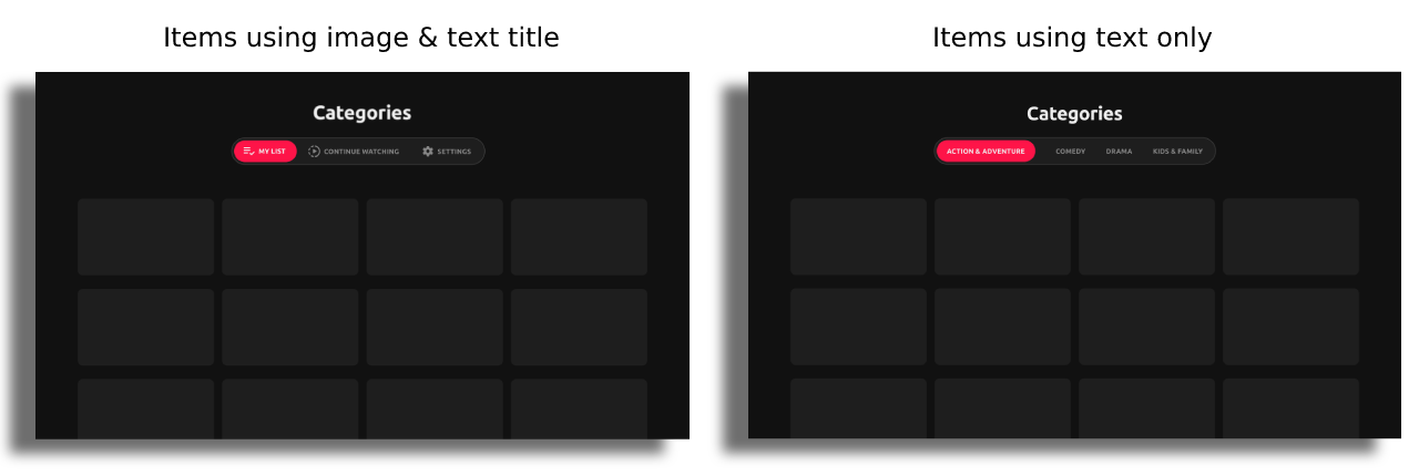
Make sure that the assets option is enabled and relevant data key values are added in the feed:
Roku
Coming soon