TV Apps Layouts
Introduction
The Zapp tools used and the process of building and releasing apps for TV platforms is the same as for mobile apps however, there are some platform specific considerations to take into account.
- A TV layout will be different to mobile.
- A single layout is possible across all supported TV devices.
- Datasources can be common to both mobile and TV apps, but images used in a TV layout will have different resolutions to mobile. Image keys for TV layouts should be included in data sources.
- TV app navigation is built around a remote control and driven by the 5-point Nav method of Up, Down, Left, Right, OK (Enter), Back (Return) and Exit.
- TV apps tend to have a much flatter layout structure, avoiding the deep nesting of screens that need to be navigated back out of.
- TV apps only contain live, linear or VOD content. Content types such as Articles and Web Links used in mobile apps cannot be used.
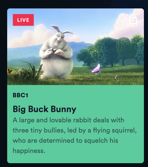
- TV apps can only have a single cell in focus at any time. It is not possible to have focusable action buttons within a cell. However, it is possible to create the appearance of buttons in an app using the TV power cell, they just happen to be individual cells themselves.
TV Layout Creation
Start with creating new layout and selecting Tv target.

Screen types
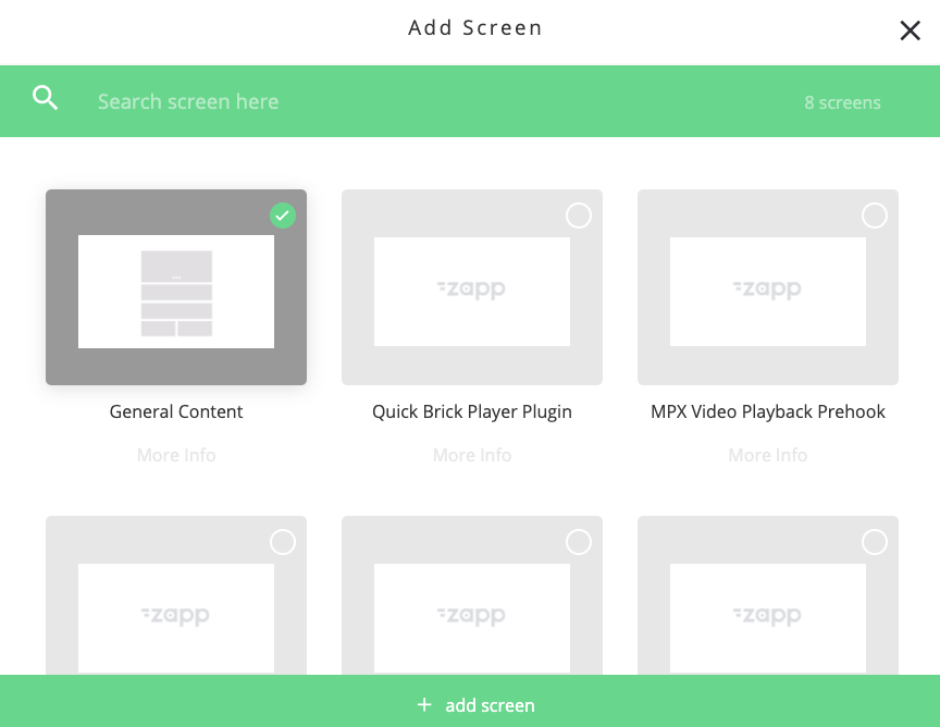
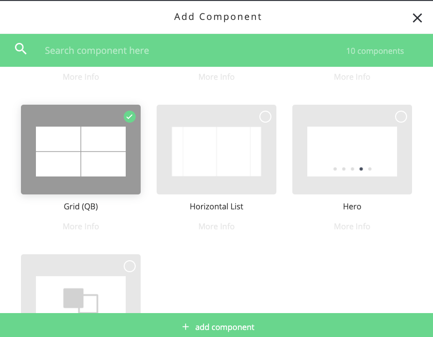
TV apps currently have one screen type - the General Component Screen. In Zapp Studio select Add Screen and then select General Content for each screen that you need in the app.
Component Types
The following component types can be added to the General Content Screen
- Horizontal List
- Grid
- Group
- Group Info
- Screen Picker
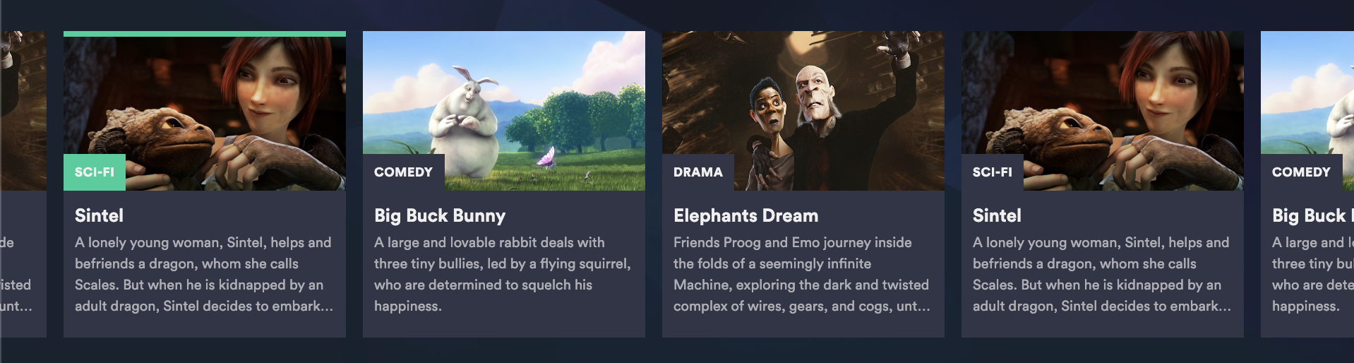
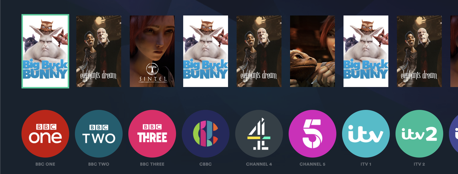
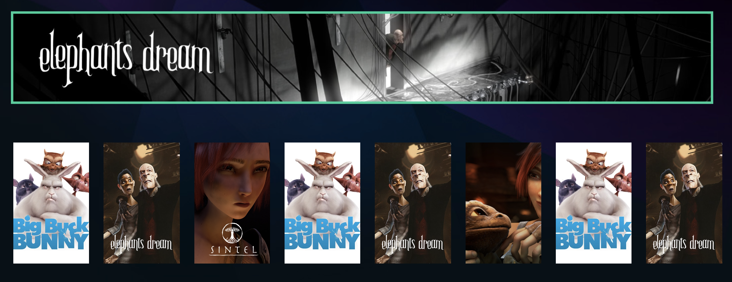
Horizontal List
The Horizontal List distributes content across a linear horizontal, scrollable and focusable rail.
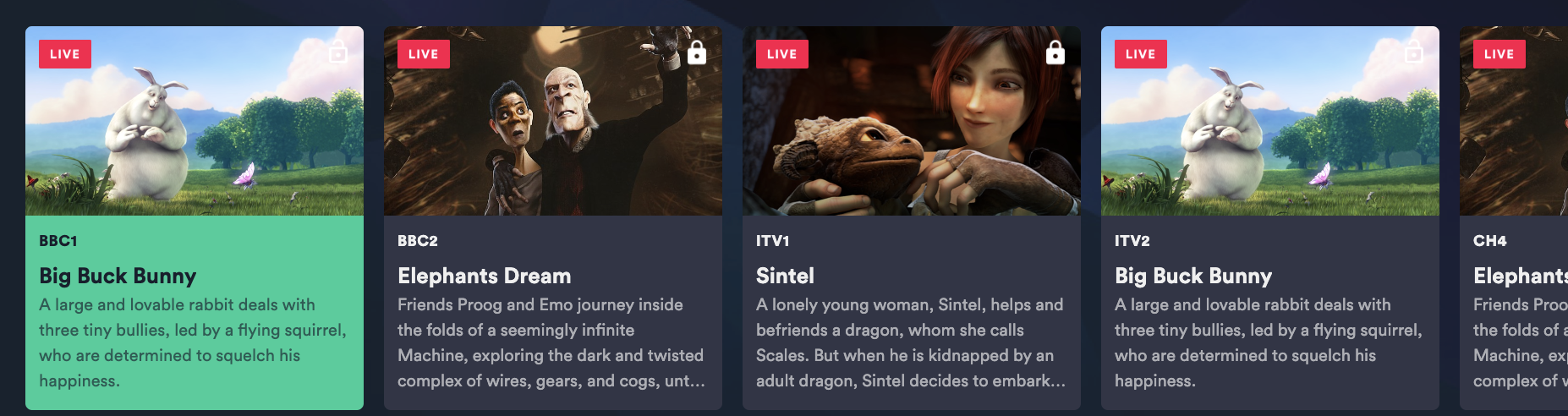
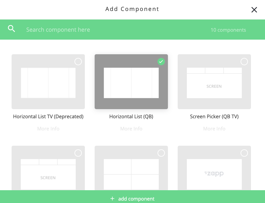
Click Add Component in a general content screen and select the Horizontal List (Quick Brick) component.
The Horizontal List needs to be attached to
- A data feed to populate its content
- A power cell for its specific styling
Each Horizontal list in a screen is configured in Zapp Studio as follows
- The
Item Limitwithin the component. Set to between 1 (e.g .for a single banner type cell) or leave unset to be unrestricted and display all items in a data feed. Cell Selectableyes / no: If set to NO then the component is focusable but no items can be selected. This could be used in future programs in an EPG for instance, where there is no action associated with selecting a future program.Clear Cache On Reloadalways checks for updates to the data source feed when the component reloads.Enable Data RefreshIf this is set to ON then the rail will automatically refresh its content at the time interval set (in seconds). Use this in live linear and event based content data feeds to indicate via a badge that an item has changed state e.g. from ‘coming soon’ to ‘on now’- Attach the component to its
data source - Select an optional
target screenthat will launch when an item in the component is selected. e.g. to go to a further show or episode screen Component Anchor Pointdefines the Y position that any individual component will scroll and anchor to as the screen components are navigated. Typically each component in a screen has the same anchor value but they could be different.Component Margin Top and Bottomdefines the gap at the top and bottom of the screen to components. (Default from Theme Plugin is 60px to avoid overscan cropping of content on TV screens)Component Padding Left and Rightsets an internal gap within the component at its left and right ends. Use this to set the gap to the screen edges for the first and last items in the list (Default from Theme Plugin is 90px to avoid overscan cropping of content on TV screens)Component Padding Top and Bottomsets blank padding space inside each component at its top and bottom.Component Gutter Horizontalsets the gap between cells in the Horizontal ListComponent Background Colorcan be used to define a color behind all cells on the component.Cell Widthin pixels defines the width of all cells in the component. The height of a the cell is then calculated automatically from the width, aspect ratio of the image in a cell, the amount of text displayed and any included line height and padding values.Cell Styles- Attach a power cell style to your componentsShow Header- leave set to off, do not use (see group components for adding a header to a component)
Examples of Horizontal Lists Styled Using Power Cell 1 TV
Grid Component
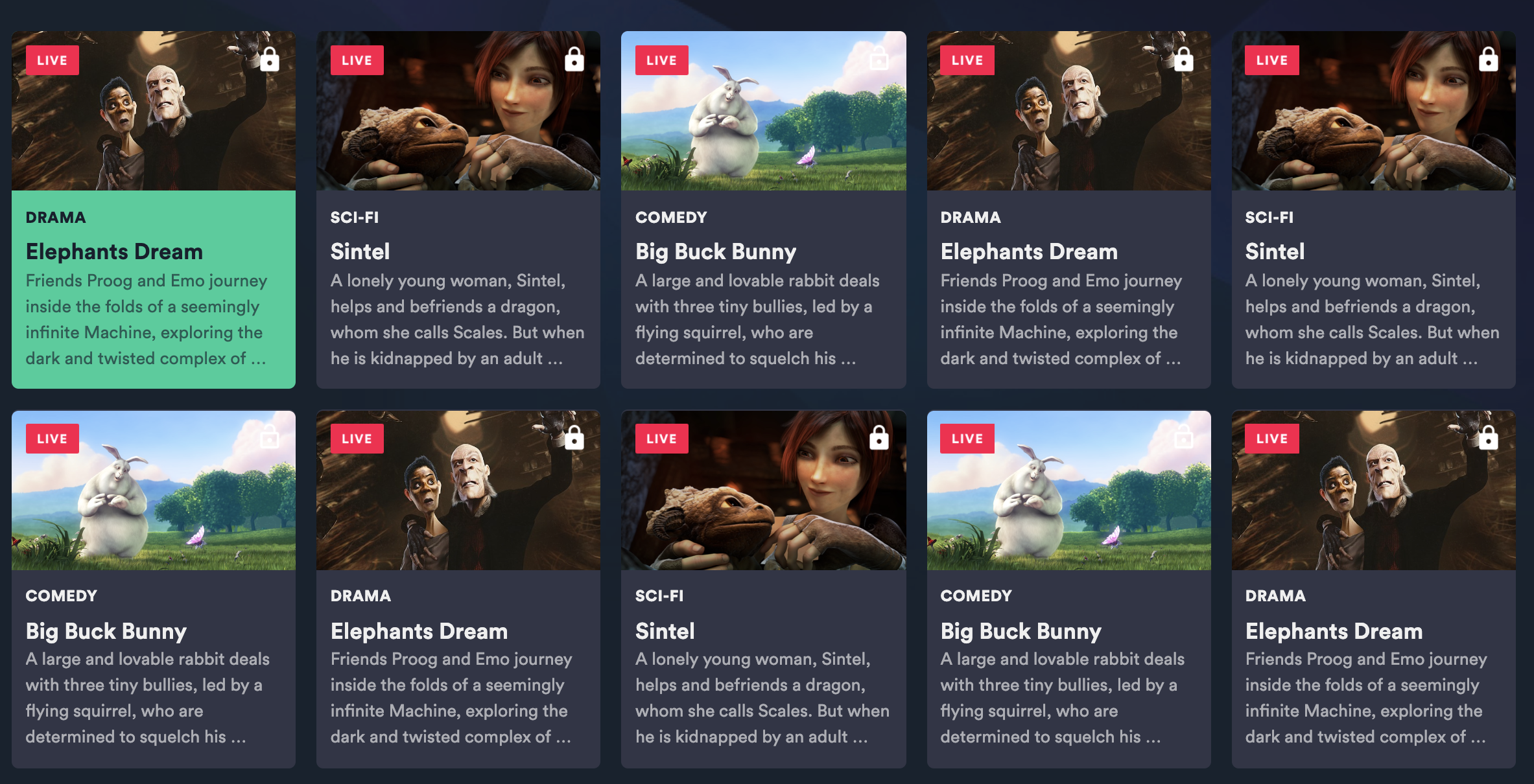
A Grid Component distributes content in a scrollable and focusable x-y grid presentation. Click Add Component in a general content screen and select the Grid (Quick Brick) component
Many of the Grid configuration parameters are the same as for Horizontal List. Additional Grid specific configuration items are;
Component Gutter Verticalthe gap between cell rows in the gridNumber of columnsset this to how many columns you require in a grid and the grid will automatically scale to fit the screen with that number of columns.
5 Column Grid Example
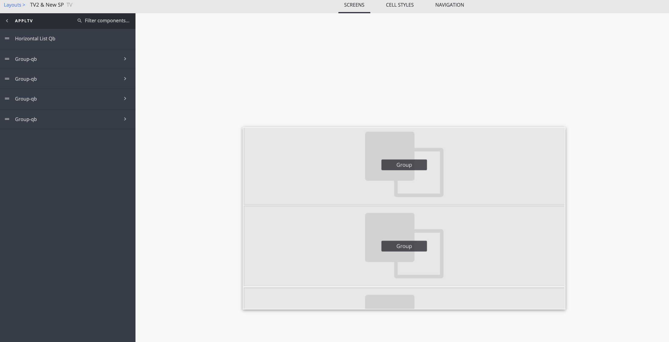
Group Component
Groups are used to
- Automatically distribute content in a single feed across a repeated pattern of components
- Include a Component Title, also known as Group Info or Component Header.
Any number of Grids and Horizontal Lists can be contained within a single Group Component.
Any number of groups can be put into a screen.
Data feeds are added at group level, not to the individual components within them. The feed is then distributed across the group.
To add a group to a screen select Add Component and select the Group Component (Quick Brick)
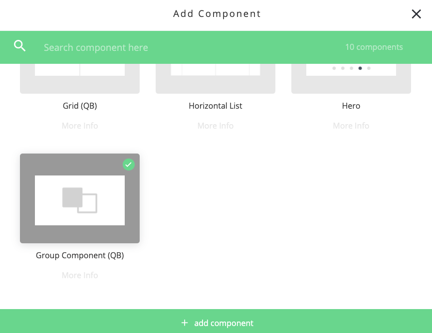
Then select the Group Component itself in your screen before adding individual Horizontal Lists and / or Grids with in it.
When in a group all components must have a fixed number of items defined in their Item Limit setting otherwise the group will not display correctly and the content will just fill the first unlimited component.
A Group can be configured to
No RepeatContent will distribute across the components in a group until it runs out of components to populateRepeat All ComponentsAll components in the group will repeat until there is no content left in the feedRepeat Last N ComponentsDefine which components you want to repeat. Useful for not repeating the header before each repeated pattern, or repeating just the horizontal rails under a large show banner.
Adding Headers (Titles) to Groups
To display a title (header) with a Horizontal List or Grid component create a group and add the Group Info Quick Brick component as the first component in the Group.
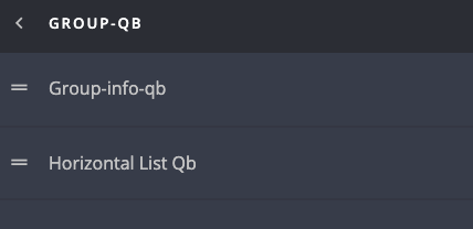
Use the Group Info Component styling parameters to control margins and paddings and hence the header position on the screen.
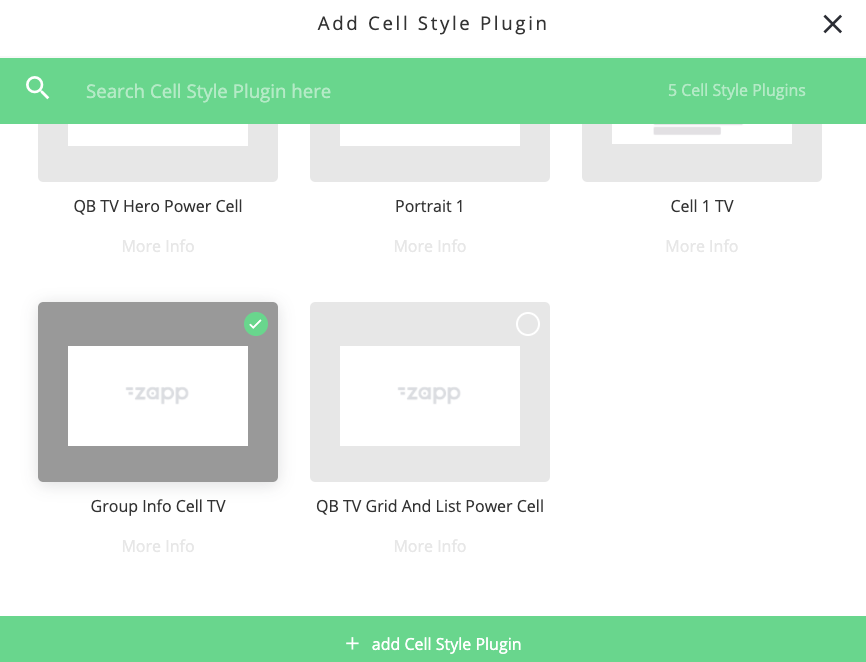
Attach the Group Info Component to a specific instance of the Group Info Cell TV power cell and style the cell accordingly.
The information displayed in a header such as title is taken from the feed. Use the data-key field in the Group Info Cell to determine what data is displayed.
Any number of Group Info Components can be added to a group e.g. to display a title, then a summary.
Power Cells for TV
TV apps currently support 2 power cell types
Cell 1 TVGroup Info Cell
Cell 1 TV
Individual instances of Cell 1 TV are added to each H List and Grid Component per style required.
Cell 1 is highly flexible and can be used to create cells that have
Image only
Text only
Image & Text with the text displayed below the image or overlaying the image (use negative margins on text fields to push up and overlay the image)
- Any size (using
pixel widthparameter for H List andnumber of columnsparameter for Grid) - Any aspect ratio - select
otherin the power cell aspect ratio field and type in the desired aspect ratio in the format 16x9, 1x1, 2x3 etc. - Add
roundingto images and cells

- Define focus states. Choose from
Text colorText background colorImage or cell borderImage or cell top or bottom highlightlineCell background color


Add positionable badges per content type or static badges. These can be used to show that an item has changed its state from ‘coming soon’ to ‘on now’, or that the item is free or needs ot be paid for. Note that TV apps do not support content of type = ‘article’ or ‘link’ compared to mobile apps.
Add a positionable runtime label sourcing its data from the duration data in a feed
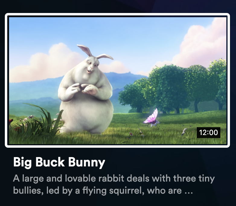
3 style-able text labels that can present title, summary or connect to any desired metadata key in the component’s feed. Per TV platform Font Type Font Size Font Spacing Line Height Font Color No of Lines
- Do not use the
Action Button Fieldin a TV app. This is used for favourites and share in mobile apps and is not supported on TV apps.
Group Info
Use this within a group component with a grid or horizontal list to display headers (titles)
In TV apps Group Cell Info
- Can only contain text
- Cannot have action buttons or badges
- Are not focusable or selectable (unlike mobile apps which can use them to link to ‘more’ content directly from the header).
- Text can be styled per TV platform for
font typesizeweightcolorspacingetc.