Web Navigation
Applicaster supports a range of navigation elements allowing to connect to screens or actions. On the Web, Responsive Navigation Bar and Nested Footer Are Supported.
Websites are accessed on a variety of devices, from desktops to smartphones; therefore, the navigation must be responsive. To achieve this, we use breakpoints.
Breakpoints are a fundamental concept in responsive web design, ensuring that a website’s layout adapts effectively to different screen sizes and devices.
Why Use Breakpoints
- Responsive Design: To make the Website adaptable to various screen sizes and orientations.
- User Experience: To optimize the appearance and usability on all devices.
- Performance: To load and display the necessary elements based on the device, ensuring efficient resource use.
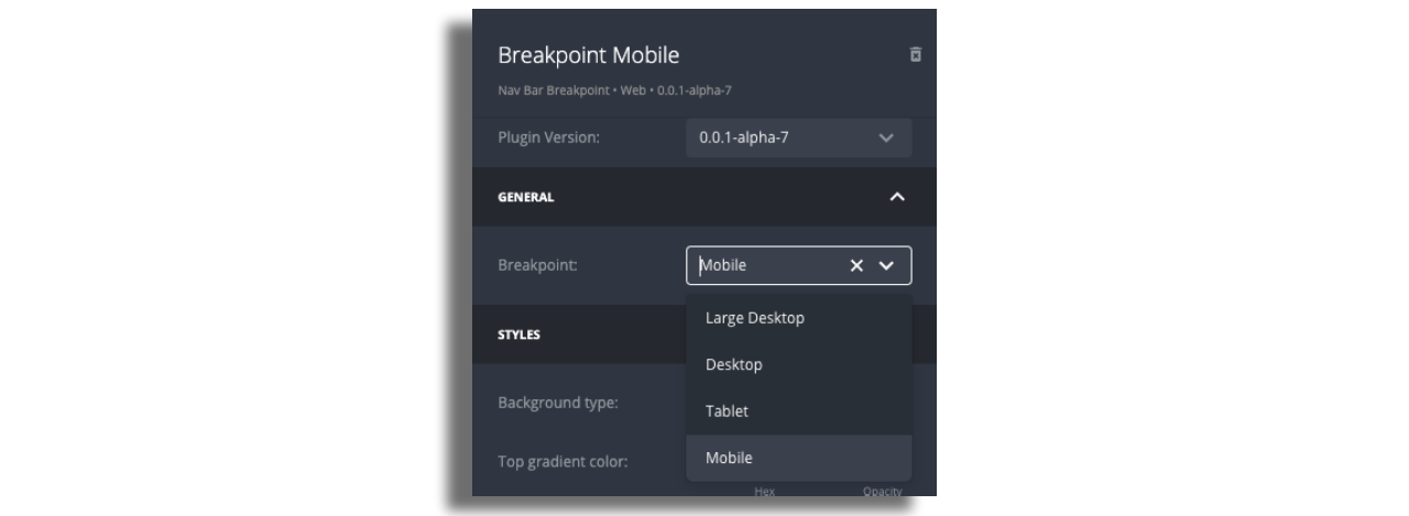
There are four breakpoints in the Studio:
- Mobile: 0-640px
- Tablet: 641-1024px
- Desktop: 1025-1344px
- Large Desktop: 1345 and above
Responsive Navbar Structure
The website uses one Responsive Navigation Bar. Inside the Navigation Bar, there are Breakpoints; one for each device.
Each breakpoint consists of Containers that shape the navigation structure.
Containers are designated areas within the responsive navbar where components such as buttons, drawers, and menu lists can be added. These containers can be positioned on the left, center, or right side of the navbar. Each breakpoint allows for different container settings, enabling a more user-friendly and adaptable layout across various screen sizes.
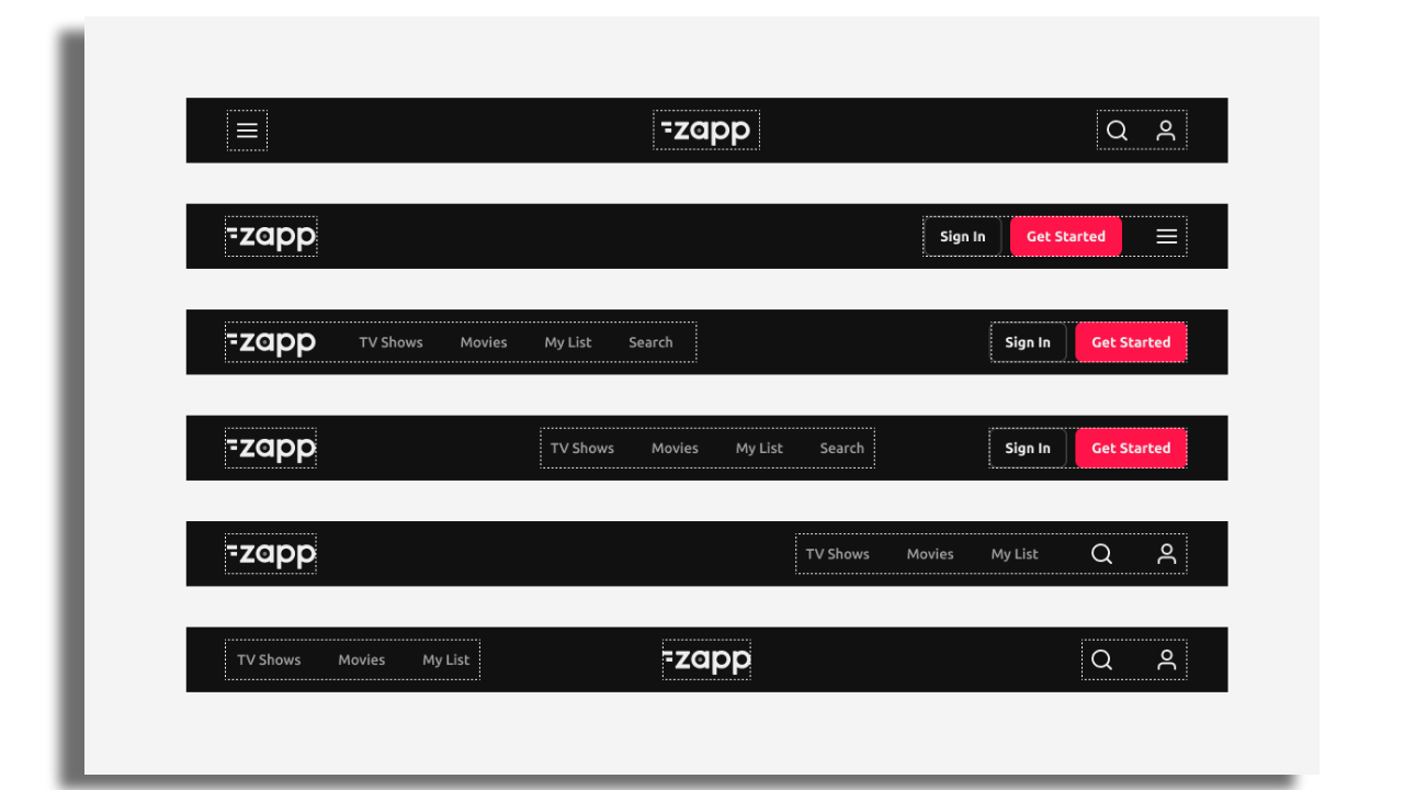
There are three containers:
- Left Container
- Center Container
- Right Container
Each container can include Items. An item refers to any individual element or component; it can include interactive elements like buttons, drawers, and menu lists, and are designed to perform specific functions or provide information to users.
Items that are available:
-
Menu List: A grouped list of navigation items that are styled consistently.
-
Button: A clickable element, either an asset or text, independently styled to direct users to pages.
-
Account Button: Displays states for logged-in or logged-out users.
-
Drawer: Includes a button to expand and reveal additional navigation options.
Configuration
Add a Responsive Navbar to your layout.

Add Breakpoints to the Responsive Navbar.
It is mandatory to create at least the Mobile Breakpoint. If no other breakpoints are defined, the Mobile Breakpoint will automatically be applied to all other breakpoints.

Assign each breakpoint accordingly.
Add containers to each breakpoint and then add items.

Navbar styling – supports solid color, gradient, border, shadow, and background blur; Scroll transition enables these properties to dynamically adjust as the user scrolls, creating a more responsive and polished visual experience.
Nested Footer
The website footer is the section at the bottom of a web page. It is automatically responsive, adjusting to different devices.
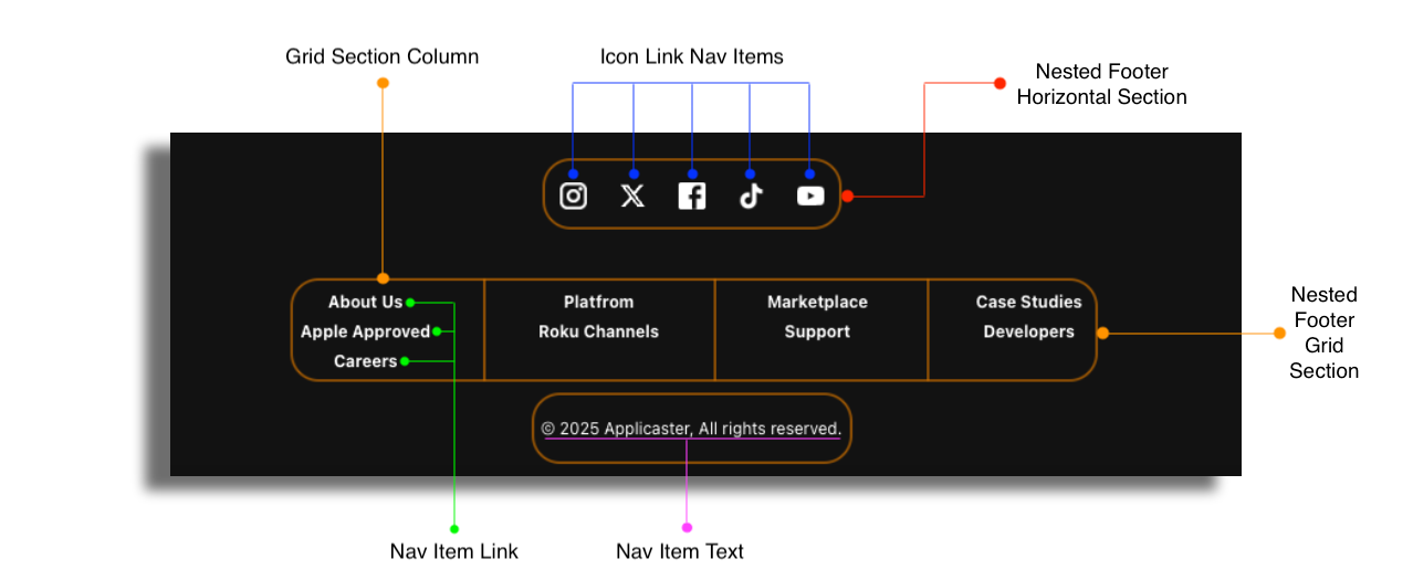
There are six types of items that can be added to the footer:
Nested Footer Horizontal Section: Divides the footer into groups of items displayed in a row format.
Nested Footer Grid Section: Divides the footer into groups of items displayed in a grid layout.
Grid Section Column: Organizes the grid section into individual columns.
Icon Link Item: Displays icons (e.g., social media icons) that link to external websites.
Nav Item Link: A clickable text link.
Nav Item Text: Unclickable text, typically for informational purposes.
Nav Item Cookie Settings: A link or section related to cookie preferences or settings.
Tabs
Tabs allow users to switch between multiple content sections within the same screen. On Web, tabs can be styled, positioned, and behave differently across four breakpoints.
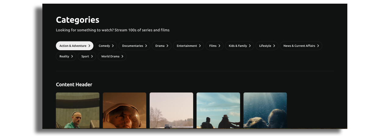
There are three Tabs presets available. Presets provide a ready-made, fully tested structure that works out of the box across all breakpoints and help prevent configuration issues.
The available presets are:
- By Season
- A–Z
- Categories
Once a preset is added, it can be safely customized by editing:
- The data source and type mapping (to control which screen opens in each tab).
- The Button Cell (for all visual styling).
- The screen-level layout settings (for structure and behavior).
If none of the presets fully match the desired use case, the guide below explains how to customize and extend the Tabs configuration.
Configuration
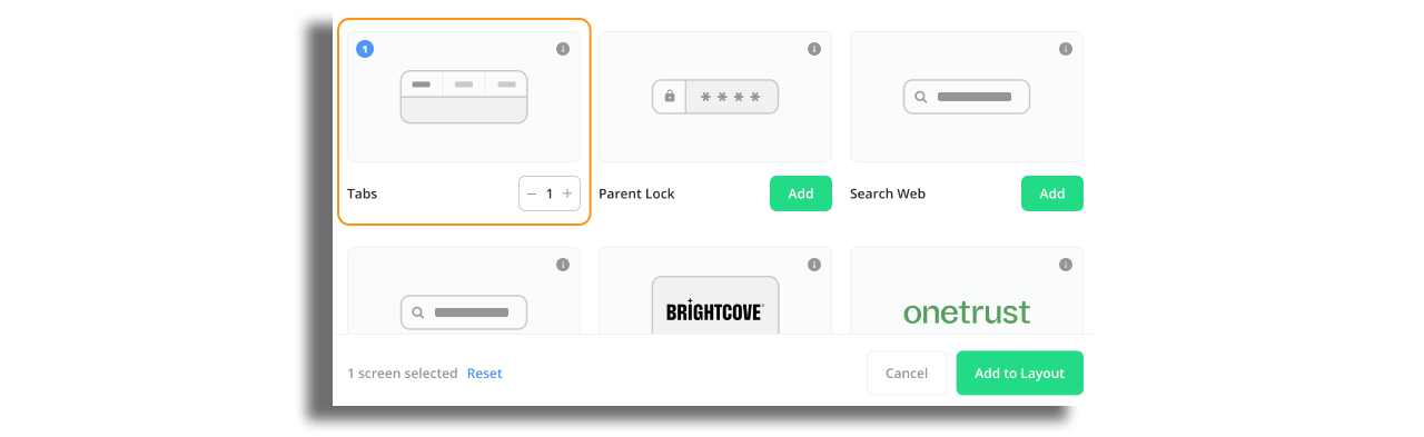
Use Tabs screen.
Assign data source on tabs screen that will include the type value for the screen inside the tab. In the example below the type value is season_generic. This value opens the screen that is set in type mapping. For more info on how type mapping works, check out this article.
  "entry": [
    {
      "extensions": {

      },
      "id": "season-1",
      "title": "Season 1",
      "type": {
        "value": "season_generic"

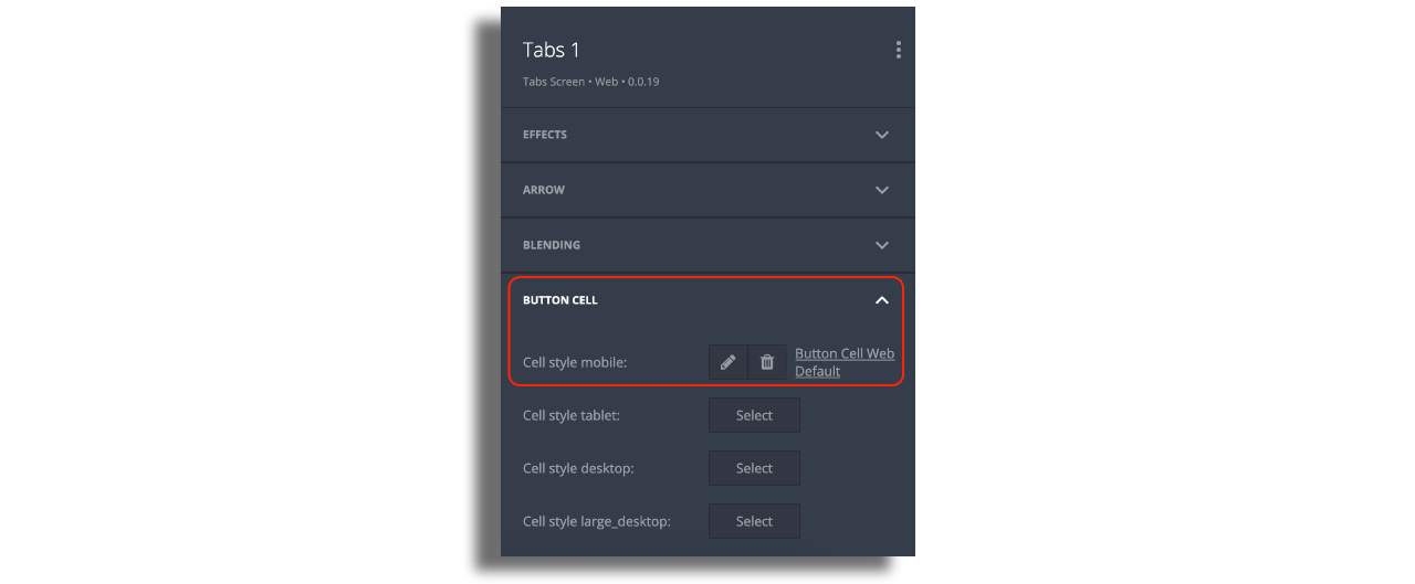
Button Cell (Tab Item Styling)
All visual styling for each tab item is controlled in the Button Cell. This includes the icon, title appearance, background colors, underline style, spacing, and borders. The Button Cell defines how each tab item looks, while the Tabs screen controls how they are arranged.
Layout Settings (Screen Level)
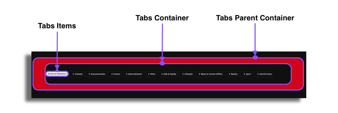
The screen-level configuration defines the structure of the tab bar.
- Tabs Parent Container manages spacing and positioning of the entire tabs section.
- Tabs Container controls styling for the bar itself and includes options such as max-width.
- Tab Items layout determines item width, overall alignment, and inner item alignment. Visual styling remains in the Button Cell.
Interactive Behaviors and Visual Effects
Web Tabs offer several behaviors that improve navigation and visibility, especially when many tabs are present.
You can enable:
- Sticky behavior to keep the tab bar visible while scrolling.
- Background blur or shadow to create separation from page content.
- Overflow handling, where tabs can scroll horizontally or stack when space is limited.
- Arrows for navigating through overflowed tabs, with full control over size, spacing, and assets.
- Blending, a fade effect at the edges of the tab bar to indicate additional tabs.
- Fractional, fixed, and dynamic widths. Depending on space and configuration, tabs may scroll, stack, or use arrows.
Each of these options can be configured separately for mobile, tablet, desktop, and large desktop layouts.
Recommendations
Use short tab labels and test each breakpoint to ensure good layout behavior. Keep visual styling in the Button Cell. Blur, sticky behavior, blending, and arrows can be combined for a polished navigation experience.