General Player Configuration
The following guide explains how to use and configure the Quick Brick Default Player plugin for mobile apps.
Player
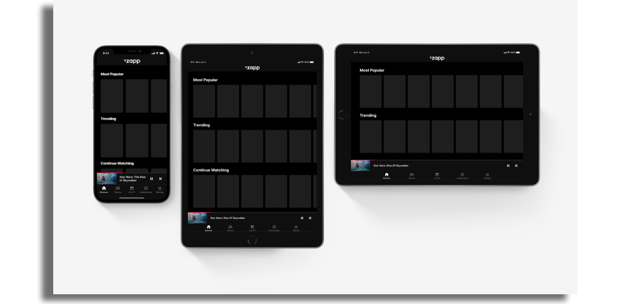
By default, the player has one state which appears as full screen in landscape mode on mobile & tablet. In order to use the other player modes, ‘Use video modal’ should be enabled within the plugin configuration. When this has been enabled the player will have 3 states:
- Full Player
- Inline Player
- Docked Player
Full Player
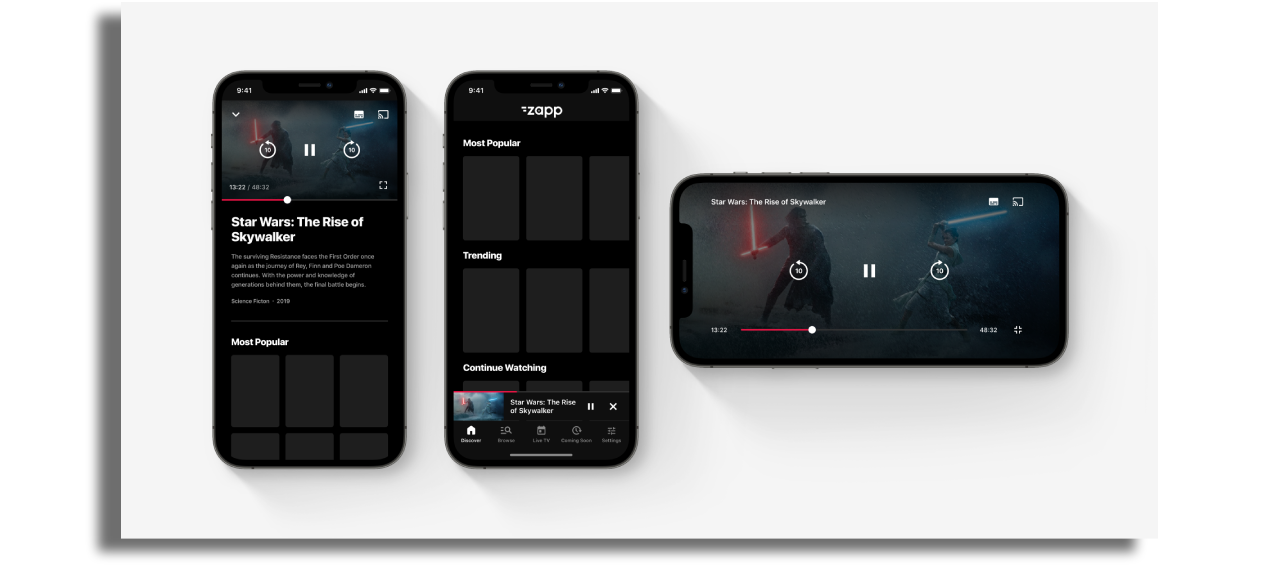
Full screen playback in landscape mode on mobile & tablet.
The full player will still play in landscape mode even if the tablet layout is set to portrait mode.
Inline Player
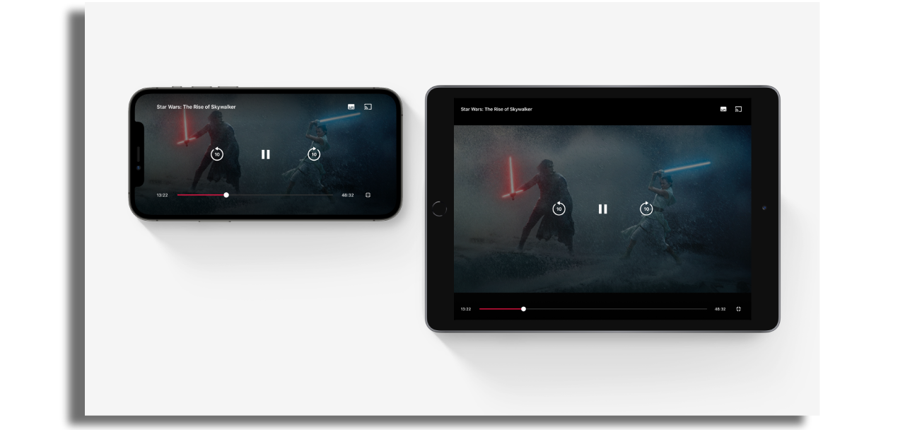
The player is presented at the top of the screen for mobile & tablet portrait. This allows for other information & content to be displayed underneath the video player. If the app is set to landscape mode on tablet then the inline player will be displayed on the left-hand side of the screen. Information & content is then displayed within a sidebar on the right-hand side of the screen.
Docked Player
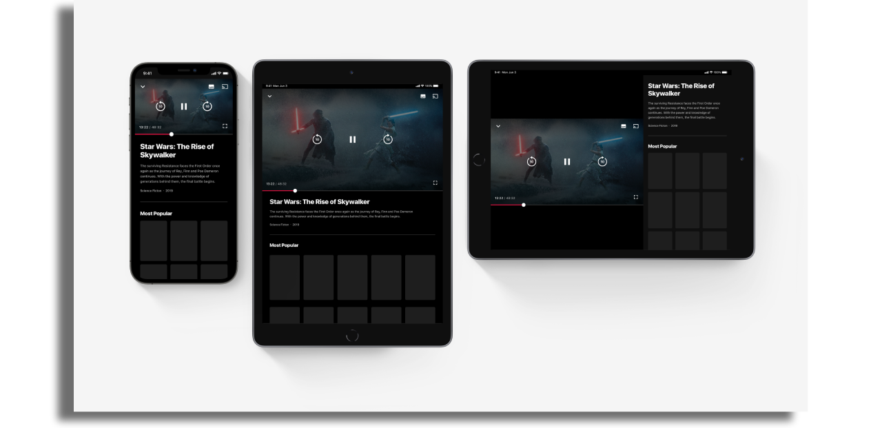
The player can be minimized during playback which allows the user to navigate across the app without having to stop playback.
Player Configuration
Player configuration has to be adjust on the player screen.
Seek duration: This is where the duration can be configured for the forward and rewind buttons. By default, this is set to 10 seconds.
The default assets for these buttons use ‘10’ in the design, be sure to update the assets to reflect the duration if this has been changed.
Player action buttons It is possible to add up to two action buttons to the player with the following identifiers that should be added to the player screen configuration separated by comma. The assets will be taken from the relevant plugins:
- Download button:
offline-content-button - Chromecast button:
quick-brick-chromecast-action - Share button:
native_share_action - Favorite button:
local_storage_favourites_action

Styles
Player Styles
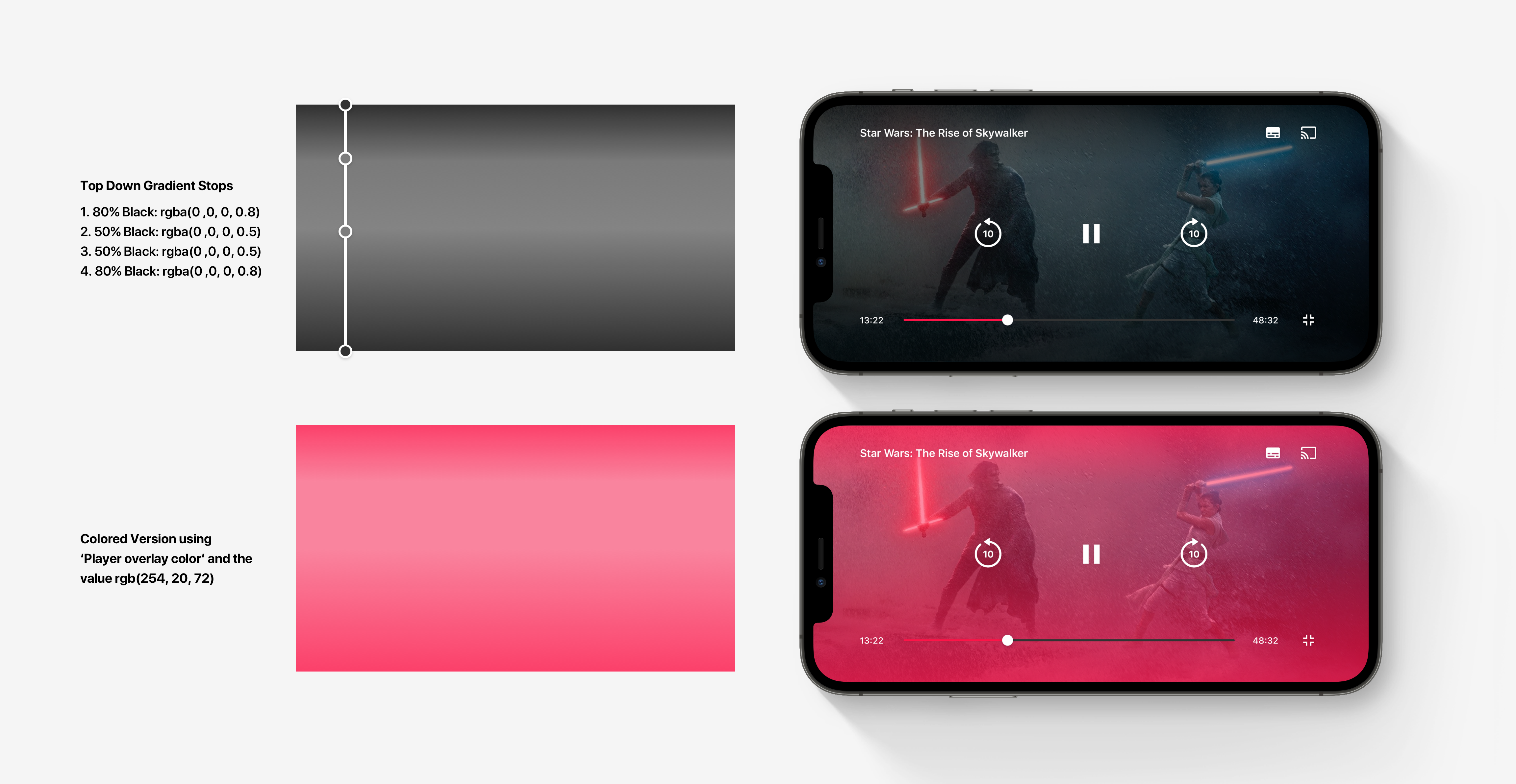
Player overlay color: This refers to the gradient that is shown between the video & the transport controls. The color of the gradient can be changed using the color picker.
The alpha channel is ignored here. This is used in both Full Player & Inline Player modes.
Modal Background Color: This refers to the background color of the whole screen when in inline mode. This is also used to color the background of the sidebar on the tablet in landscape orientation.
Minimized height (mobile & default): This refers to the height of the docked player at the bottom of the screen. The video element will scale to match the height of the docked player.
Docked player background color: The background color of the docked player can be configured here.
Inline Player Close Button Toggle: Select whether you want to include a close button in the inline player mode.
Full Player Close Button Toggle: Select whether you want to include a close button in the full player mode.
Tablet Landscape
Tablet landscape Player container background color: This controls the color that appears around the video element when using the inline mode in landscape orientation on the tablet.
Tablet landscape sidebar width: This defines how wide the sidebar should be when using the inline mode in landscape orientation on the tablet. This field can either take a set pixel value (375 for example) which will give a constant sized sidebar across different screen sizes. Alternatively, the field can also take percentage values (35% for example). This allows the sidebar to scale across different sized devices so that it occupies a consistent portion of the screen.
The background color of this element is coming from the Modal Background Color field.
Assets
Full Player & Inline Player
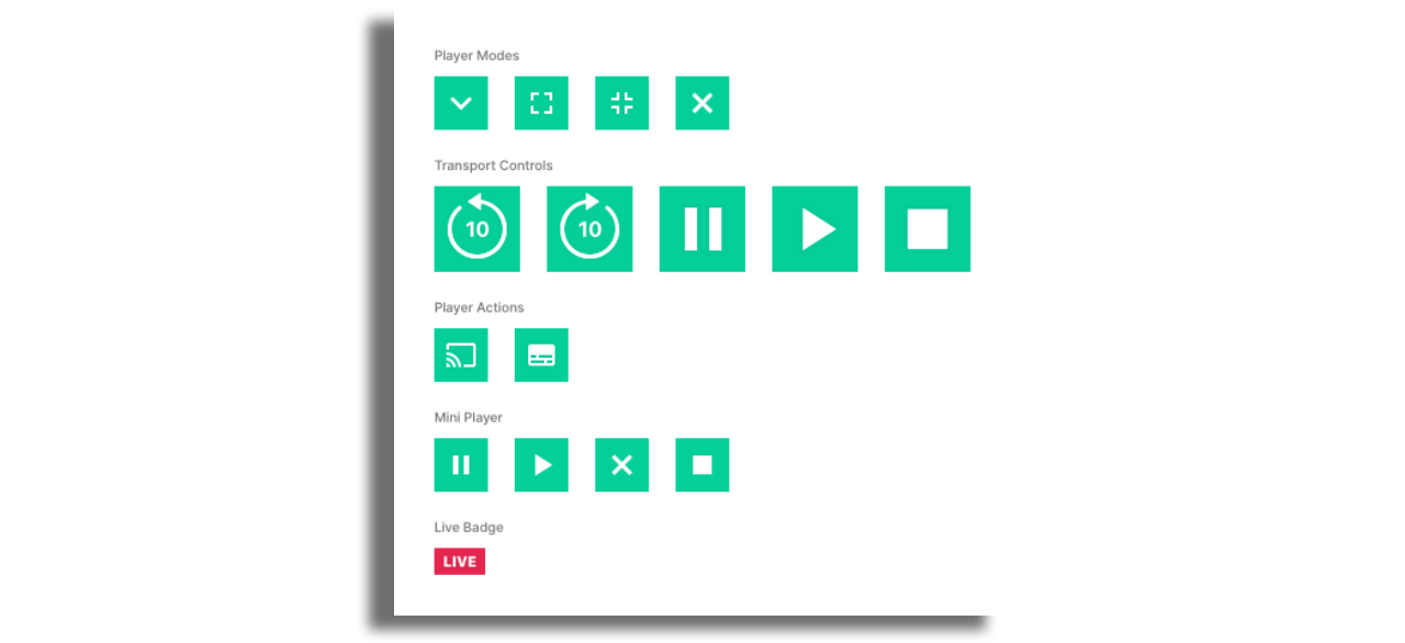
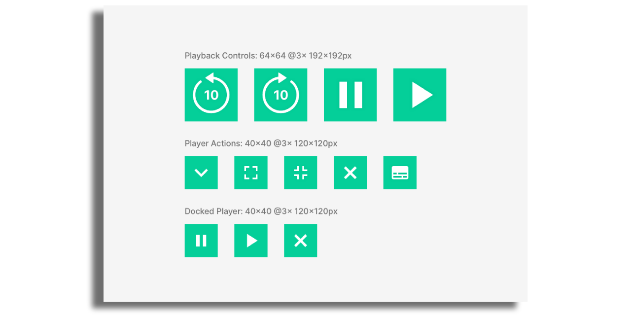
These assets are shared across full & inline modes on both mobile & tablet so that only one set of assets needs to be provided. Assets should be provided in the following sizes:
Playback controls
Play Button: 64x64 @3x 192x192pxPause Button: 64x64 @3x 192x192pxForward Button: 64x64 @3x 192x192pxRewind Button: 64x64 @3x 192x192px
Action badges
Down Badge: 40x40 @3x 120x120pxMaximize Badge: 40x40 @3x 120x120pxMinimize Badge: 40x40 @3x 120x120pxClose Badge: 40x40 @3x 120x120pxSubtitle Badge: 40x40 @3x 120x120px
The space around the icon within the asset. This is to allow a good tap area and should be considered when designing these buttons.
Docked Player
There are three assets that should be provided for the docked player & they should all be supplied at the same size:
Play Button: 40x40 @3x 120x120pxPause Button: 40x40 @3x 120x120pxClose Button: 40x40 @3x 120x120px
The space around the icon within the asset. This is to allow a good tap area and should be considered when designing these buttons.
Player Content Title
Inline & Full Player Configuration
The player content title configuration fields affect both the inline & full player modes. There are separate styles for the docked player. The fields include:
- Enable (On/Off)
- iOS & Android font, font size, line height & letter spacing
- Title color
- Title text transform
- Title margin bottom
Docked Player Configuration
The docked player title has separate configuration to the inline & full player modes. The fields include:
- Enable (On/Off)
- iOS & Android font, font size, line height & letter spacing
- Title color
- Title text transform
- Title margin bottom
- Number of lines (Title will span across 2x lines if set to 2 and if the docked subtitle is disabled)
Player Content Subtitle
Inline & Full Player Configuration
The player content subtitle configuration fields affect both the inline & full player modes. There are separate styles for the docked player. The fields include:
- Enable (On/Off)
- iOS & Android font, font size, line height & letter spacing
- Subtitle color
- Subtitle text transform
Docked Player Configuration
The docked player subtitle has separate configuration to the inline & full player modes. The fields include:
- Enable (On/Off)
- iOS & Android font, font size, line height & letter spacing
- Subtitle color
- Subtitle text transform
- Number of lines
Scrub Bar
The scrub bar configuration fields affect both the inline & full player modes. There are separate styles for the docked player.
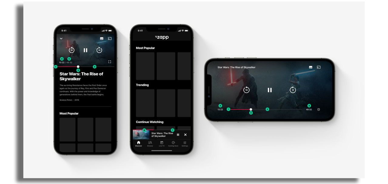
Inline & Full Player Configuration:
- Scrub bar progress color: This refers to the color of the progress of the video being played.
- Scrub bar color: This refers to the color of the total length of the scrub bar.
- Scrub bar handle color: The refers to the handle of the scrub bar which can be used to scrub forwards/backwards through playback.
- Scrub font: Various configuration fields that allow customization of the text that shows duration of video
- Scrub total duration font color (inline mode only): This allows the total duration label to be configured differently from the progress label. It will only affect the label in inline mode.
Docked Player Configuration:
- Docked scrub bar progress color: This refers to the color of the progress of the video being played.
- Docked scrub bar color: This refers to the color of the total length of the scrub bar.
Video Detail Component
The video detail component can be used to display video information underneath the player in mobile & tablet portrait mode or within the sidebar when using the tablet in landscape mode. This can be added to the Quick Brick Player Plugin once it has been added to the app. The video detail component is populated with data coming from the currently playing video and therefore no data source is required here.
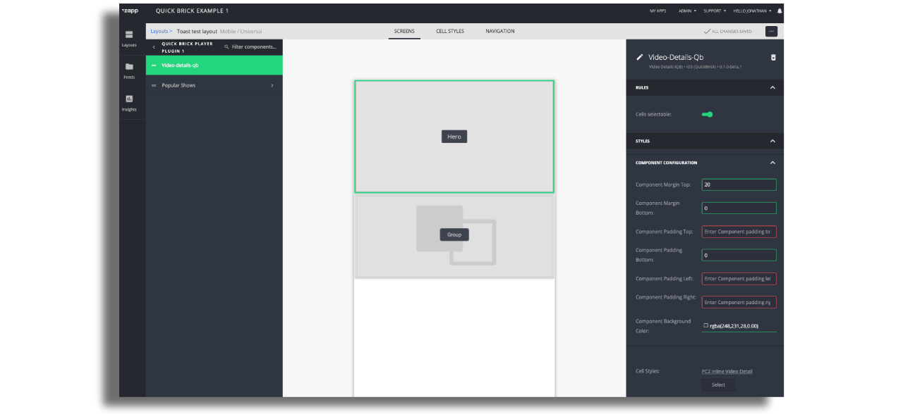
Just like all components, any cell style can be attached to the Video Detail Component. Power Cell 2 has been used in the following example to show just text from the video entry.

Similar to screens, other components can be added under the video detail component within the video player plugin. In this example, we have a grid of popular content which is coming from a static feed.
Using Pipes V2 we can populate these components with data from a dynamic feed. The content that will be shown will be based on the currently playing video. For example, you can show content related to the currently playing content with a feed like:
https://api.com/relatedContent?contentId={{ id }}
In this case, the id used to call this data source will be the one from the currently playing video. Content will then reload each time a new video is played.
Enhanced Video Experience
Player Lock
The player lock feature can be used to hide the UI controls & lock the screen when in full player mode. The feature can be enabled by tapping on the ‘player lock’ button on the player controls. The screen then becomes locked until the ‘unlock’ button is tapped twice: once to activate the unlock button and then again to unlock the player. When controls are locked, switching orientation to portrait by changing the device rotation physically will not change the appearance of the player. A walkthrough of the feature can be seen in the video below:
The feature can be found within the player screen and can be enabled via the toggle in the ‘Player Screen Lock’ section.

Assets & Configuration
There are a number of configuration fields for this feature - the illustration below should help in showing which configuration affects which elements in the UI.
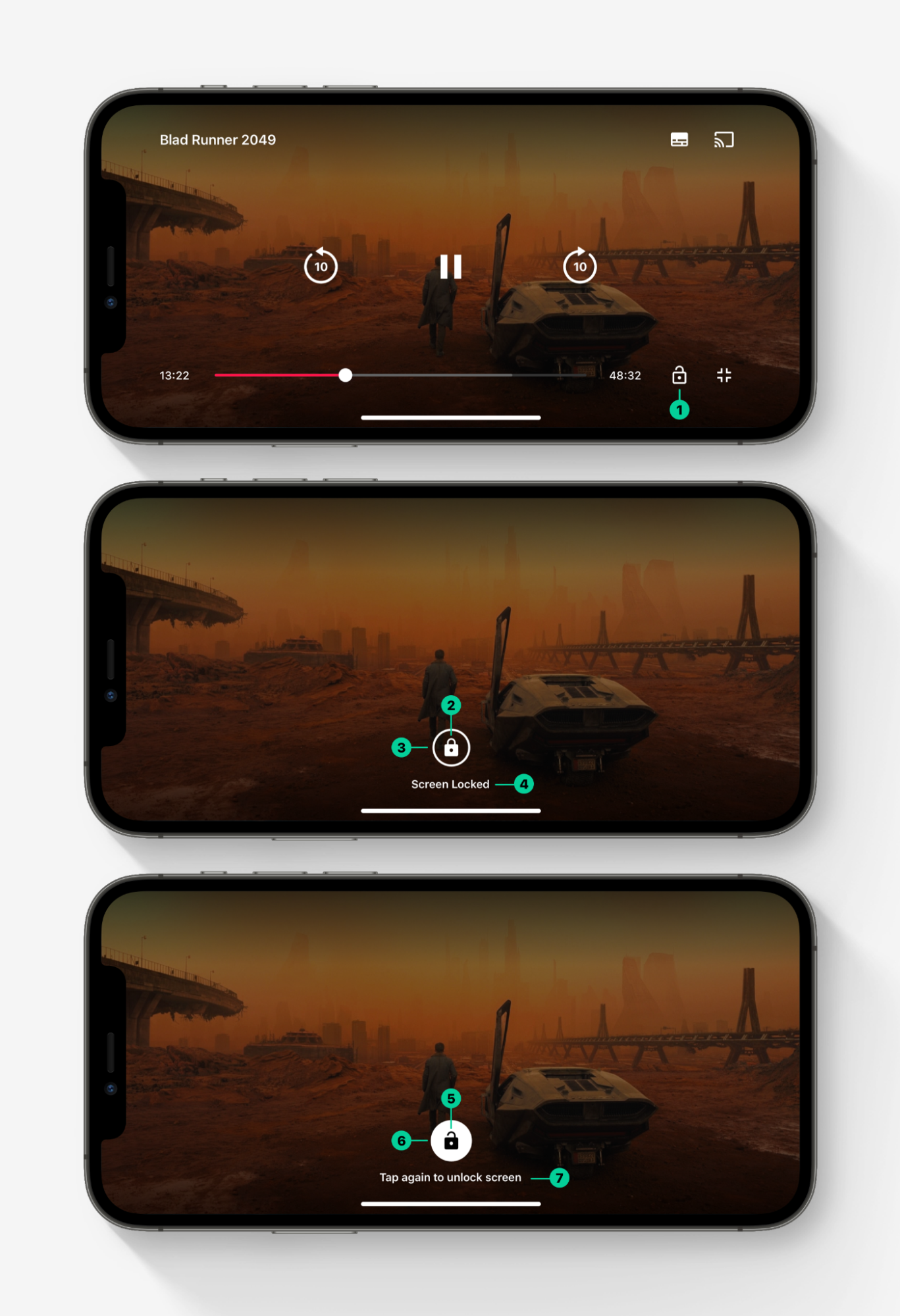
- Lock button on the player transport controls
- Locked Icon
- Locked Border
- Message 1 text label
- Unlock Icon
- Unlock Background
- Message 2 text label
Assets should be supplied 40x40 @3x 120x120px. There are 3x assets that are used here:
- Lock button on the player transport controls
- Locked Icon
- Unlock Icon
Dedicated Live controls
Live content does not offer the same functionalities available for VOD content regarding playback. Therefore the QuickBrick player allows you to use dedicated controls for Live content.
These controls will flag the content as being live, skip the progress bar and the skip buttons, and replace the play / pause buttons with play and stop buttons. Indeed, live content cannot be paused and resumed from that point. It can be stopped, and played again from the current live point. The dedicated live controls for the player will allow you to reflect this major difference between live and VOD content. The live controls will work in each of the three player states (fullscreen, inline, docked).
Some back ends will allow live content to be skipped / forwarded, and scrubbed with a progress bar. This is not a supported feature of the Quick Brick player, and it won't work as expected if you simply stick to using the standard VOD controls for live controls. We strongly encourage you to flag live content as such, and use the dedicated live controls for a better live content experience
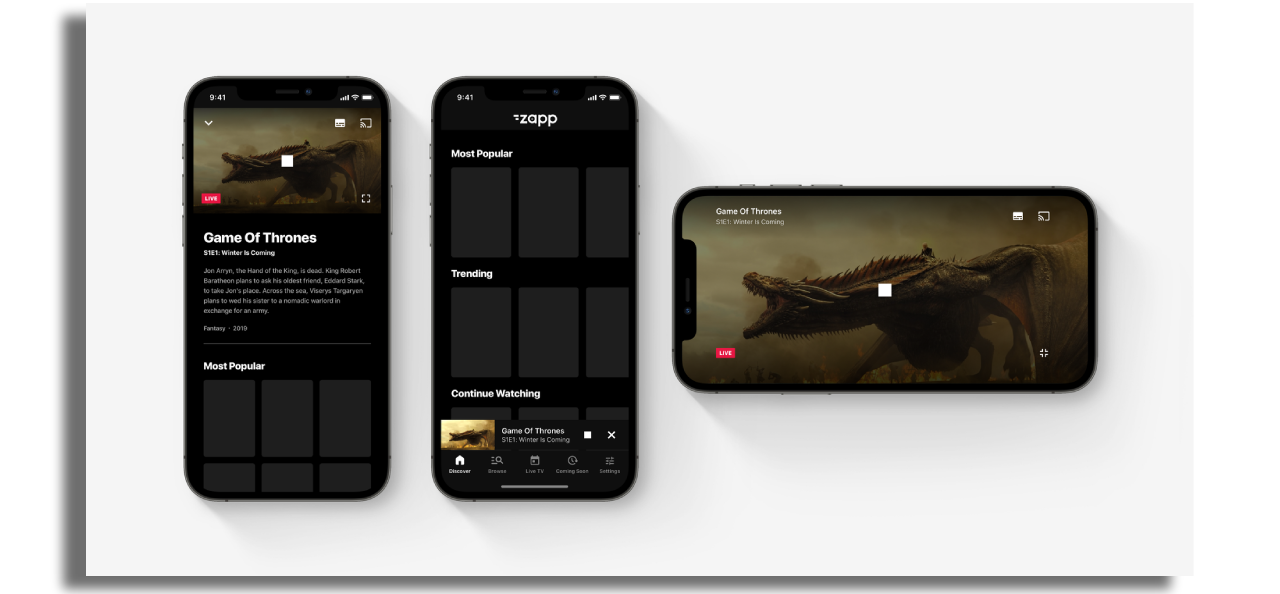
In order to use the dedicated live controls, the entry needs to contain the live: true extension key, so that the player and the transport controls are aware they should be using the live controls for this piece of content.
You can define the extra live controls assets on the player screen, in the assets section, along with the other assets.

The extra assets for the dedicated live controls are:
- Stop badge
- Docked Stop badge
On top of this, you can customize the live badge. The default asset is a red rectangle of 38x20px with the word "live".
You can provide a custom live badge which can take any form. The player configuration allows you to specify the width and height of your custom live badge. Bear in mind though, that the live badge may not be bigger than 230x40px, in order to leave sufficient space for the other elements of the transport controls.
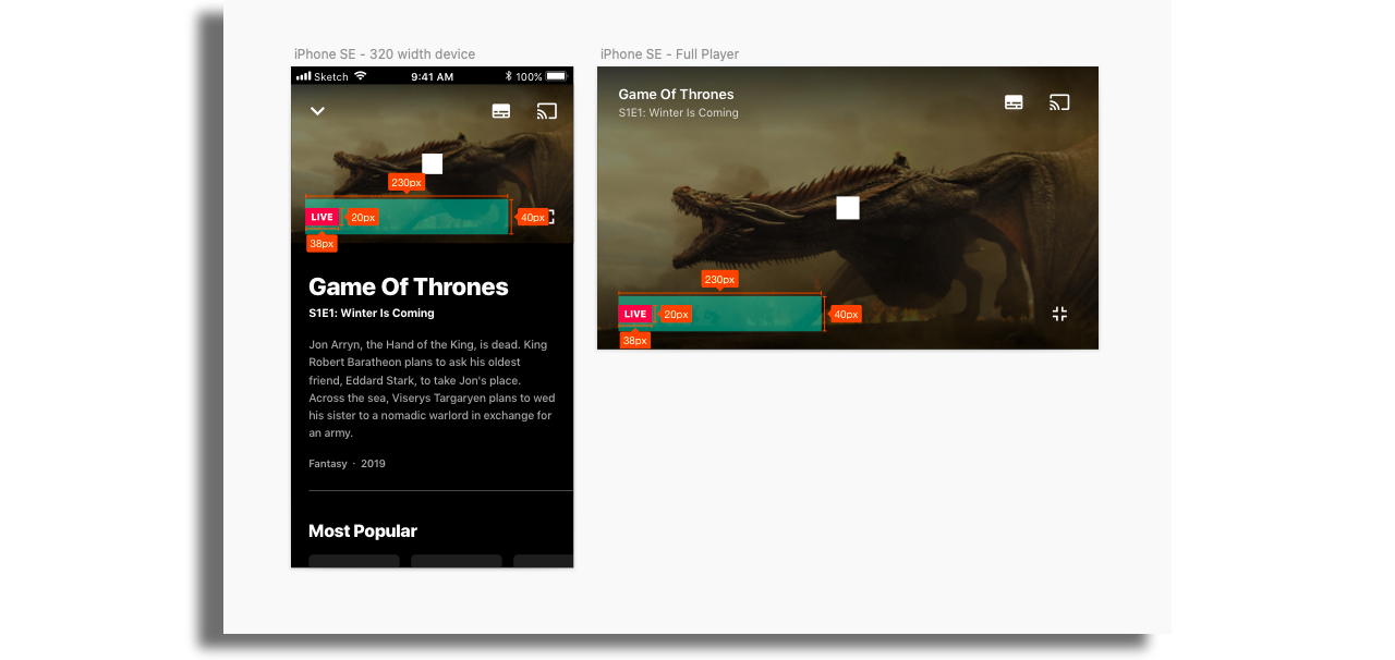
If you decide to use the dedicated live controls, here are the full set of assets required for styling the transport controls.
