Mobile Navigation
Navigation bar
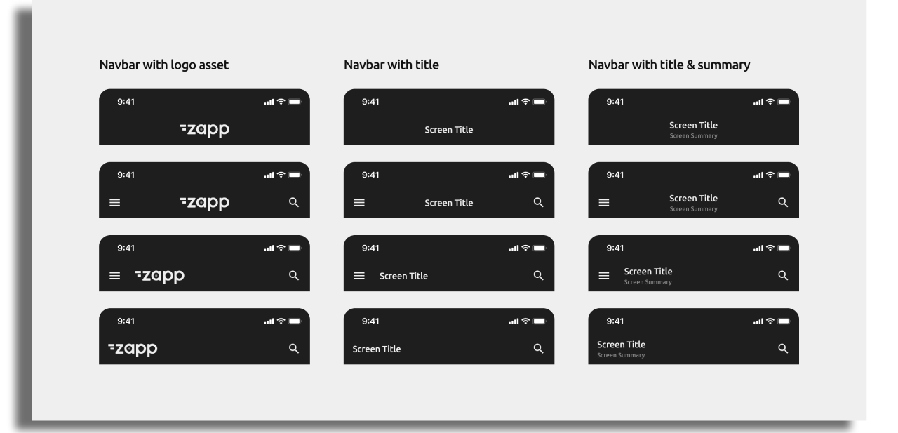
The Navbar is a key component that helps users easily navigate between different sections or screens within the app. It provides quick access to important features, pages, or functionalities. The Navbar can include the following elements:
Menu & Back Buttons: Positioned on the left-hand side for navigation control. Menu button requires assigning the Side Menu as a navigation method.
Logo or Screen Title: Can be centered or left-aligned based on design preferences.
Text Labels: Option to include up to two text labels, allowing a summary or additional context.
Action Items: Action items can be placed on the right-hand side of the Navbar for quick access to key features.
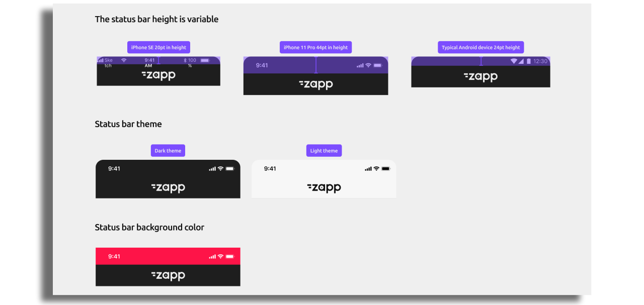
Status Bar
The height of the Status Bar can vary depending on the device and platform, making it dynamic in nature. You can choose between a light or dark theme.
Navbar configuration
You can fully customize the Navbar's appearance and behavior, including enabling or disabling it, adjusting its alignment, choosing between logo or title displays, and modifying its bottom border. Additionally, you can set the Navbar Color or Gradient, apply a Blur Effect and position the content in different ways.
Examples of the Navbar styling are below:
- Navbar Color or Gradient: Select a solid color or gradient to suit your app’s design.
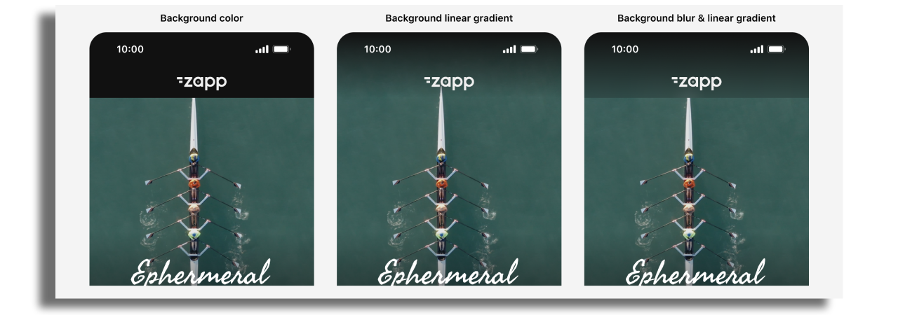
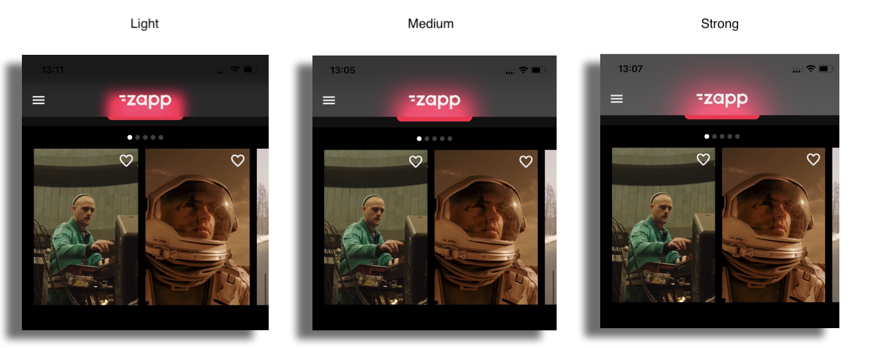
- Blur Effect: Choose from four intensity levels—None, Light, Medium, or Strong.
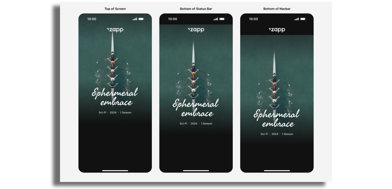
- Screen Content Positioning: Position content in three ways relative to the Navbar, Status Bar, and Screen — at the top, below the Status Bar (safe area), or below the Navbar — allowing flexibility for different screen layouts, with padding adapting accordingly.
Action Buttons
Action buttons can be added on the right hand side of the navbar. These can include buttons that direct to a search, favorites or settings screen for example.
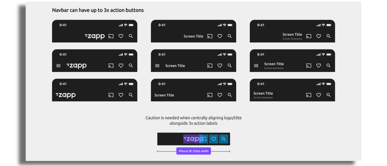
As a best practise it's recommended to limit to 3 action buttons to the Navbar for a clear, prioritized navigation experience. This also ensures optimal display across different screen sizes.
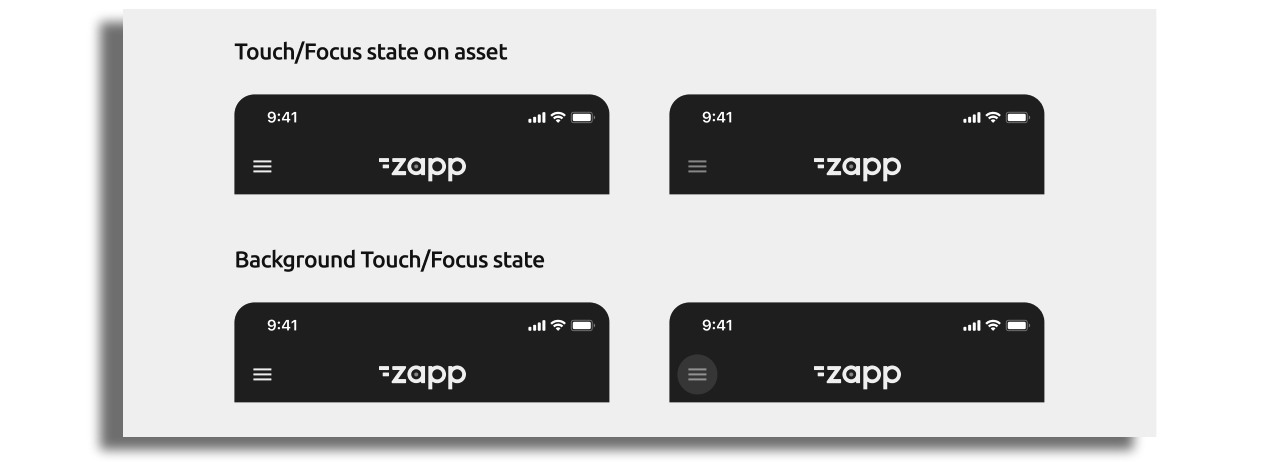
Tapping a button on the Navbar can provide visual feedback by fading the button's opacity. Optionally, a background color can be applied to highlight the active state.
Be cautious when placing buttons next to a logo or title, as space may be limited on smaller devices. The navbar title will adjust its width based on available space, with a recommended test width of 320pt. If needed, consider shortening the title or logo. Alternatively, you can adjust the button sizes, but the touch target should remain at least 40x40pt.
It is recommended by Apple & Android to have bigger sizings/spacings for tablet vs mobile. This can be achieved through configuration on a tablet specific layout.
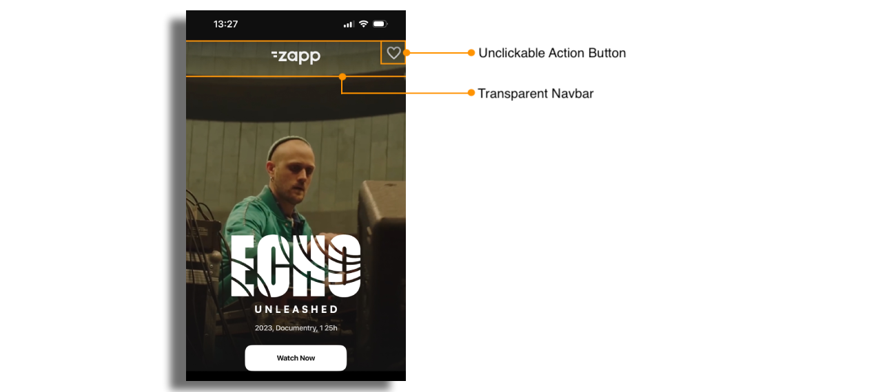
Consider the design of the cells to ensure the action button remains accessible to the user, even when covered by the transparent navbar. See example below.
Interaction
Under Navbar Effects section there are several options to choose from to enahnce your app's look.
Scroll Reveal Effect
The Scroll Reveal Effect makes elements, like the navigation bar, fade in as the user scrolls down the page, creating a smooth, dynamic experience.
Scroll Collapse
The Scroll Collapse feature automatically hides the navigation bar as the user scrolls down, maximizing screen space for content. When the user scrolls back up, the navbar reappears. This provides a seamless, distraction-free experience, similar to apps like YouTube and Netflix.
Assets
Assets - The default size is 40px x 40px. These dimensions can be changed via configuration using the 'Button Asset Width' & 'Button Asset Height' fields. The assets should be exported at a resolution of 3 times the standard pixel density (@3x).
Logo - The default size is 87px x 40px (to match our default Zapp logo asset). These dimensions can be changed via configuration using the 'Logo Asset Width' & 'Logo Asset Height' fields. The asset should be exported at a resolution of 3 times the standard pixel density (@3x).
To add Chromecast to the Navbar, find more info here.
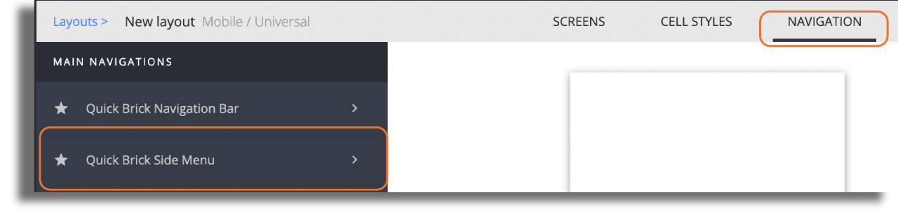
Side Menu
A Side Menu is used to navigate to main screens within the app. Side menu asset should be added to the Navbar.

Configuration
When creating a new layout, side menu is a added by default. To style it and add items, just go to the navigation section of the studio and choose side menu.
Modify the side menu settings according to your needs. You can change:
- the background color of the menu and each item in the menu.
- font family, color and size.
- color for selected and unselected state of menu items.
- add any icon asset on the right of each item. The asset needs to be in PNG format, size: 40px x 40px and exported at a resolution of 3 times the standard pixel density (@3x).
Attach screens to the Menu
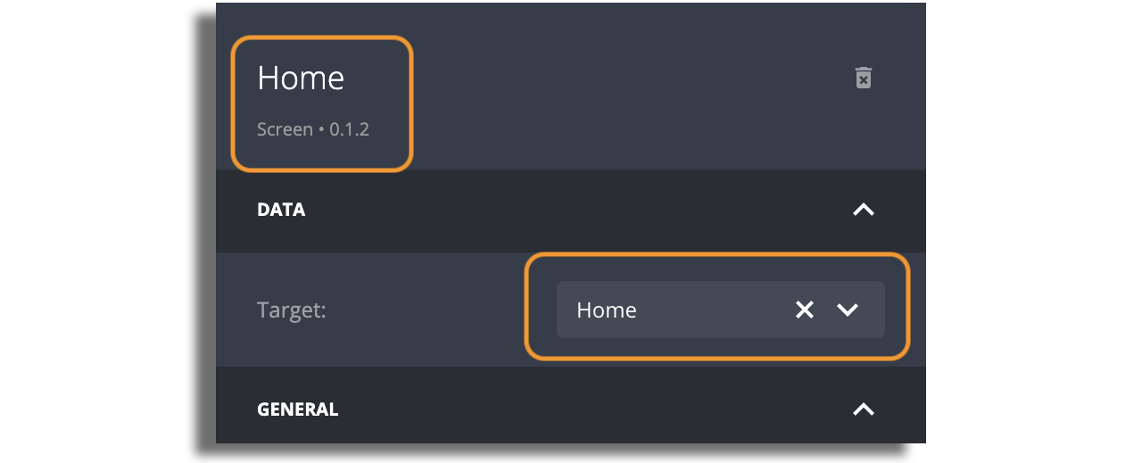
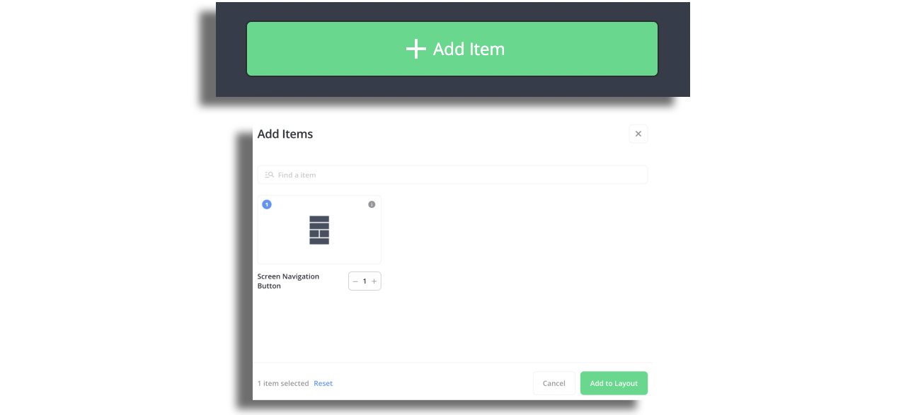
Click on the +ADD ITEM button and choose the item you would like to add.
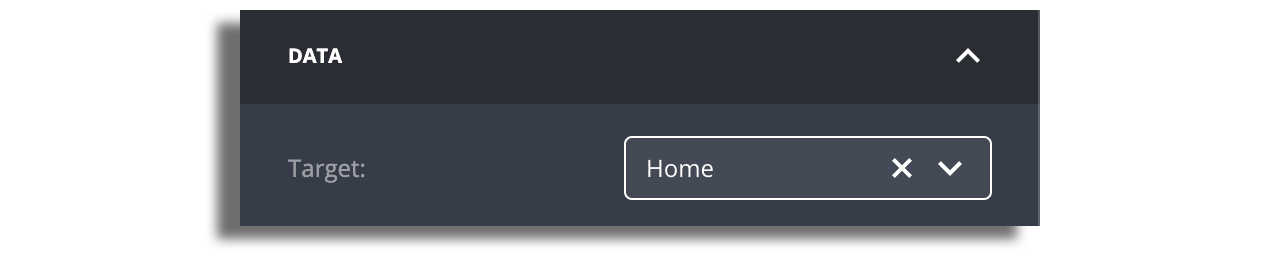
Your new item will appear on the left panel. Choose the new item you just added and set its name, icon and screen target.
The name that you set for the screen will show up in the side menu.
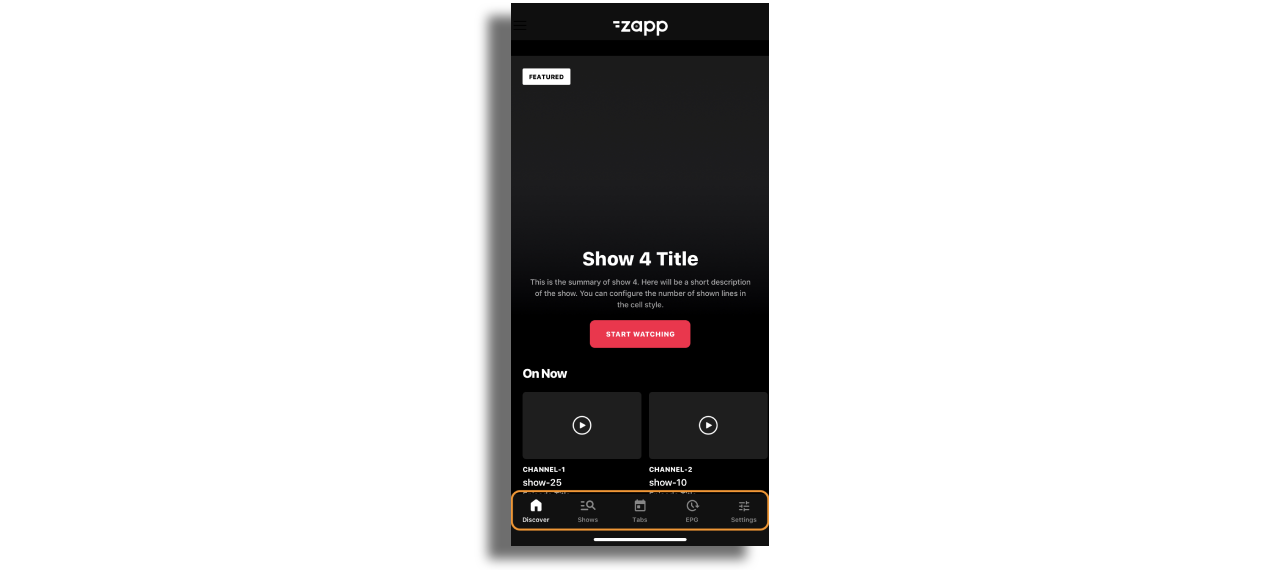
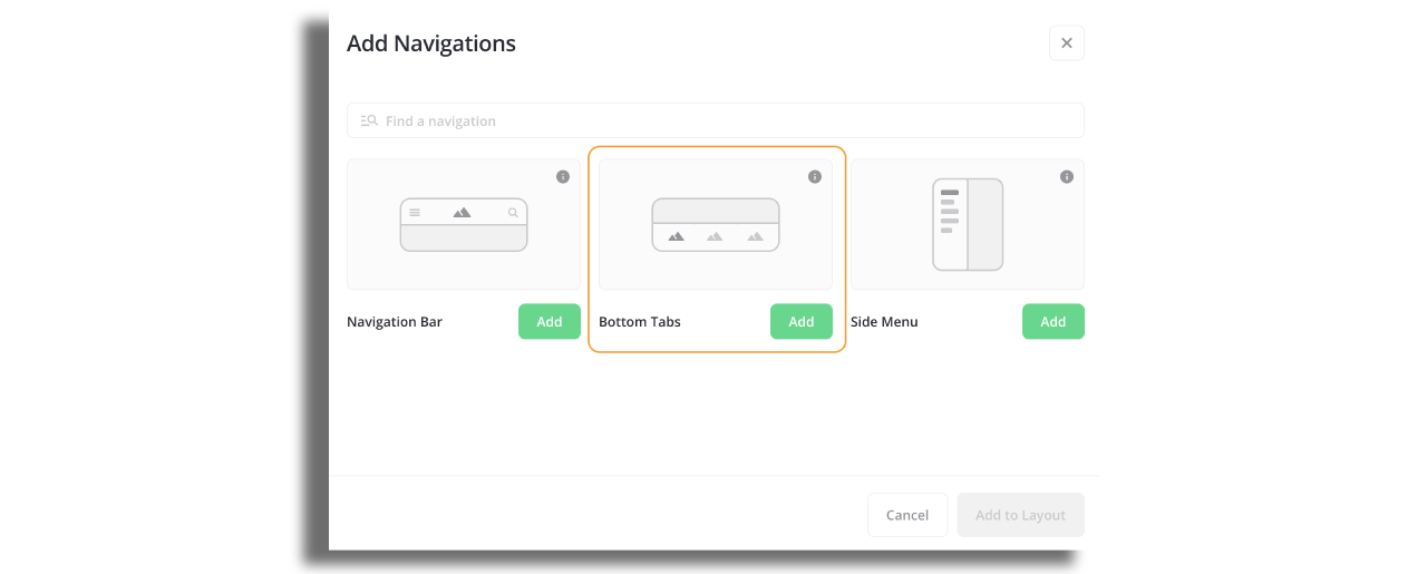
Bottom Tabs
Bottom Tabs acts as a navigation menu and can display one to five menu items at the bottom of a screen. Each menu item is represented by an icon and an optional text label.
Configuration
Go to the Navigation section of the Studio and choose the Bottom Tabs.
Modify the bottom tab bar settings according to your needs. You can change:
-
Background color of the bottom tab bar, top border color and thikness, font family and size.
-
Upload 40px on 40px assets for item icons. Make sure that the assets are exported at a resolution of 3 times the standard pixel density (@3x)
-
Ensure that the toggle to display tab titles is enabled if you wish to have items portrayed with images and titles.

- Add items to the bottom tab bar that will represent screens. You can do so by clicking on Add Item in the right panel. Each item will represent a screen in the bottom tab bar.
- Each item must have assigned target screen. The item's name will be automatically retrieved from the screen, but you have the option to modify it and the edited name will then be displayed as the title.
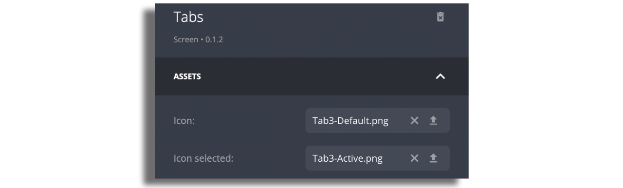
- Enter each item, change the button state to "image" and upload assets. For each item, switch the button status to "image", and then upload the corresponding assets.The section to upload assets will only appear if you chooose option
imageat the top of the right panel.
Tabs
Tabs represent inner screen navigation and allows users easily navigate content grouped by any topic, such as show season, music genre, etc.
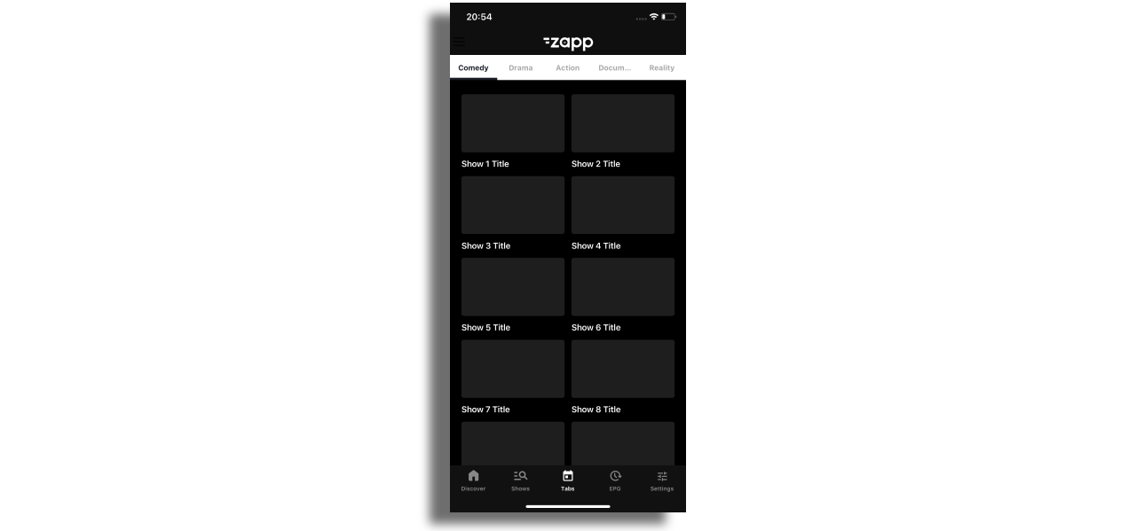
Configuration
In order to add tabs, select Add Screen and then choose Tabs.
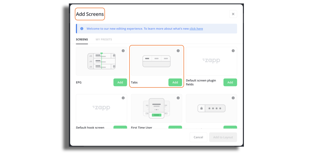
Select the screen in Studio and configure the Tabs in the right hand panel. Note the following:
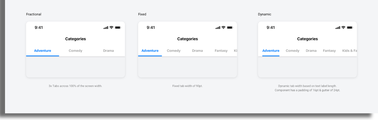
Display Mode There are three modes that can be chosen when using the tabs component.
-
Fractional- tabs are equally distributed across 100% width of the screen. -
Fixed- all tabs have the same width which is defined by the user. -
Dynamic- tabs have different widths based on text label width.
Data source
Assign data source on tabs screen that will include the type value for the screen inside the tab. In the example below the type value is season_generic. This value opens the screen that is set in type mapping. For more info on how type mapping works, check out this article.
  "entry": [
    {
      "extensions": {

      },
      "id": "season-1",
      "title": "Season 1",
      "type": {
        "value": "season_generic"
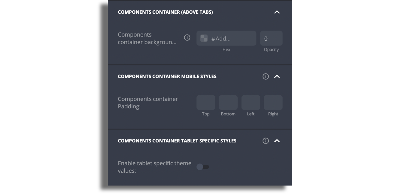
Components Container (above tabs) - you can add one component above the tabs by adding this component to the screen, selecting cell style and assigning data source to it.
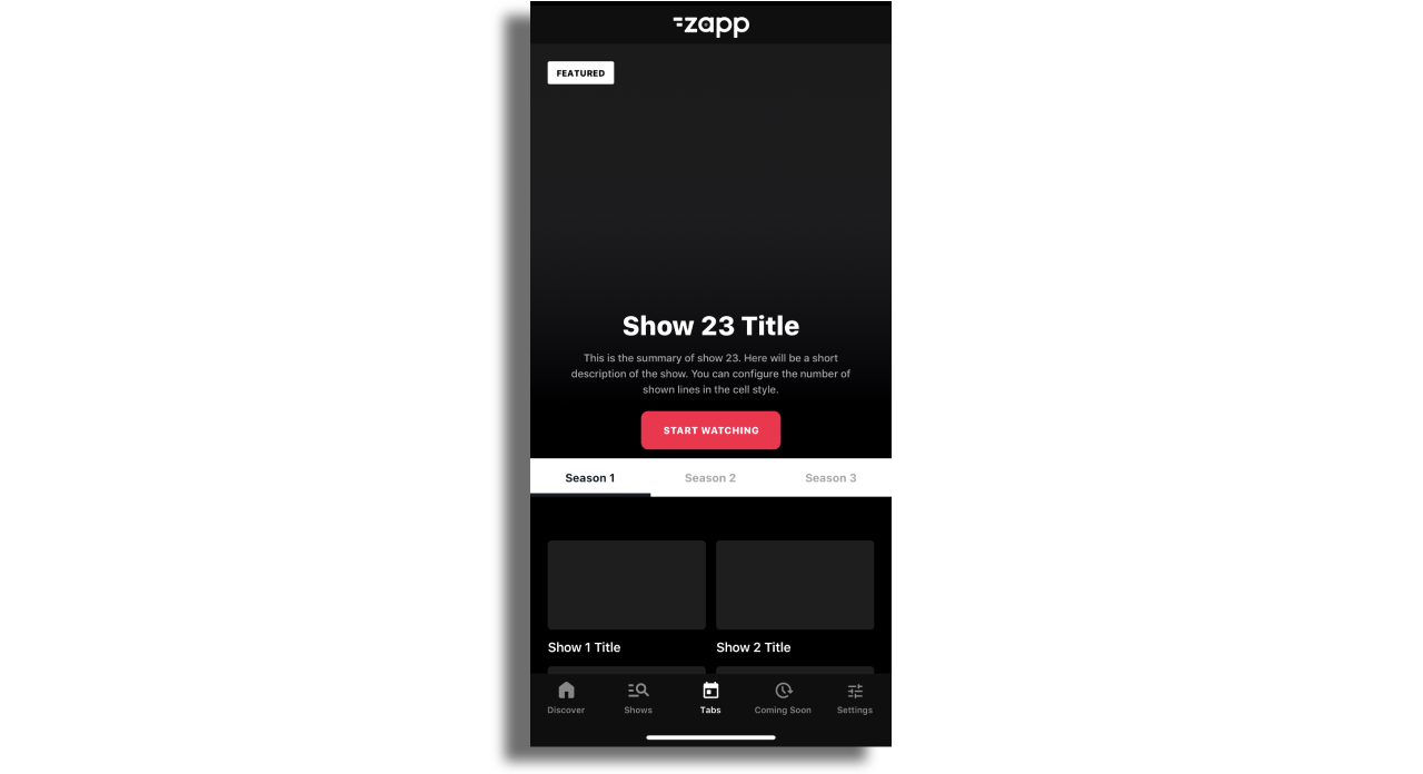
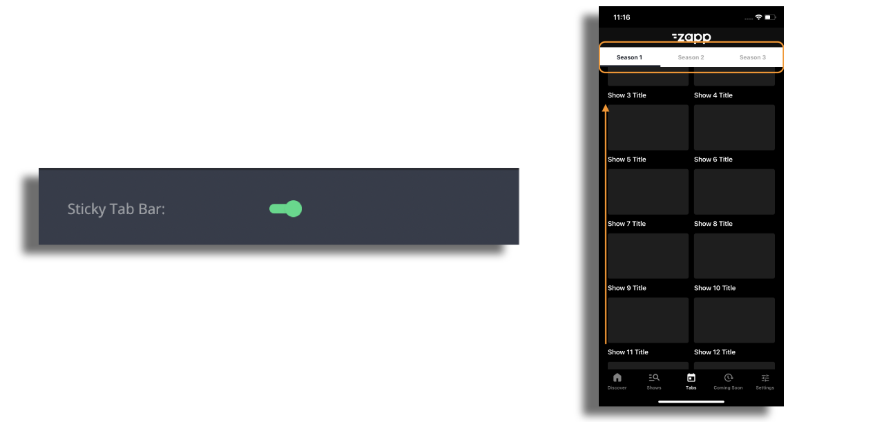
To ensure that the tabs remain attached to the navigation bar while scrolling the content upwards, activate the Sticky Tab Bar option.
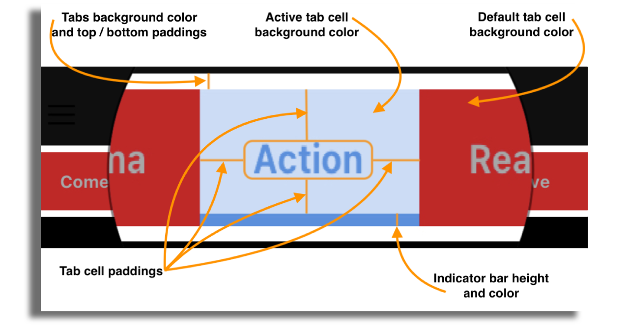
Tab design - Tabs and its' contents can be styled according to your needs:
Text label- text transformation, font family, size, color and spacing.Tab Bar- background color and padding.Tab cell- background color default and active, paddings, indicator bar height and color (indicator is the underline).
Container above the tabs on tablet - Within the section displayed below, you have the ability to customize certain properties for the components located above the tabs, such as padding and background color. Moreover, you can activate specific theme values for tablets if you are utilizing the same layout for both mobile and tablet devices.