Secondary Image
Secondary images allow to expand the app design and make it more appealing. The secondary images are available on both mobile and all tv platforms and all cell styles.
Start by enabling the toggle for the secondary image on a cell style.

Image Positioning
The secondary image can be positioned either using a text label as a position reference or over the cells image, anchoring to either the center or one of the corners (similar to how badges/action buttons are positioned). This approach allows maintaining the number of text labels there are and still have the ability to use a secondary image.
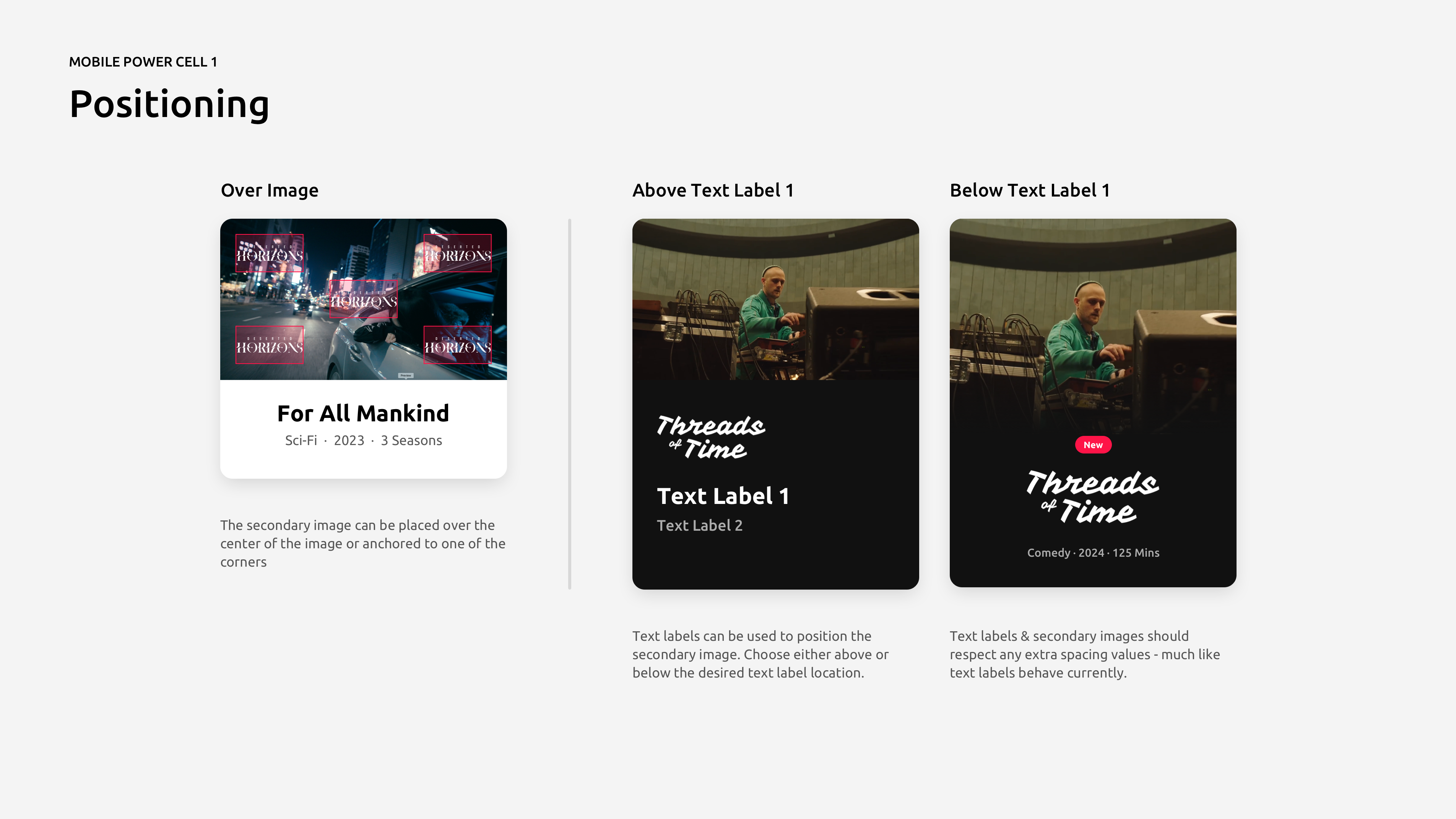
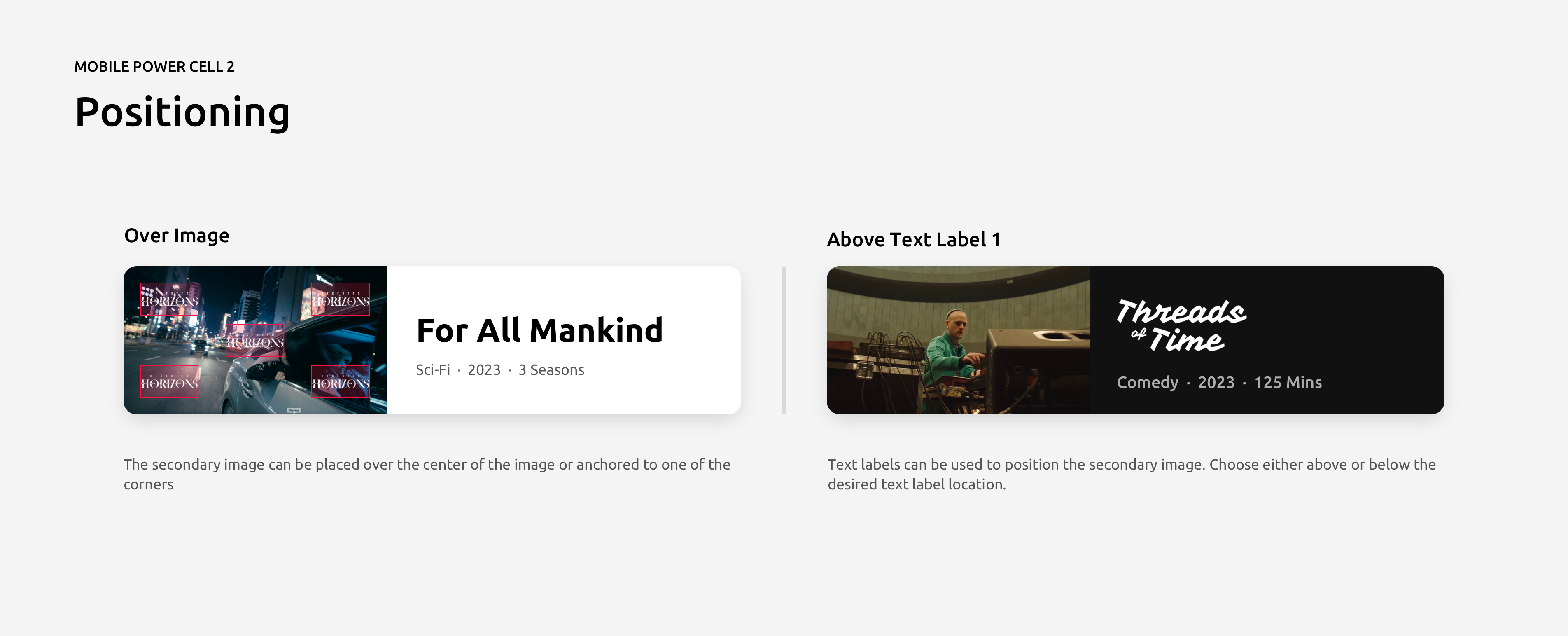
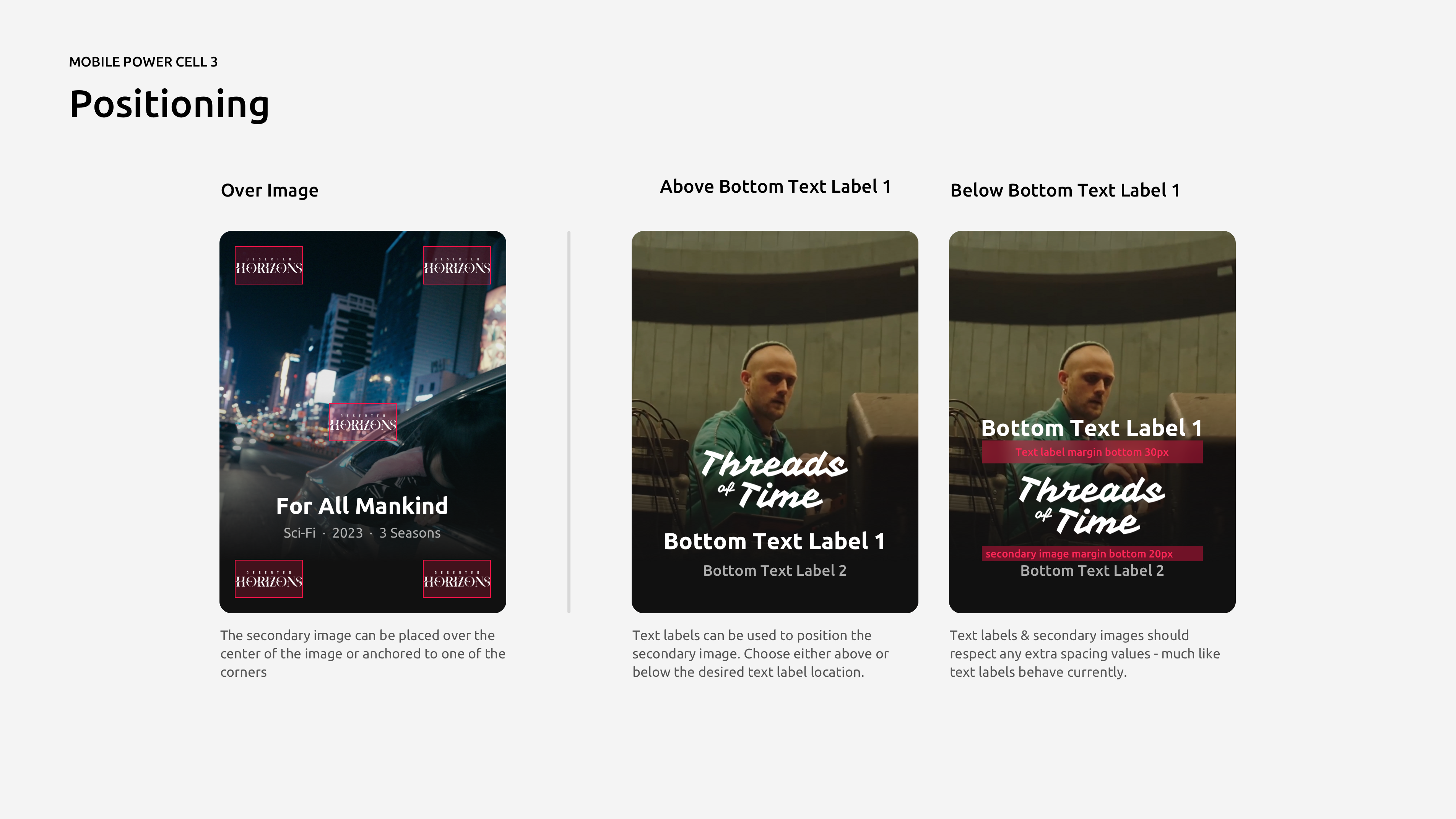
Image Size
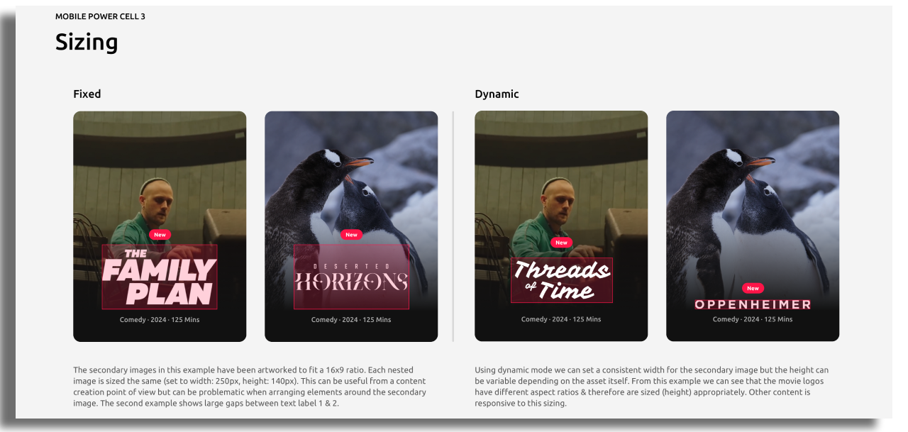
There are two ways to size a secondary image: Fixed or Dynamic.
Fixed: A width & height should be defined here. The secondary image asset will fit this space.
Dynamic: Only a width is defined here & allows for dynamic height resizing based on the asset itself. This is useful when positioned between other elements.
Dynamic mode is only available on Power Cell 3.
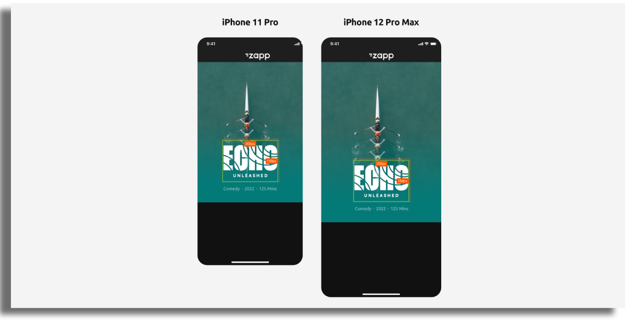
The image size will be fixed across all devices. A width & height will need to be specified. That means that this will not scale from a small mobile device to a large mobile device but maintain it’s size - see illustration below. This is similar to how text labels and other cell furniture behave on mobile.
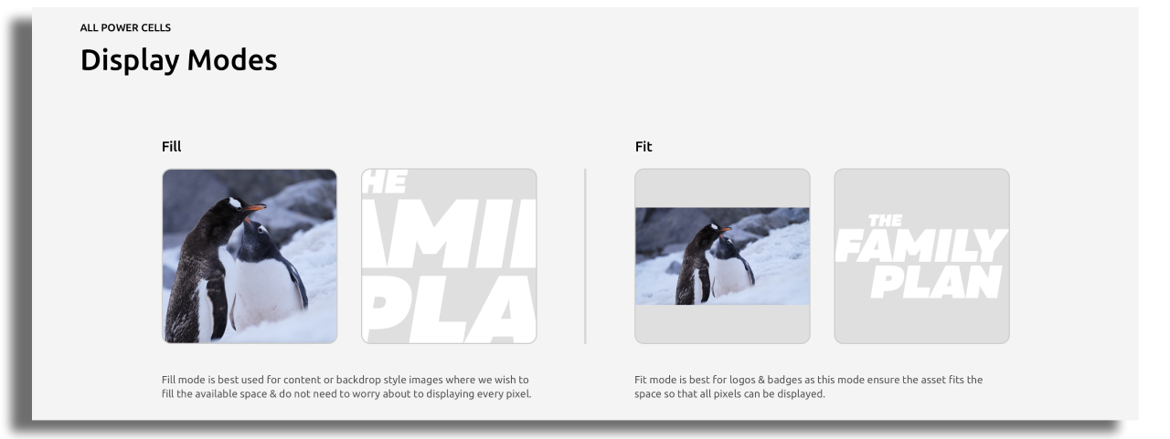
Secondary image display - Fill or Fit
There are two modes available for the secondary image display when using a ‘Fixed’ image sizing:
Fit mode will resize a secondary image to fit within the bounds of its container (defined width & height) with no cropping.
Fill mode will expand an image to fill the whole container, which may result in some cropping depending on the dimensions of your container and the image you send into it.
Display mode is only available when using Fixed image size
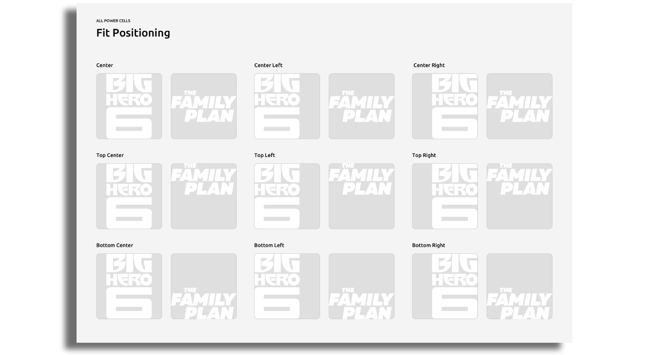
Fit Position
When using Fit mode it might be useful to position the secondary image to a point of origin that all secondary images will render from. The following positions should be considered:
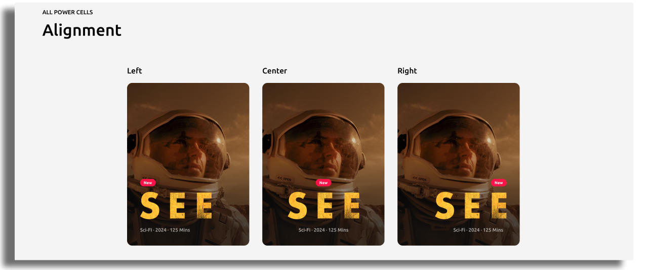
Alignment
Alignment of a secondary image is useful when using a text label as a positional reference. We may wish to align our image so that it matches the alignment of our text labels.