Components
The following component types can be added to the General Content Screen.
Common Parameters
Most of the configuration parameters are shared between the components and TV/Mobile.
- The
Item Limitwithin the component. Set to between 1 (e.g .for a single banner type cell) or leave unset to be unrestricted and display all items in a data feed. Cell SelectableIf set to NO then the component is focusable but no items can be selected.Cell focusableon TVs only. If set to NO then the component is neither focusable nor selectable.Enable Data Refresh. Auto Content Update Inside Components.Data sourcehas to be attached to the component.Component Anchor Pointon TVs only.Component Margins.Component Paddings.Component Gutter.Component Background Colorcan be used to define a color behind all cells on the component.Cell Styles- Attach a power cell style to your components.- [
Enable Video Preview] - More info can be found here.
Horizontal List
The Horizontal List distributes content across a linear horizontal, scrollable and focusable rail.
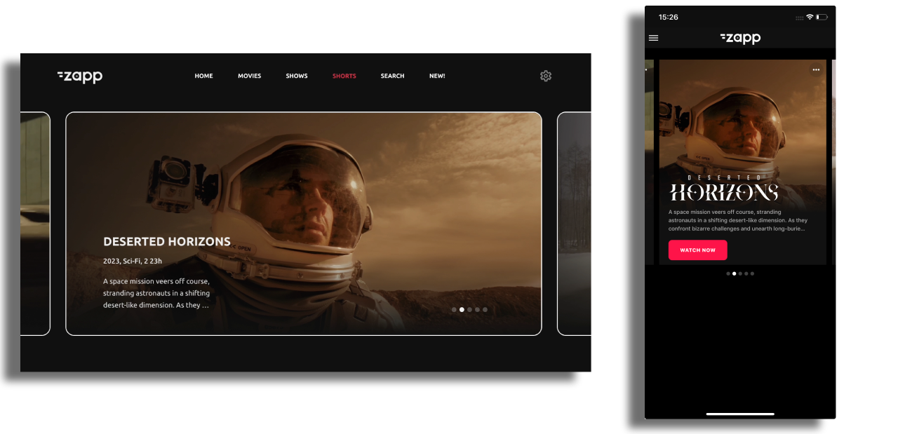
Additional Horizontal List specific configuration items are:
Cell Width Cell Width in pixels defines the width of all cells in the component. The height of the cell is then calculated automatically from the width, aspect ratio of the image in a cell, the amount of text displayed and any included line height and padding values.
Autoscroll Enabling auto-scroll makes the rail of items scroll automatically between items, without user interaction being needed. Setting the scroll interval will determine the number of seconds before auto-scrolling to the next item on the list.
Loop Enabling the loop turns the rail into a carousel: when a user reaches the last item, all the items will reload and allow them to keep scrolling, again and again and again. Loop can be used in combination with Auto Scroll.
Horizontal Indicator A swipe gesture-based component that cycles through elements. Only available for Horizontal list component.
Hero
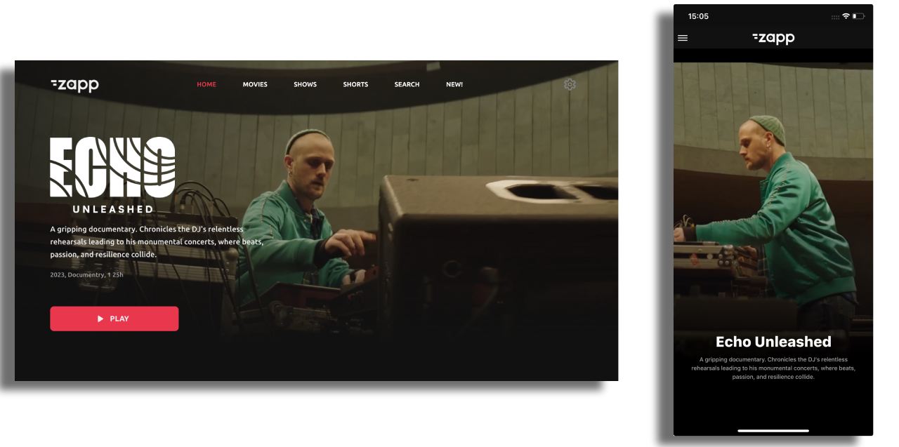
Hero is a single item component with common parameters.
List
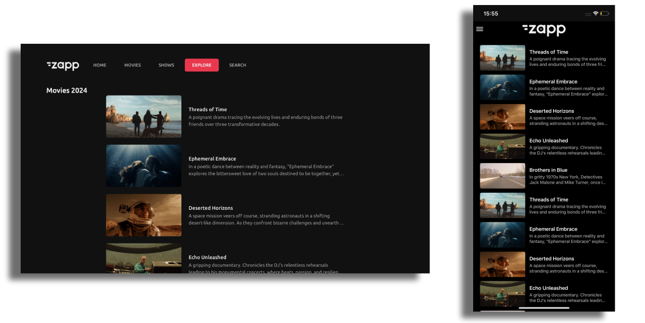
The List component distributes content across a vertical, scrollable and focusable list with common parameters.
Grid
The Grid Component distributes content in a scrollable and focusable x-y grid presentation.
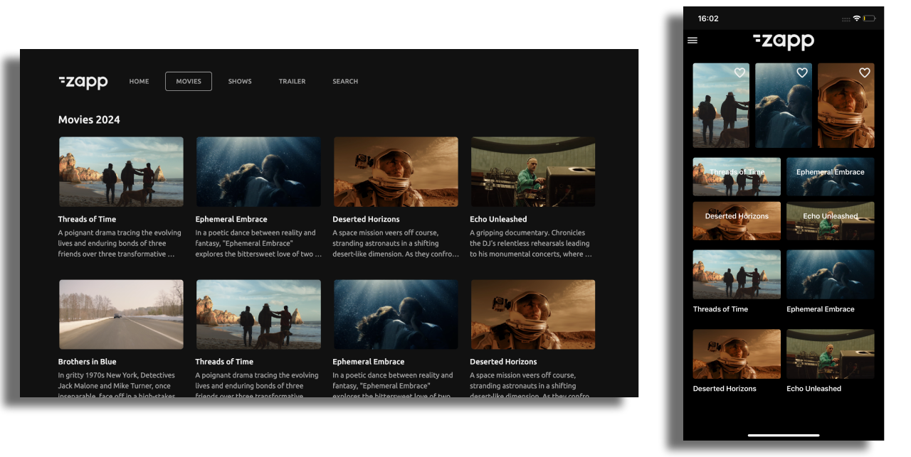
Additional Grid specific configuration items are:
- Component Gutter Vertical the gap between cell rows in the grid.
- Number of columns set this to how many columns you require in a grid and the grid will automatically scale to fit the screen with that number of columns.
- Component Horizontal Alignment allows you to align items in the last row of a grid to the center, left, or right when the number of items is insufficient to fill the row completely.
Group Component
Groups are used to:
- Automatically distribute content in a single feed across a repeated pattern of components.
- Include a Component Title, also known as Group Info.
- Include an Empty Group Component to draw the user’s attention to an empty screen or component, which may require actions such as performing a search, adding a favorite item, or downloading content.
Data feeds are added at a group level, not to the individual components within the group. The feed is then distributed across the group, which can contain any number of various components. Below is an example of how the items of one feed can be distributed among different components:
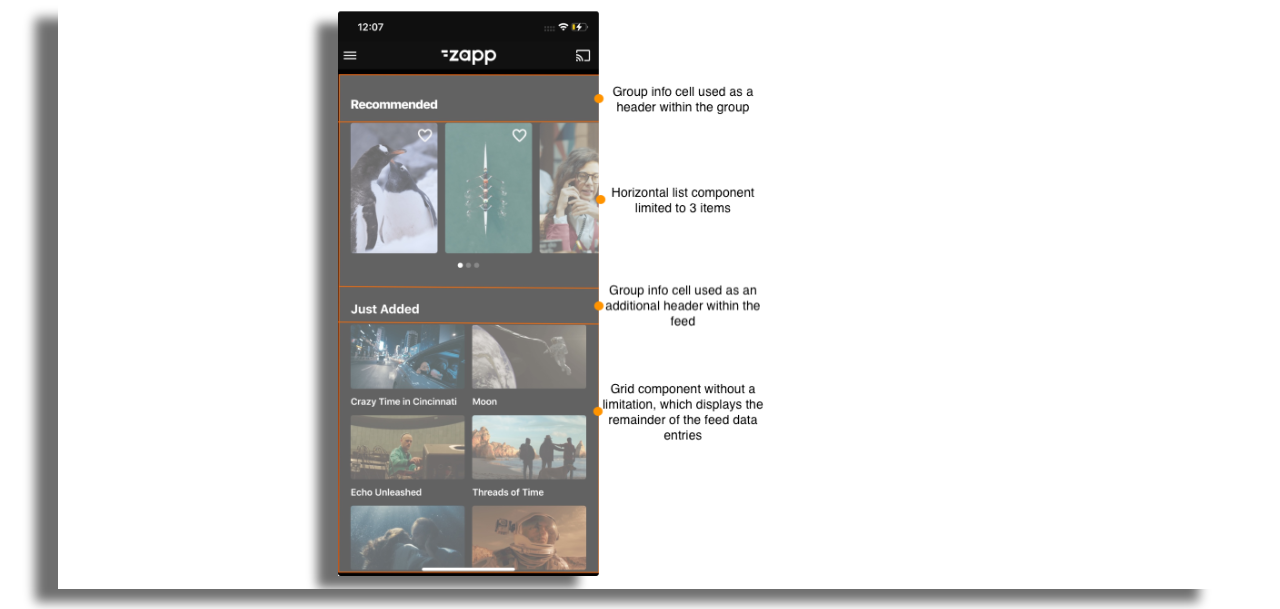
When in a group, all components must have a fixed number of items defined in their Item Limit setting otherwise the group will not display correctly and the content will just fill the first unlimited component.
A Group can be configured to:
No RepeatContent will distribute across the components in a group until it runs out of components to populate.Repeat All ComponentsAll components in the group will repeat until there is no content left in the feed.Repeat Last N ComponentsDefine which components you want to repeat. Useful for not repeating the header before each repeated pattern, or repeating just the horizontal rails under a large show banner.
Group info
To display a title (header), first add a Group Component and then add the
Group Info componentas the first component in the Group.Use the Group Info Component styling parameters to control margins and paddings and hence the header position on the screen.
The information displayed in a header such as title is taken from the feed. Use the
data-key fieldin the Group Info Cell to determine what data is displayed.Any number of Group Info Components can be added to a group e.g. to display a title, then a summary.
The title provided by the feed can be modified in the localization section on the right panel.