App Structure
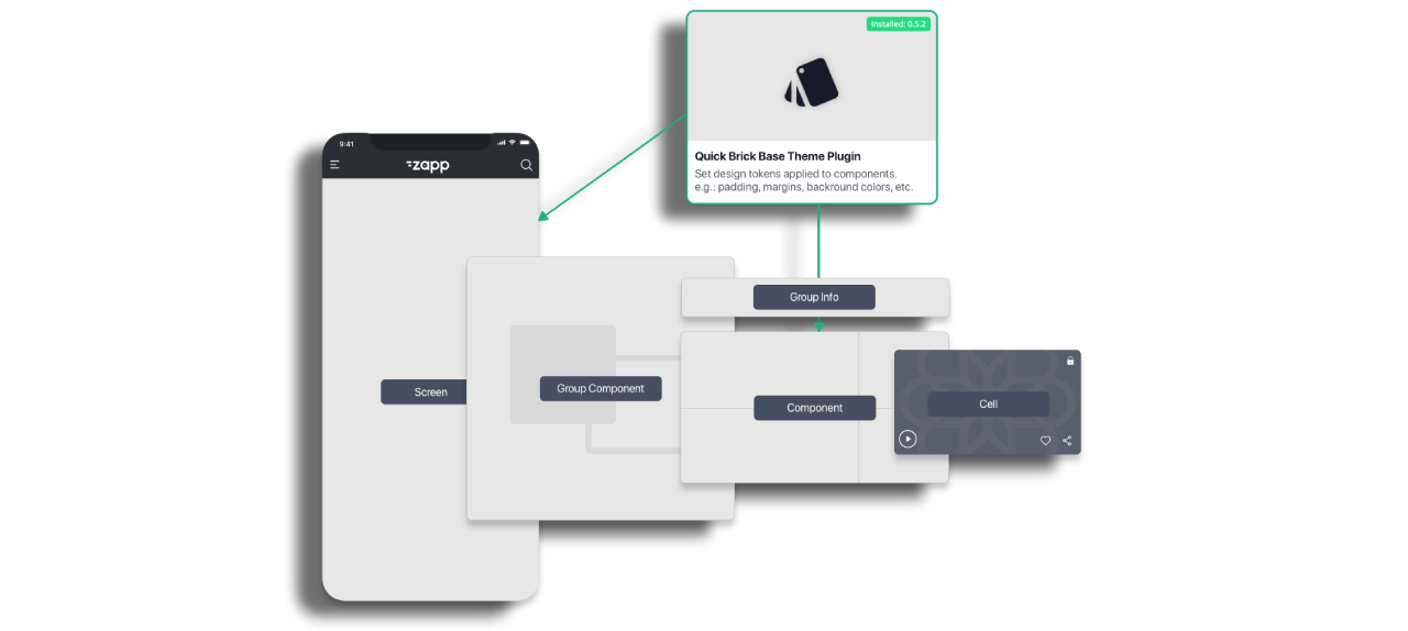
An Applicaster App is built from a number of core building blocks.
Theme
The Theme is a plugin that contains some principal information about the app layout. More info about Theme plugin can be found here.
Default values that can be adjusted per app ensure that an app appears sensible when it is first built.
Screens
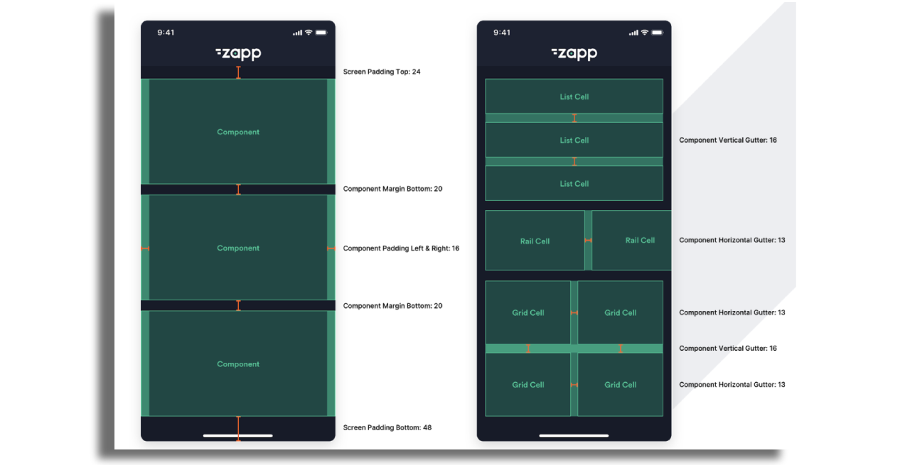
All Zapp apps are built from screens. Using Zapp Studio you can configure and design what screens your app will have in a layout. You can build both dynamic and static screens for your app. A dynamic screen is basically a template screen you set once and can hold different content according to a given context (e.g. a series screen that repeats its design and structure, but displays a different content according to the show context).
Components
Each screen contains components. A component is a structure to hold pieces of content in themed ways such as episodes, movies of a certain genre, promoted content such as "recently added" or "latest podcasts" The possibilities are endless. Here's more info about components.
Cell Style
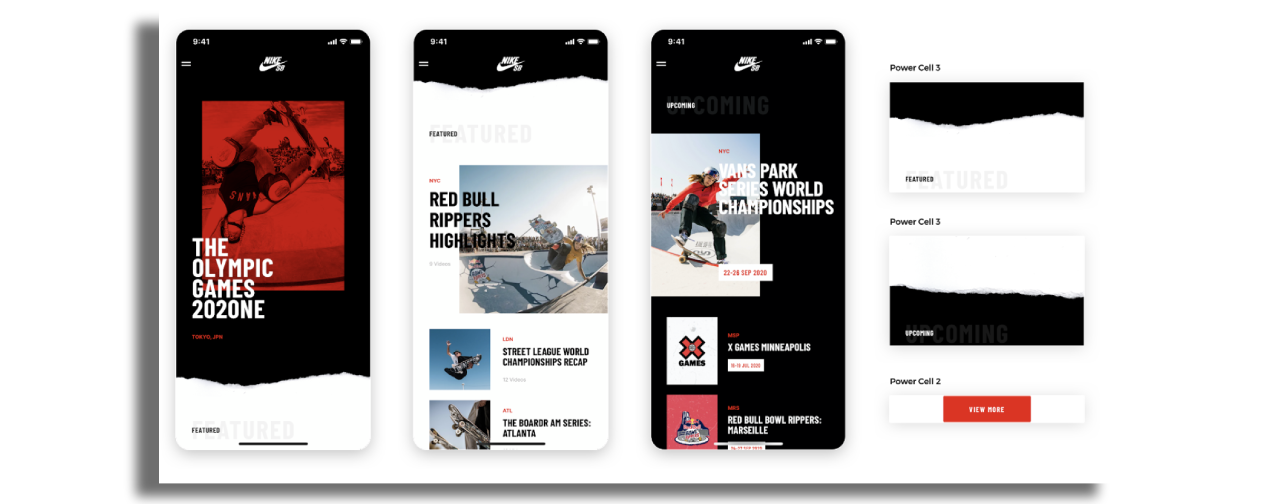
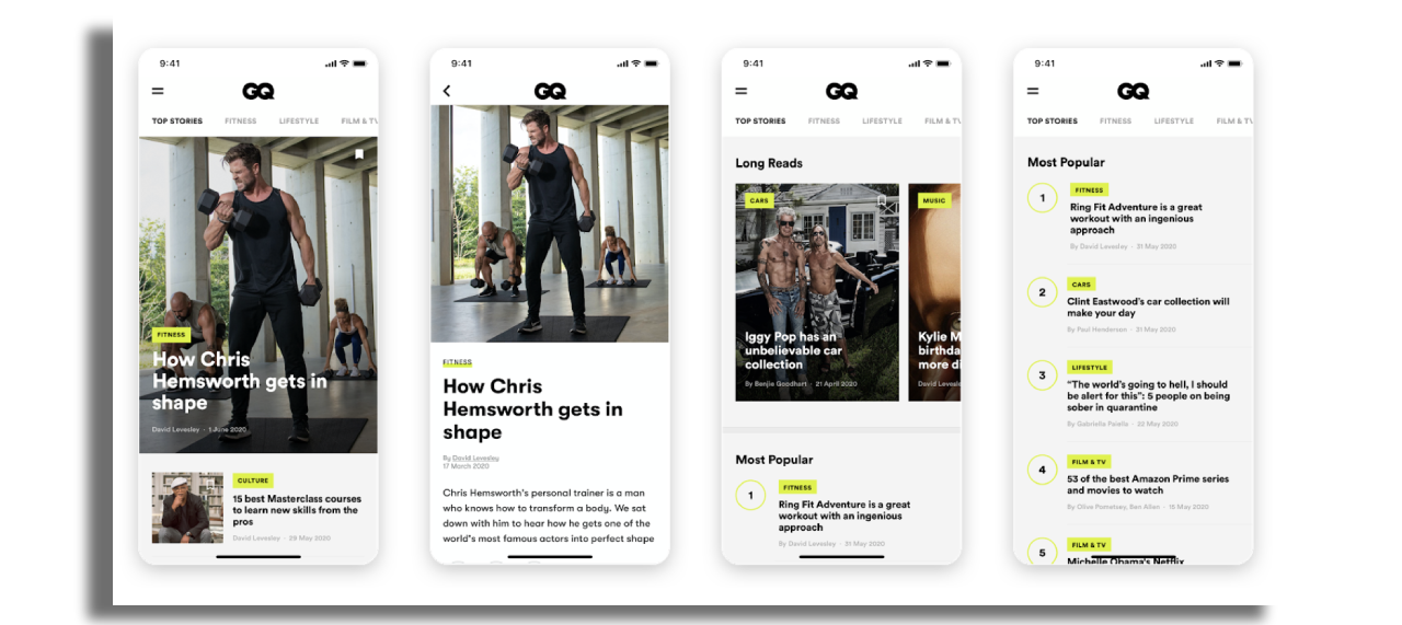
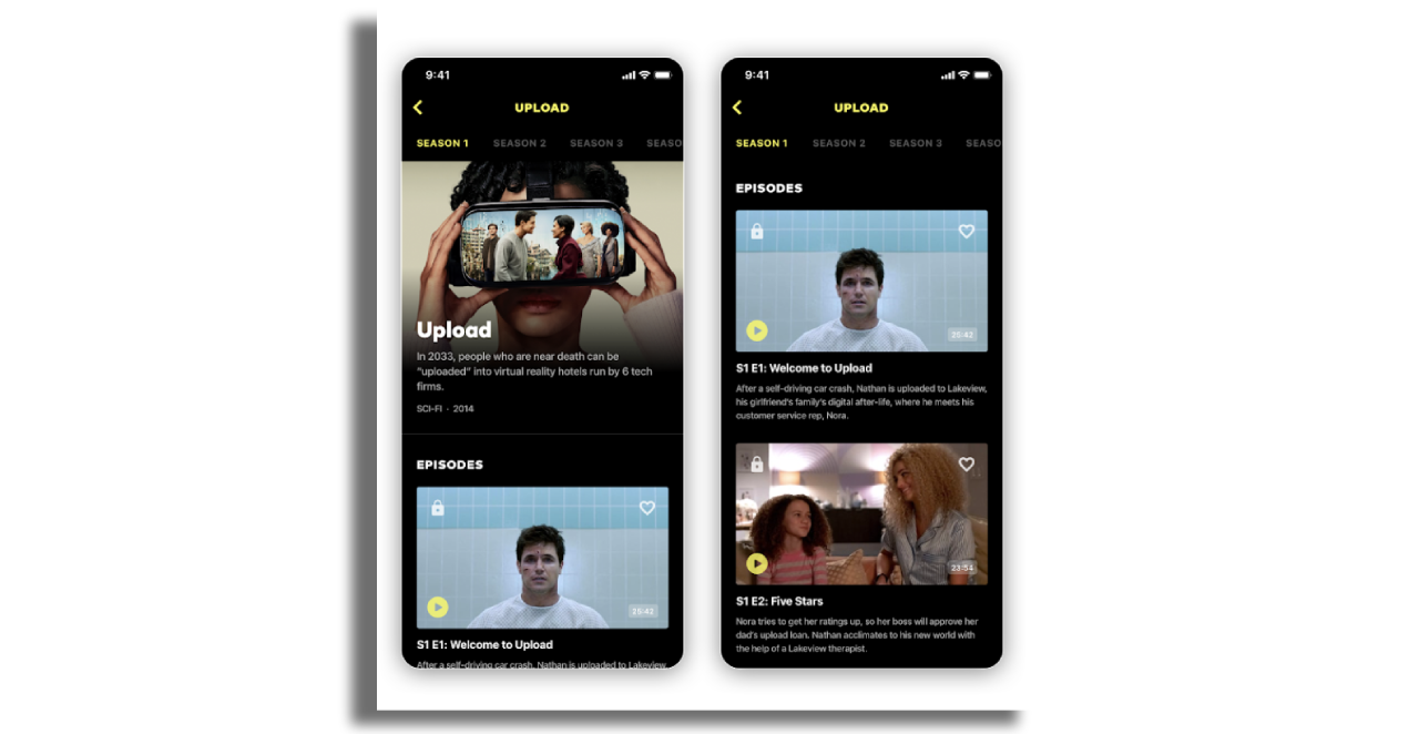
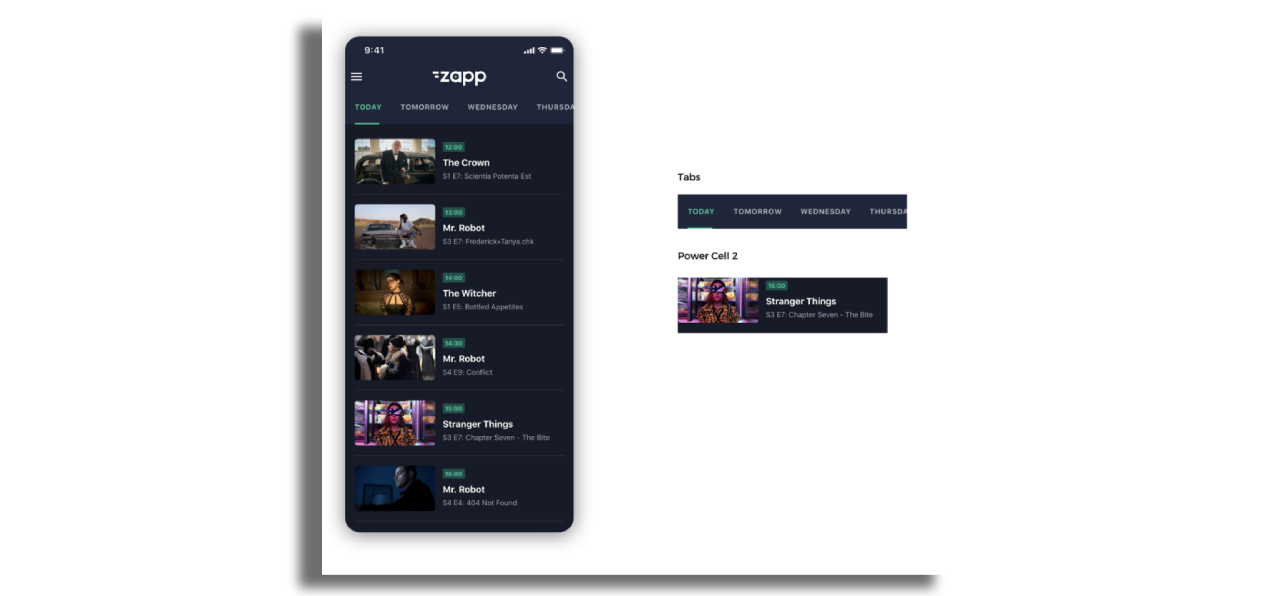
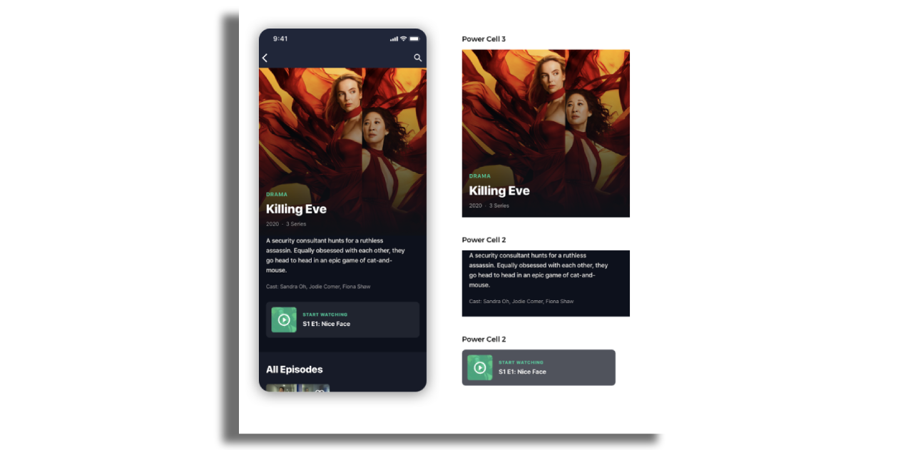
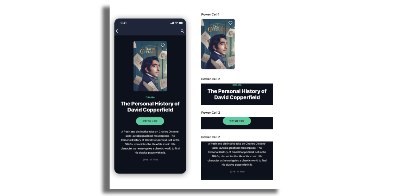
Components contain cells. In Applicaster language these are called Power Cells because they are so flexible. There are 3 types of power cell depending principally where the text and image sit in relation to each other and a 4th Power Cell for headers. Here's more info about the cell styles.
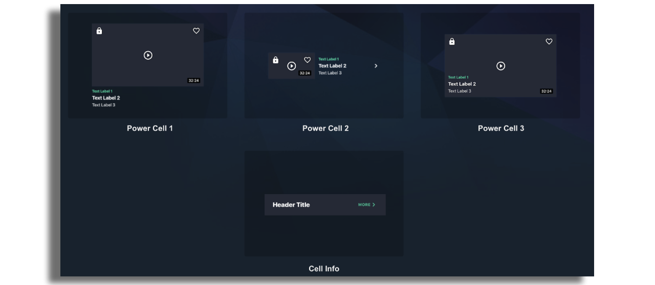
Below are some screen shots of how power cells have been styled.
Navigation
Applicaster supports a range of navigation elements allowing to connect to screens or actions.
On mobile, side menus, bottom tab bars, and in-line horizontal tabs are supported, in addition to a customizable top navigation bar with action buttons.
On TVs, top menu bar is supported, along with horizontals and vertical tabs.
Here's more info about App Navigation.