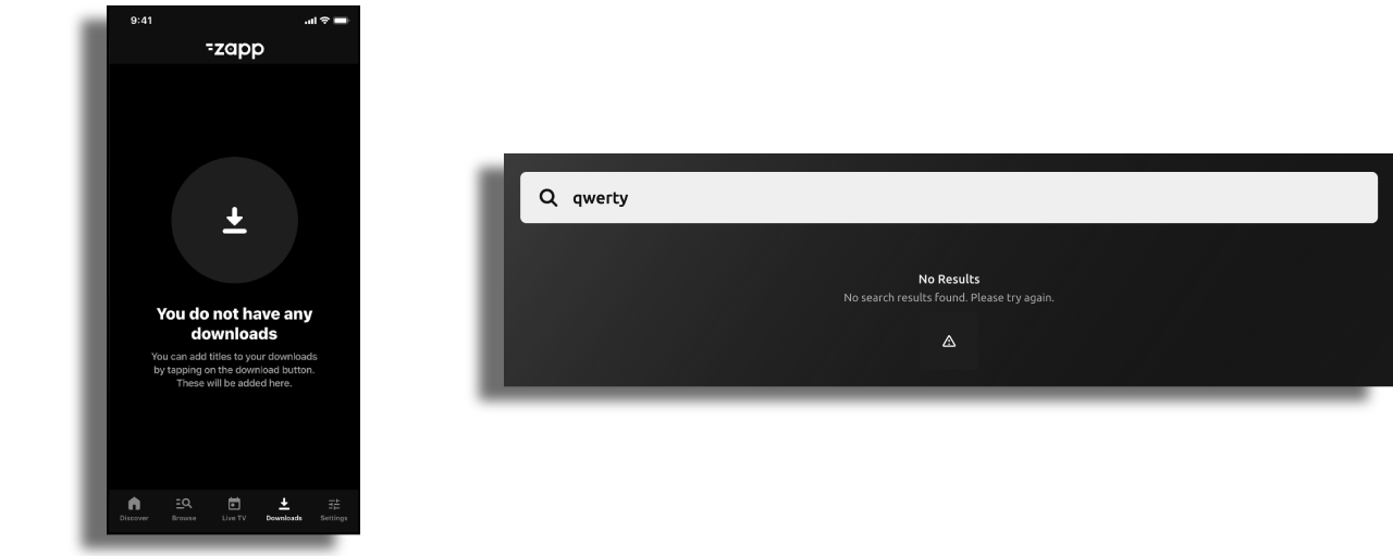
Empty State Alert
At times, it is important to draw the user’s attention to the fact a screen/component are empty. This Alert enables you to display an alternative view, when there aren't any items in the feed. It is optional, and may be appropriate for favorites, downloads or search - as useful examples. This feature is available across all platforms.
Prerequisite
Create a cell style to hold the empty component cell style design. Use title key for the title and use summary key for the description.
In the layout, create a group component with the following components and order:
- Group info (if needed).
- Empty group component.
- The wanted components that will be displayed when the feed will return content.
In order to have empty state alert displayed on the screen, ensure that the toggle to hide the component with the feed if data is empty is ON.

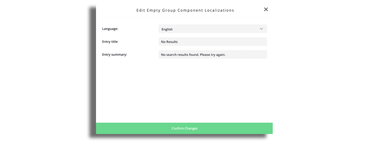
Modify the alert component.
Edit the alert text in the Localization modal.
Choose the cell style you've created to display this component.
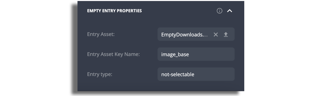
In the “Empty entry properties” section upload an image on “Entry Asset” and modify the key name to the corresponding key name on the cell style you've created.
The text labels are the cell style's default title and summary.