TV Gallery Component
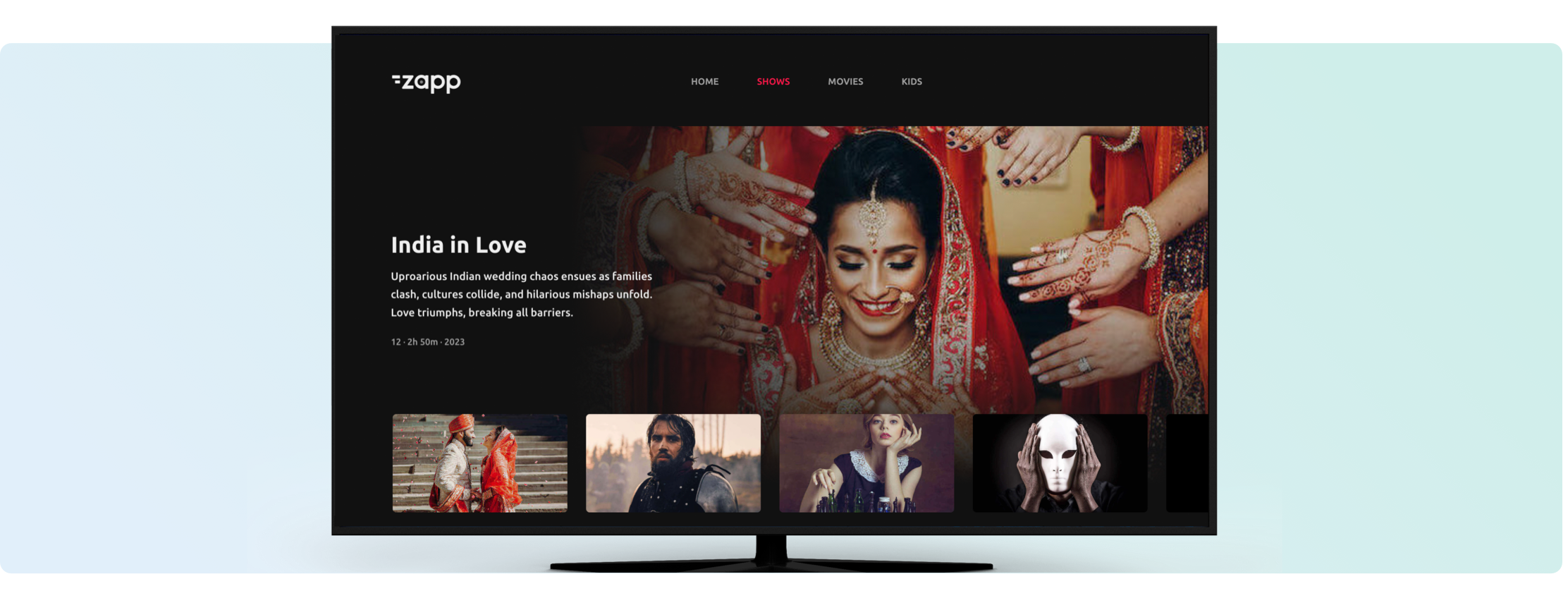
The TV Gallery Component is an immersive way to promote your content. Capture your audience's attention with eye-catching images that boost views, increase engagement, and elevate the user experience. This component supports both high resolution still art or otherwise can be combined with the Auto-Play feature.
Mobile and TVs
Make sure the version contains the Gallery Component plugin.
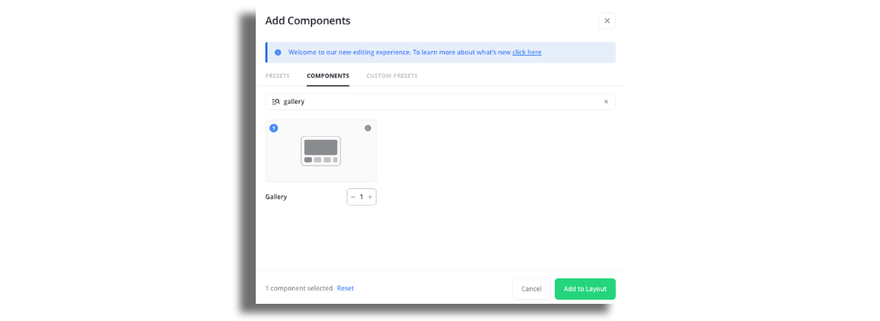
Add the Gallery Component to the screen.
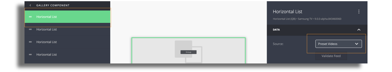
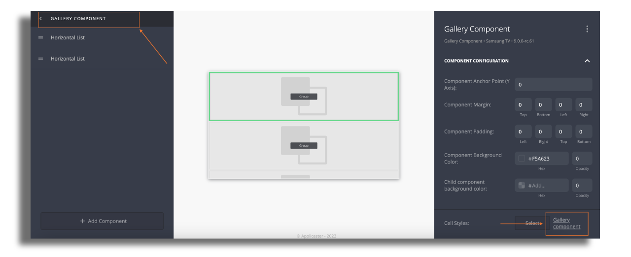
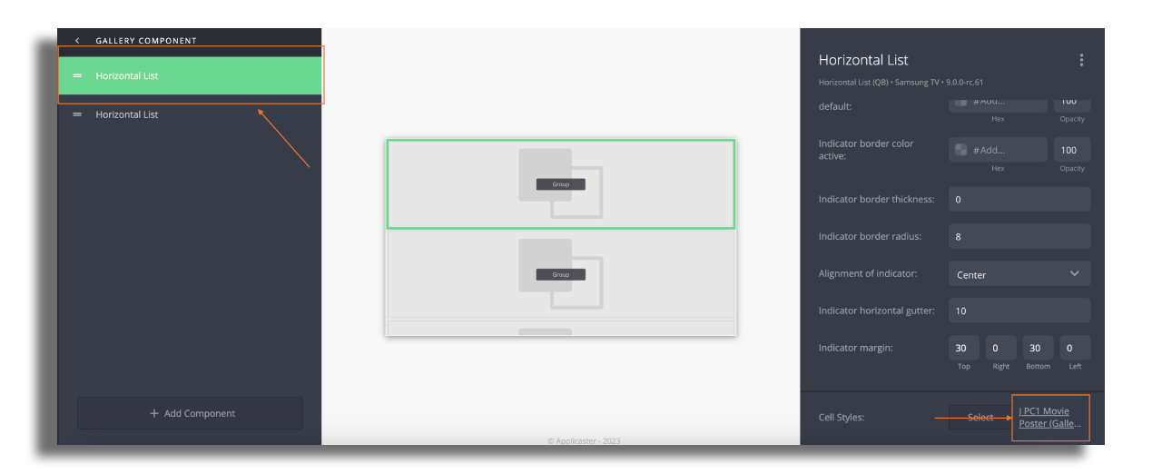
Add horizontal list or group component. Gallery Component can contain a group component, group info and a horizontal list. Other components can also be added before or after the gallery component on the same screen. Assign a data source to the horizontal list or group component.
Data source
TV Gallery Component (for example title, summary, & backdrop image) and thumbnail will be sourced from the same feed entry. Therefore, the feed should only be assigned to the component inside the gallery.
Styling
Create and assign separate cell styles for the gallery component and the thumbnail. All cell styles are compatible with the gallery component.
Please note that gallery components are not selectable nor focusable, therefore action buttons cannot be added to it.
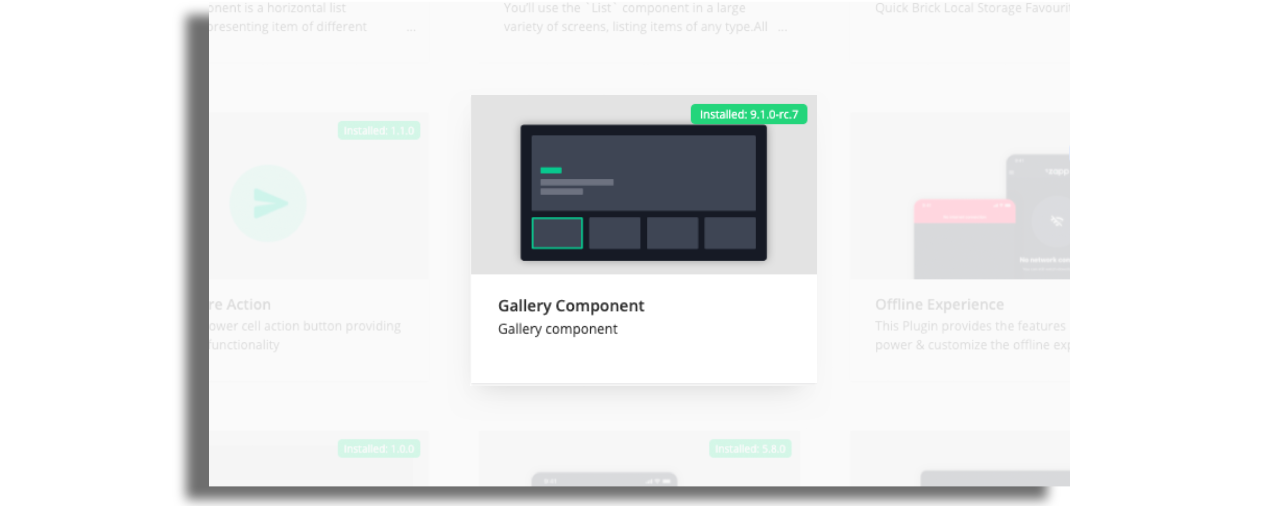
Presets
For more convenience and easy start, there are three Gallery Component presets available in the Studio.