Screens and Components
Screens and components are the main building blocks of any app. With Zapp you may add components and screens remotely, style them, or apply a predefined style, connect your content, and publish to all users in minutes.
We offer pre-made and designed components that include mock data sources as starting points. Those components are listed under the "Presets" tab. More info about presets can be found here.
General Content Screen
There are various screens such as Login Flow, Player, Smart App Rater and many more. The most common and used screen is the General Content Screen which is a composable app screen to which components, banners and interstitials can be attached.
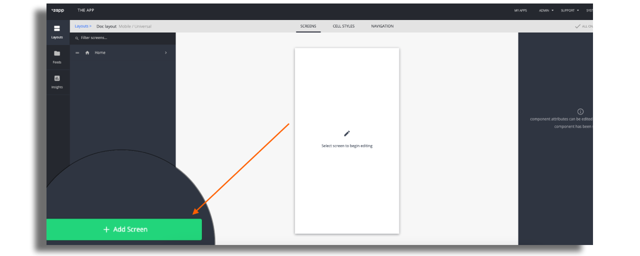
To add the screen, go to the Studio and on the relevant layout, add a new screen “General Content”.
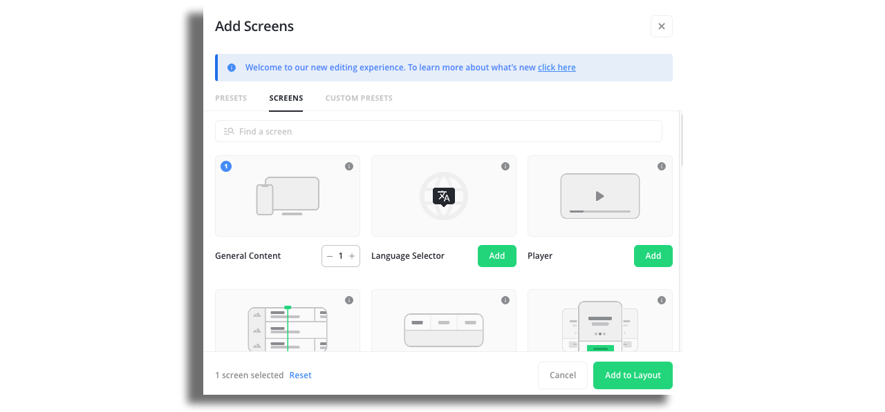
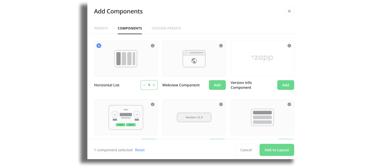
You can choose multiple components and screens. They will appear on the screen in the same order as you chose. There is an indication in the top right corner of each item.
On the right panel of the General content screen, you can adjust the configuration.
Enable the “Pull to refresh” function if needed. Here's more info.

Choose how to present the screen. You have the option for full screen, you can choose the orientation and you can attach any navbar that is available in your layout.
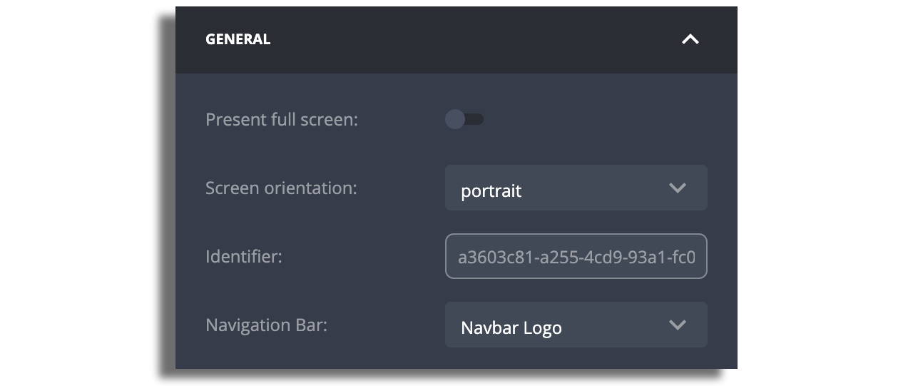
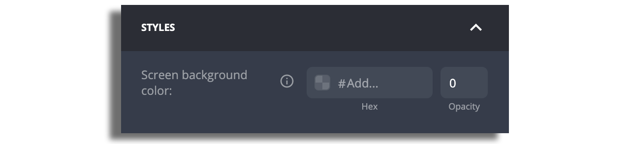
You can modify the background color that will override the color that is set on the Theme plugin.
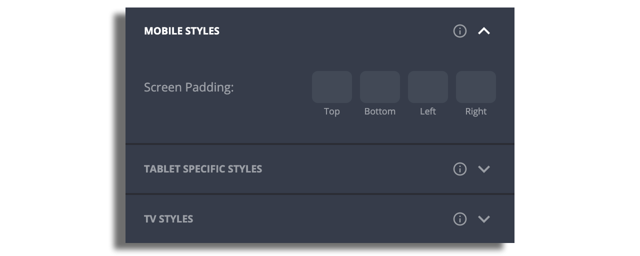
You can customize the padding and margins if needed.
Components
After adding a screen you can add the components. The components represent various common UI elements: Horizontal Lists (also known as Rails), Vertical Lists, Grids, Hero and more.
Inside the screen click the Add button to add relevant components.