Search
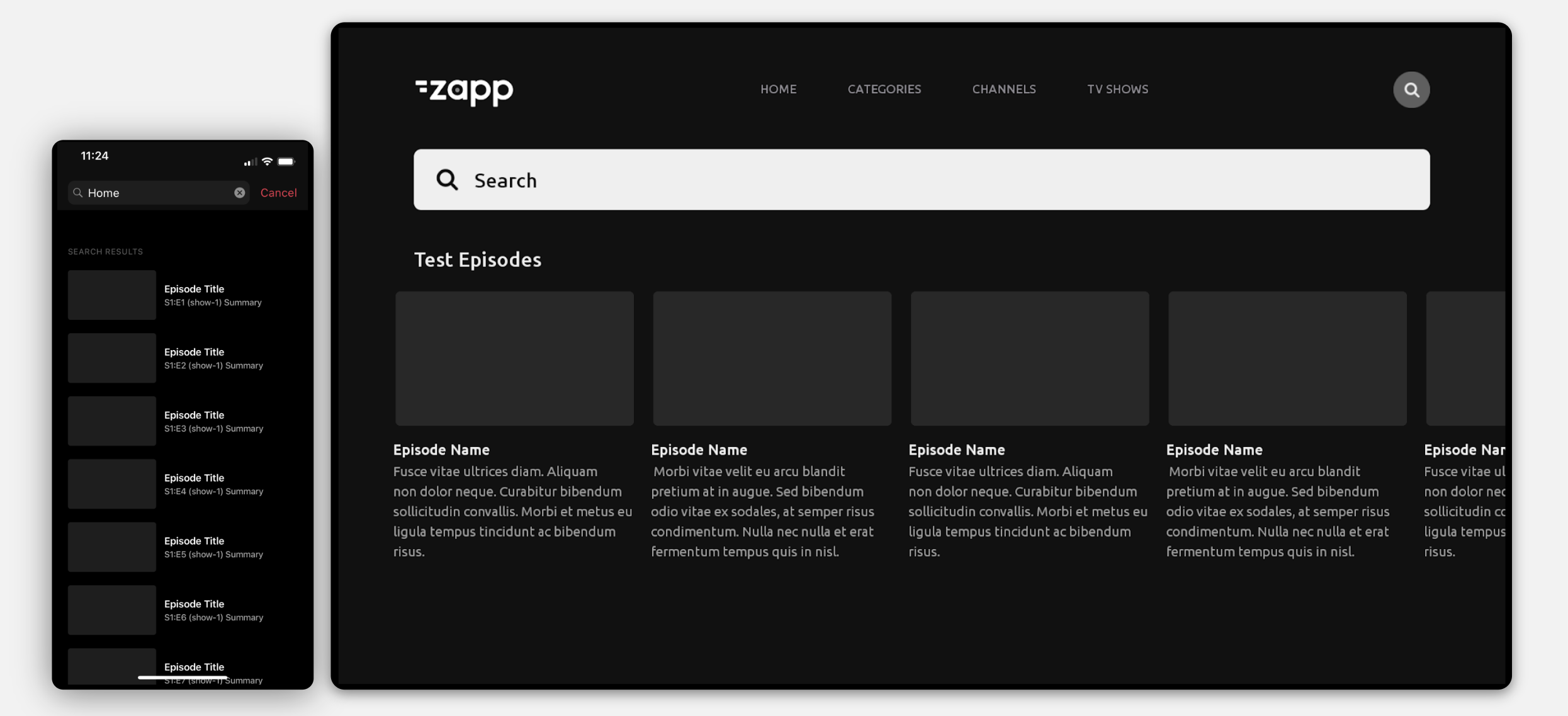
The Search is an essential way for users to discover and browse content efficiently. Our search feature includes:
- The search bar
- Customizable results screen
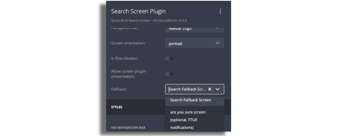
- Fallback screen (optional)
- Empty State Alert (optional)
- Search Filters (optional)

Prerequisites
- A search feed in the data source. For more information see here.
- Create a search feed in the Feeds section e.g.
https://pipes2-server-example.herokuapp.com/media?byType=episode&q={{q}}.
If your content is hosted in JW, please check this documentation.
Search screen
Start by adding a Search screen to the layout and then include the components, where the results will be displayed.
Assign the search feed you’ve created. Once you select the Search feed, it will detect it automatically and offer to select Search instead of Entry. Then add the q parameter. See below

In the Fallback field, choose the general content screen you’ve created for the Fallback screen.

The localization section for modifying the hint text and all available design configurations are available on the right panel.

Adjust the styling according to the app's branding, including elements like colors, backgrounds, borders, and assets.
On the Web there's an option to select search bar positioning. A "Relative" search bar scrolls with the page, while a "Fixed" search bar remains stationary regardless of scrolling. For the fixed version, a 'Y position' value is required to adjust its distance from the top of the viewport.
Recommended icons' size is 42x42 Pixel dimension.
Fallback screen
The Fallback Screen can display content before users perform a search and can be used to promote items or showcase popular content. Simply add the component, choose the cell style, and set up the feed for the default content you want to present.
Empty State Alert
To inform users of empty search results, you can add Empty Group Component to the Search Screen.
Search Filters
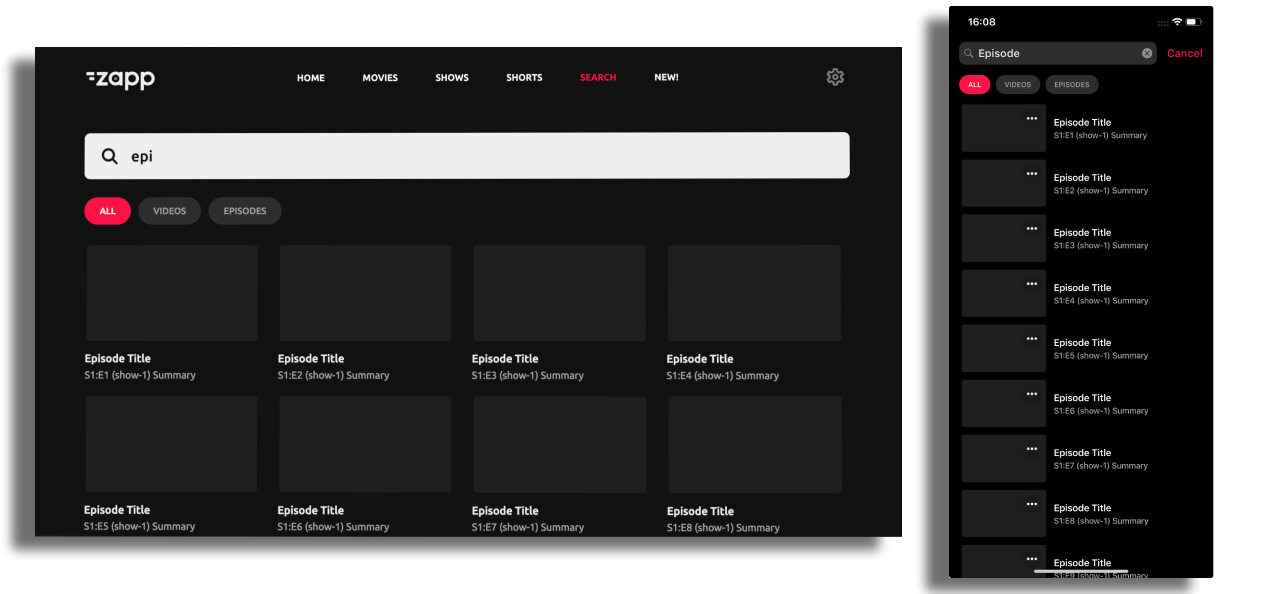
Search filters allow users to narrow their search results, according to the filter-tags set in the feed. For instance, these filters could categorize results into various types, such as All, Video, Audio or by genres like Comedies, Dramas, Thrillers and more.
In order to utilize this feature, an additional implementation is required from the customer's side!
Search filters feature is not available on Web!

Additional implementation
A feed with the search query as described here.
A feed with additional parameters for the Search Filter tabs that will display the results.
Zapp configuration:
Enable search filters toggle on the right panel of the Search Screen:

Assign the feed for the Search Filter tabs on a Search Screen level:

On a component level assign a search feed that includes filter-tags and make sure that q key and filterTag key parameters are added also:

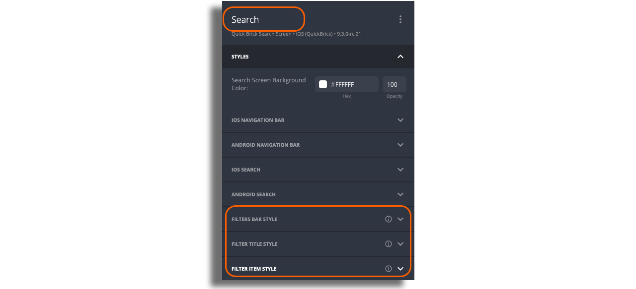
The Search filters can be styled on a Search Screen level in expandable fields on the right panel of the screen:

Behavior:
- Filters will be presented only on the results screen and will not be shown on a fallback screen.
- Once the search filters are enabled, the users will see a tab bar with categories below the search bar.
- Filters order will be displayed according to the data feed.
- First filter tag is selected by default.
- Moving from one filter to another keeps the query as it is.